vue-enhanced-check


Enhanced checkboxes /radio input, component for vue 2+.
Note that unicode is used for 'icons'. Therefore design can change according to your browser. It is still possible to override CSS style with '!important' instruction (checked and hover styles)
- Issue with ES2015 -> switch away in version 1.4
- Issue with bootstrap 3.3 on toggle component -> style fix in version 1.5
Based on first enhancedCheck project (CSS/JS)
Global use
- npm install
npm install --save vue-enhanced-check - import components
import { EnhancedCheck, EnhancedCheckGroup, EnhancedCheckRadio, EnhancedToggle } from 'vue-enhanced-check' or only one according to your needs
import { EnhancedCheck } from 'vue-enhanced-check' - declare use or imported components in your vue script
export default { components: { EnhancedCheck, EnhancedCheckGroup, EnhancedCheckRadio, EnhancedToggle }, methods: ... } - Use components as described below
Components
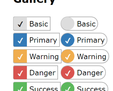
Checkbox
Label is prefixed by 'check' icon
<enhanced-check label="Checkbox"></enhanced-check> <enhanced-check :label="sc_label" :subClass="sc_subclass" v-model="sc_model" :disabled="sc_disabled" :rounded="sc_rounded" :animate="sc_animate" id="enhancedCheck" name="" value=""> </enhanced-check> | Prop | Type | Note |
|---|---|---|
label | String | REQUIRED: by design, label is a main part of the display |
id | String | id of input and associated label. |
name | String | name of classic input. Empty by default |
value | String | value of classic input. Empty by default |
subClass | String | Same colors than bootstrap style, possible values are 'default', 'primary', 'success', 'warning', 'danger' |
disabled | Boolean | False by default. Prevent clic action but not direct model change |
rounded | Boolean | False by default. Rounded border style |
animate | Boolean | False by default. Add a transition on style |
As a classic simple checkbox, model bound to check state: true or false
Checkbox group
<enhanced-check-group :label="['First', 'Second', 'Third']"></enhanced-check-group> <enhanced-check-group :label="['First', 'Second', 'Third']" :subClass="gc_subclass" v-model="gc_model" :disabled="gc_disabled" :rounded="gc_rounded" :animate="gc_animate" :inline="gc_inline" :combine="gc_combine" :value="[gc_val1, gc_val2, gc_val3]" id="enhancedCheckGroup" name=""> </enhanced-check-group> | Prop | Type | Note |
|---|---|---|
label | Array | REQUIRED |
value | Array | Value for each input. By default equal to label |
id | String/Array | id of input and associated label. If string provided, each element id will have a counter as suffix |
name | String/Array | name of classic input. Use array to specify different names |
subClass | String | Same than checkbox |
disabled | Boolean | Same than checkbox |
rounded | Boolean | Same than checkbox |
animate | Boolean | Same than checkbox |
inline | Boolean | False by default. Turn all input as inline-block |
combine | Boolean | False by default. Turn 'check' icon into 'plus' icon |
As classic multiple checkboxes, model bound to array of value from checked input
Radio
Label is prefixed by 'dot' icon
<enhanced-check-radio :label="['Element A', 'Element B', 'Element C']"></enhanced-check-radio> <enhanced-check-radio :label="['Element A', 'Element B', 'Element C']" name="radiotest" :subClass="rc_subclass" v-model="rc_model" :disabled="rc_disabled" :rounded="rc_rounded" :animate="rc_animate" :inline="rc_inline" id="enhancedCheckRadio" :value="[rc_val1, rc_val2, rc_val3]"> </enhanced-check-radio> | Prop | Type | Note |
|---|---|---|
label | Array | REQUIRED |
name | String | name of classic input. |
id | String/Array | id of input and associated label. If string provided, each element id will have a counter as suffix |
value | Array | Value for each input. By default equal to label |
subClass | String | Same than checkbox |
disabled | Boolean | Same than checkbox |
rounded | Boolean | Same than checkbox |
animate | Boolean | Same than checkbox |
inline | Boolean | Same than checkbox group |
As classic radio buttons, model bound to value from checked input
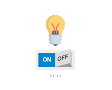
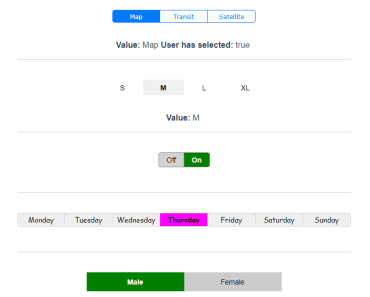
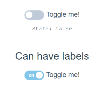
Toggle button
Checkbox is replaced by 2 switching labels, for on and off states
<enhanced-toggle></enhanced-check> <enhanced-toggle :labelOn="tc_labelOn" :labelOff="tc_labelOff" :styleOn="tc_styleOn" :styleOff="tc_styleOff" v-model="tc_model" :disabled="tc_disabled" :rounded="tc_rounded" id="enhancedToggle" name=""> </enhanced-toggle> | Prop | Type | Note |
|---|---|---|
labelOn | String | Label display for 'on' state (checked). Default is 'On' |
labelOff | String | Label display for 'off' state (unchecked). Default is 'Off' |
styleOn | String | style for 'on' state (checked), see checkbox's subclass. Default is primary |
styleOff | String | style for 'off' state (unchecked), see checkbox's subclass. Default is default |
id | String | id of input and associated label. |
name | String | Same than checkbox |
value | String | Same than checkbox |
disabled | Boolean | Same than checkbox |
rounded | Boolean | Same than checkbox |
As a classic simple checkbox, model bound to check state: true or false
Override style
You can define your own check color by adding a specific style
For example, let's define a 'custom' sub class.
<enhanced-check label="Custom" subClass="custom"></enhanced-check> Checkbox will get the class 'enhancedCheck-custom', that you can use in your CSS. Simple override for checkboxes:
.enhancedCheck.enhancedCheck-custom input[type="checkbox"]:checked + label:before { background: fuchsia; color: white; } .enhancedCheck.enhancedCheck-custom input[type="checkbox"]:not(:checked) + label:hover { border-color: fuchsia; } Full less sample:
.enhancedCheck.enhancedCheck-custom { input[type="radio"], input[type="checkbox"] { &:checked + label:before { background: $color; color: white; } &:not(:checked) + label:hover { border: 1px solid $color; } &:checked:disabled + label:before { background: $color-disabled; } &:not(:checked):disabled + label:hover { border: 1px solid $color-disabled; } } } Contribution
- Fork the repository
- Run
npm install - You can run
npm run dev, site is at http://localhost:8081. - Do your stuff
- When you're done, run
npm run buildcommand and commit your work for a pull request.