Qswitch
An awesome switch component for Vue.(一个帅气的Vue开关组件。)
Build Setup(构建安装)
# Before doing so, make sure Vue(>2.2) is installed correctly.(在此之前,请确保Vue(>2.2)已正确安装。) # install Qswitch for your project.(为你的项目安装Qswitch。) npm install qswitch --saveImport(导入组件)
import Qswitch from 'path/to/Qswitch' Vue.use(Qwsitch)Usage
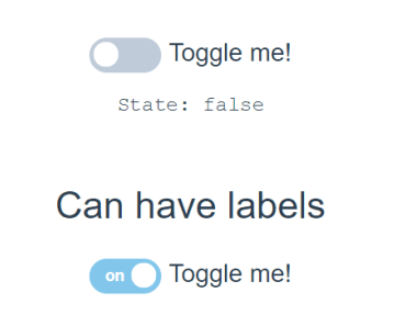
In order to achieve twoway binding, must set the
v-modelattribute for Qswitch. (为了实现双向绑定,必须设置v-model属性。)
<div> <h2>Qswitch default v-model: {{ ref_to_checked }}</h2> <qswitch v-model="ref_to_checked" :value="val"></qswitch> </div> import Qswitch from './components/Qswitch.vue' export default { name: 'app', data() { return { msg: 'An awesome switch component for Vue.', val: 'I am value', ref_to_checked: false } }, components: { 'qswitch': Qswitch } }
font awesome is required in order to dispaly icon for Qswitch.(需要 font awesome才能显示Qswitch的图标。)
Properties(属性)
| Name | Type | Default | Description |
|---|---|---|---|
| name | String | The name attribute of the <input type="checkbox" /> element in the Qswitch componnent.(Qswitch组件中<input type ="checkbox"/>元素的name属性的值。) | |
| value | String | false | The value attribute of the <input type="checkbox" /> element in the Qswitch componnent.(Qswitch组件中<input type ="checkbox"/>元素的value属性的值。) |
| checked | Boolean | false | The checked attribute of the <input type="checkbox" /> element in the Qswitch componnent.(Qswitch组件中<input type ="checkbox"/>元素的checked属性的值。) |
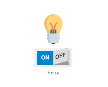
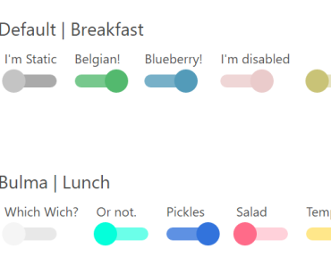
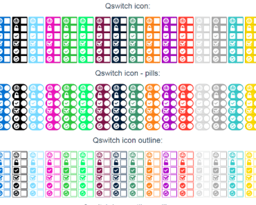
| type | String | default | The type of Qswitch componnent, allow values: default , text , icon and 3d.(Qswitch组件的类型,允许值为:default 、 text 、 icon 、 3d。) |
| size | String | default | The size of Qswitch componnent, allow values: default , mini , small and big.(Qswitch组件的大小,允许值为:default 、 mini 、 small 、 big。) |
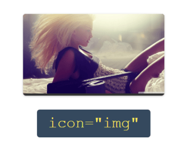
| icon | String | The icon of Qswitch componnent, allow values: happy , lock , check , check2 , check3 and check4.(Qswitch组件的图标,允许值为:happy 、 lock 、 check 、 check2 、 check3 、 check4。) | |
| color | String | blue | The color of Qswitch componnent, allow values: black , aqua , blue , fuchsia , green , lime, maroon , navy , olive , orange , purple , red , silver , gray , teal and yellow.(Qswitch组件的颜色,允许值为:black 、 aqua 、 blue 、 fuchsia 、 green 、 lime、 maroon 、 navy 、 olive 、 orange 、 purple 、 red 、 silver 、 gray 、 teal 、yellow。) |
| pill | Boolean | false | The Qswitch componnent dispaly as a pill shape.(Qswitch组件已胶囊形状显示。) |
| outline | Boolean | false | The Qswitch componnent dispaly as an outline shape.(Qswitch组件已轮廓形状显示。) |
| alt | Boolean | false | The Qswitch componnent dispaly as the default but outline shape.(Qswitch组件已默认加轮廓形状显示。) |
| text_on | String | The text of the Qswitch componnent when it is on. Only valid when type is text.(Qswitch组件处于开启状态时显示的文字。只有在type为text`的时候有效。) | |
| text_off | String | The text of the Qswitch componnent when it is off. Only valid when type is text.(Qswitch组件处于关闭状态时显示的文字。只有在type为text`的时候有效。) |
Donate(赞助)