bootstrap-popover-x

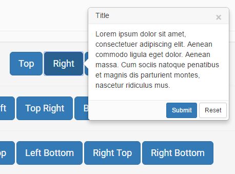
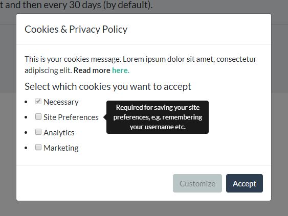
Bootstrap Popover Extended - Popover with modal behavior, multiple placements, automatic placements, ability to load content dynamically, and more other styling enhancements. The plugin enhances the styles for Bootstrap 3.x, and incorporates various additional styling options. This plugin was originally inspired by BootstrapModalPopover for Bootstrap 2.x, and has been significantly enhanced for Bootstrap 3.x and includes various new features.
NOTE: Refer the CHANGE LOG for details of changes to various releases. From release v1.4.5, Bootstrap 4.x framework is also supported along with Bootstrap 3.x.
Features
The plugin offers these enhanced features:
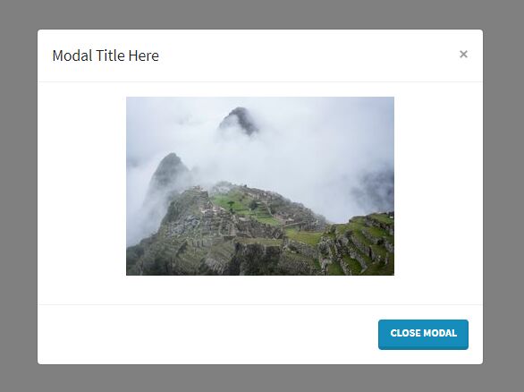
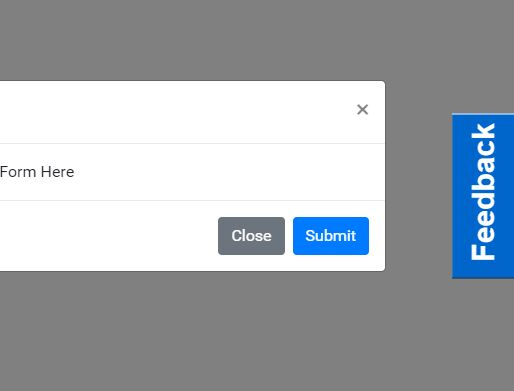
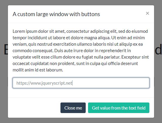
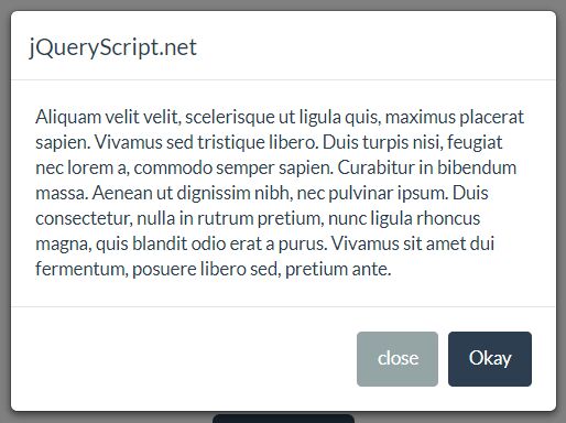
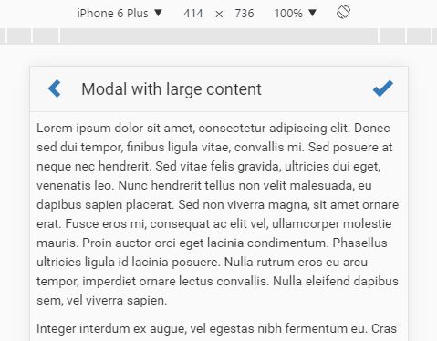
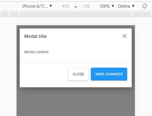
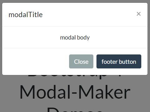
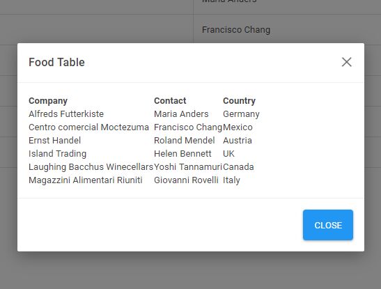
- The extended popover can be rendered just like a bootstrap modal dialog with the bootstrap popover styling. Since the plugin extends the bootstrap modal, all features of the bootstrap modal and its methods are also available.
- Adds a popover footer along with header. Configuration of the HTML content for the popover is much easier, just like a bootstrap modal.
- Specially styles and spaces out bootstrap buttons added in popover footer.
- Add a close icon/button to a popover window.
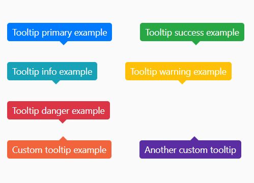
- Configure various prebuilt styles/templates. In addition to a default (grey), the bootstrap 3 contextual color styles of
primary,info,success,danger, andwarningcan be used. - Control popover placements with respect to the target element. The plugin supports 12 different placement options:
- right
- left
- top
- bottom
- top top-left
- top top-right
- bottom bottom-left
- bottom bottom-right
- left left-top
- left left-bottom
- right right-top
- right right-bottom
- auto
- auto-top
- auto-right
- auto-bottom
- auto-left
- horizontal
- vertical
- Specially style the popover arrow to be consistent for each contextual color and popover placement.
- Prebuilt CSS styles for controlling appearance and sizes of the popovers
- Ability to initialize and set popovers via javascript using the
PopoverButtonplugin. - Auto placement functionality that allows the popover to be placed automatically based on scroll and device screen dimensions. Various automatic placement options are available like
auto,auto-top,auto-right,auto-bottom,auto-left,horizontal, andvertical. - Allow scrolling of the page with popover displayed (unlike bootstrap modal).
- Styling enhancements for popover to not overlay but stay behind the bootstrap navbar.
Demo
View the plugin documentation and plugin demos at Krajee JQuery plugins.
Pre-requisites
- Bootstrap 4.x or 3.x (Requires bootstrap
modal.js) - Latest JQuery
- Most browsers supporting CSS3 & JQuery.
Installation
Using Bower
You can use the bower package manager to install. Run:
bower install bootstrap-popover-x Using Composer
You can use the composer package manager to install. Either run:
$ php composer.phar require kartik-v/bootstrap-popover-x "dev-master" or add:
"kartik-v/bootstrap-popover-x": "dev-master" to your composer.json file
Manual Install
You can also manually install the plugin easily to your project. Just download the source ZIP or TAR ball and extract the plugin assets (css and js folders) into your project.
Usage
Load Client Assets
You must first load the following assets in your header.
<!-- bootstrap 4.x is supported. You can also use the bootstrap css 3.3.x versions --> <link rel="stylesheet" href="https://maxcdn.bootstrapcdn.com/bootstrap/4.0.0-beta/css/bootstrap.min.css"> <link href="path/to/css/bootstrap-popover-x.min.css" media="all" rel="stylesheet" type="text/css" /> <script src="https://code.jquery.com/jquery-3.2.1.min.js"></script> <!-- popper.min.js below is needed if you use bootstrap 4.x. You can also use the bootstrap js 3.3.x versions without popper.min.js. --> <script src="https://cdnjs.cloudflare.com/ajax/libs/popper.js/1.11.0/umd/popper.min.js"></script> <!-- bootstrap.min.js below is needed for modal dialog dependency. bootstrap 4.x is supported. You can also use the bootstrap js 3.3.x versions. --> <script src="https://maxcdn.bootstrapcdn.com/bootstrap/4.0.0-beta/js/bootstrap.min.js" type="text/javascript"></script> <script src="path/to/js/bootstrap-popover-x.min.js" type="text/javascript"></script>If you noticed, you need to load the bootstrap.min.css, jquery.min.js, and bootstrap.min.js in addition to the bootstrap-popover-x.min.css and bootstrap-popover-x.min.js for the plugin to work with default settings.
Note: The plugin extends the bootstrap modal plugin and hence the
bootstrap.min.jsmust be loaded beforebootstrap-popover-x.min.js.
Option 1: Via data attributes
After loading the assets, setup your input markup for the extended popover plugin. You can activate the extended popover without writing JavaScript. Set data-toggle="popover-x" on a controller element, like a button, along with a data-target="#foo" or href="#foo" to target a specific popover to toggle.
<button class="btn btn-primary btn-lg" data-toggle="popover-x" data-target="#myPopover1" data-placement="top">Top</button> <div id="myPopover1" class="popover popover-x is-bs4 popover-default"> <!-- the is-bs4 class is needed for bootstrap 4 styling --> <div class="arrow"></div> <h3 class="popover-header popover-title"><span class="close" data-dismiss="popover-x">×</span>Title</h3> <div class="popover-body popover-content"> <p>Lorem ipsum dolor sit amet, consectetuer adipiscing elit. Aenean commodo ligula eget dolor. Aenean massa.</p> </div> </div>NOTE: The
Option 2: Via javascript
Alternatively, you can initialize the popover manually on your page via javascript using the PopoverButton plugin. This feature is typically useful when dynamically rendering content and dynamically enabling an element to trigger the popover.
<-- for example with the following button markup and using the same popover content markup above --> <button id="#btn1" class="btn btn-primary btn-lg">Top</button> <script> $(document).on('ready', function() { // initialize popover on click of `#btn1` $('#btn1').popoverButton({ target: '#myPopover1' }); // or alternatively initialize popover on hover of `#btn1` $('#btn1').popoverButton({ target: '#myPopover1', trigger: 'hover focus' }); }); </script>Documentation and Demo
View the plugin documentation and plugin demos at Krajee JQuery plugins.
License
bootstrap-popover-x is released under the BSD-3-Clause License. See the bundled LICENSE.md for details.
