autocomplete


Run these commands from the command-line.
Dependencies
npm install bower installBuild
gulp defaultUnit Tests
karma start --single-runUsage
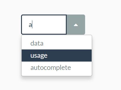
In code:
const options = { dataSource: 'https://localhost:3000/my-awesome-datasource' }; $('input.my-autocomplete').autocomplete(options);or in markup:
<input data-provide="softec-autocomplete" data-source="https://localhost:3000/my-awesome-datasource">Options
| Name | Description |
|---|---|
| appendToBody | If true, the dropdown-menu will be appended to the HTML body element, instead of inside the autocomplete container. Default: false |
| dataSource | Can be either an Array or an URL. In case of an URL, Ajax is used to gather the data. |
| nameProperty | The property that will be used as display text. Default: name |
| valueProperty | The property that will be used as the value. Default: value |
| valueField | Can be either a selector or an element. Specified elements will get their value set to the value of the selected element (specified by the valueProperty option). |
| filter | function(input, data) { ... } Function which will be used to filter the items. input contains the input value. data contains the object retrieved by the dataSource. |
| filterOn | Event which will trigger the filter function. Will be attached to the text input field. Default: input |
| validation | function(input, data) { ... } Function which can be used for custom validations. Has to return true if value is valid, otherwise the input field will be marked as invalid. Can also be set with the attribute validation-function="MyJavaScriptFunction(input, data)" and this function has to be defined by yourself |
| validateOn | Event which will trigger the validation function. Will be attached to the text input field. Default: blur |
| onSelected | Function that will be called when a value is selected. |
| openOnInput | Function which will be called when the input is clicked. Can also be set with the html attribute open-on-input="true/false" |
| selectFirstMatch | Autocomplete will automatically select the first options - even if there are more options available. Can also be set with: select-first="true". |
| invalidClass | Class that will be set on the input, if the validation function does not return true. Default: invalid |
| preAppendDataItem | function(li, item) Function which allows you to manipulate the DOM element. li is the DOM element to be inserted as dropdownitem and item is the element from the datasource. Can also be set with the html attribute pre-append="preAppendDataItem(li, item)" |
| distinct | If true the dropdown will only show unique values. Default: false |
Some options can be set in markup:
- data-source
- data-invalid-class
- data-value-field
- validation
Events
| Name | Description |
|---|---|
| initial-value-selected | Will be triggered as soon as the initial value is selected. Initial value is optionally provided by the referenced valueField. The value will only be selected if the dataSource contains a corresponding element. |


