bootstrap-easy-sidebar
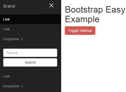
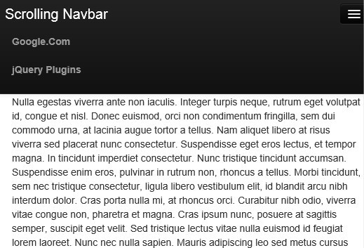
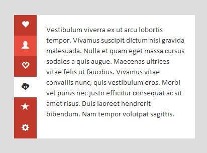
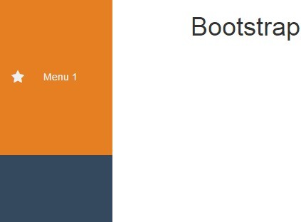
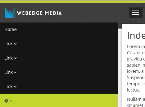
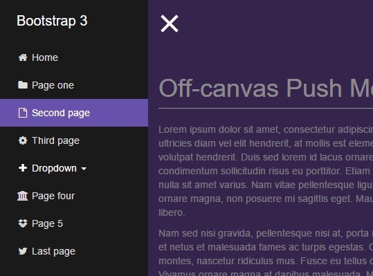
I've seen a few sidebars for bootstrap around and found most of them lacking in the areas of theme integeration and flexibility. This is an attempt at full integrating a sidebar with Bootstrap by inheriting all styling from navbar and then changing where required.
Should support any kind of bootstrap theme you throw at it, I've tested a few free ones from around the web to check compatibility.
Does NOT affect other navbars so you can use them separately on the same page.
Any issues don't hesitate to let me know
Update 1.2.0
This update brings better usability across all platforms and screen sizes.
Sidebar now stays fixed to the browser window to facilitate longer menus and to remove the necessity to be at the top of the page's content to see, especially on mobile.
Also removed the need for a separate legacy CSS file for older versions of IE.
Demo
Check out the demo of it in action
Installation
If you use bower:
bower install bootstrap-easy-sidebar Or you can just download the zip from here.
Note: You will have to download the zip for detect_swipe separately if you're doing it manually because GitHub doesn't include dependencies in the downloadable zip files.
Usage
Add the css to your head
<link rel="stylesheet" href="easy-sidebar.css">Assign the class easy-sidebar-active to the html tag.
<html class="easy-sidebar-active">When creating a bootstrap navbar, simply add the class easy-sidebar to the end.
<nav class="navbar navbar-inverse easy-sidebar">Place the class easy-sidebar-toggle on any elements you wish to open/close the sidebar with. You can either not include the navbar-toggle at all or convert it to the close button for the menu, it will automatically convert the menu bar icon spans into an X eg.
<button type="button" class="navbar-toggle easy-sidebar-toggle" aria-expanded="false"> <span class="sr-only">Toggle navigation</span> <span class="icon-bar"></span> <span class="icon-bar"></span> <span class="icon-bar"></span> </button>Turns into this:
ALL Page content EXCLUDING the sidebar navbar requires it be enclosed within a container-fluid with the easy-sidebar-container class attached to it. This ensures that your content stays on the page and facilitates scrolling in the new layout.
NOTE: This will NOT affect your ability to choose your own page layout at all. The fluid container is basically an empty container with no margin or padding and so acts exactly like body would. You can nest containers and navs inside it just like you would any normal bootstrap page.
Example layout:
<body> <nav class="navbar navbar-inverse easy-sidebar"> Sidebar content goes here. </nav> <div class="container-fluid easy-sidebar-container"> ALL page content goes here. </div> </body>Include the swipe_detect javascript after jquery and bootstrap
<script src="detect_swipe/jquery.detect_swipe.js"></script> At the bottom of your page, before the closing body tag add in this small script
<script> $('.easy-sidebar-toggle').click(function(e) { e.preventDefault(); $('.easy-sidebar-container').toggleClass('toggled'); $('.navbar.easy-sidebar').toggleClass('toggled'); }); $('html').on('swiperight', function(){ $('.easy-sidebar-container').addClass('toggled'); $('.navbar.easy-sidebar').addClass('toggled'); }); $('html').on('swipeleft', function(){ $('.easy-sidebar-container').removeClass('toggled'); $('.navbar.easy-sidebar').removeClass('toggled'); }); </script>And you should be all set!
Be sure to check out the demo page below for a complete example using the default Bootstrap CSS and inverted navbar style for the sidebar itself to contrast the top navbar and the rest of the page.
IE Support
Should work straight out of the box. Any issues with specific browsers let me know so I can test them.
Author
Andy Cormack (Front-End Developer)
Twitter: @groundxaero
Email: [email protected]
Portfolio: http://ac-design.co.uk
