Cari periodPicker
A period picker build on the top of Bootstrap 4 and Moment.js that allow to select month, quarter, semester or full year.
Please see the demo.

Installation & dependencies.
periodPicker requires jQuery, Bootstrap 4 and Moment.js.
Clone, download, or include the lib from CDN :
<link href="https://cdn.jsdelivr.net/gh/cariagency/period-picker@1/dist/period-picker.min.css" rel="stylesheet" type="text/css"/> <script src="https://cdn.jsdelivr.net/gh/cariagency/period-picker@1/dist/period-picker.min.js" type="text/javascript"></script>Includes dependencies into your page, then dist/period-picker.min.css and dist/period-picker.min.js.
Example :
<!DOCTYPE html> <html lang="en"> <head> <meta charset="utf-8"> <meta http-equiv="X-UA-Compatible" content="IE=edge"> <meta name="viewport" content="width=device-width, initial-scale=1"> <title>periodPicker</title> <link rel="stylesheet" href="https://maxcdn.bootstrapcdn.com/bootstrap/4.0.0/css/bootstrap.min.css" integrity="sha384-Gn5384xqQ1aoWXA+058RXPxPg6fy4IWvTNh0E263XmFcJlSAwiGgFAW/dAiS6JXm" crossorigin="anonymous"> <link href="https://cdn.jsdelivr.net/gh/cariagency/period-picker@1/dist/period-picker.min.css" rel="stylesheet" type="text/css"/> </head> <body> <!-- *** --> <script src="https://cdnjs.cloudflare.com/ajax/libs/moment.js/2.22.2/moment.min.js"></script> <script src="https://code.jquery.com/jquery-3.2.1.min.js" crossorigin="anonymous"></script> <script src="https://cdnjs.cloudflare.com/ajax/libs/popper.js/1.12.9/umd/popper.min.js" integrity="sha384-ApNbgh9B+Y1QKtv3Rn7W3mgPxhU9K/ScQsAP7hUibX39j7fakFPskvXusvfa0b4Q" crossorigin="anonymous"></script> <script src="https://maxcdn.bootstrapcdn.com/bootstrap/4.0.0/js/bootstrap.min.js" integrity="sha384-JZR6Spejh4U02d8jOt6vLEHfe/JQGiRRSQQxSfFWpi1MquVdAyjUar5+76PVCmYl" crossorigin="anonymous"></script> <script src="https://cdn.jsdelivr.net/gh/cariagency/period-picker@1/dist/period-picker.min.js" type="text/javascript"></script> </body> </html>Usage.
Basic example.
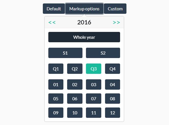
<button type="button" class="btn btn-primary" id="period-picker">periodPicker</button> <script type="text/javascript"> $('#period-picker').periodPicker({ pick: function (value) { window.location.href = 'my/url?start=' + value.start.format('YYY-MM-DD HH:mm:ss') + '&end=' + value.end.format('YYY-MM-DD HH:mm:ss'); } }); </script>Markup options.
You can define following options using data-xxx attribute :
- year : default year (YYYY)
- min : first selectable month (YYYY/MM).
- max : last selectable month (YYYY/MM).
- active : the current active period. Must match :
/^(\d{4})(\/(0[1-9]|1[1-2]|Q[1-4]|S[1-2]))?$/
Example :
<button type="button" id="period-picker" data-year="2016" data-min="2015/05" data-max="2017/08">periodPicker</button> <script type="text/javascript"> $('#period-picker').periodPicker(); </script>Custom options.
Any of default options (see full list below) can be overrided when initializing the picker.
Example :
<button type="button" id="period-picker">periodPicker</button> <script type="text/javascript"> $('#period-picker').periodPicker({ btnClass: 'btn btn-success', yearName: 'Année complète', quarterName: 'T', prevTemplate: '<i class="fa fa-arrow-left"></i>', nextTemplate: '<i class="fa fa-arrow-right"></i>' }); </script>Global configuration.
You can override globally any default options (see full list below).
This must be done before periodPicker initilization.
Example :
(function ($) { $.fn.periodPickerDefaults.btnClass = 'btn btn-success'; $.fn.periodPickerDefaults.prevTemplate = '<i class="fa fa-arrow-left"></i>'; $.fn.periodPickerDefaults.nextTemplate = '<i class="fa fa-arrow-right"></i>'; if ($('body').attr('lang') === 'fr') { $.fn.periodPickerDefaults.yearName = 'Année complète'; $.fn.periodPickerDefaults.quarterName = 'T'; } }(jQuery));Theming.
Following options allows you to customize some elements of the picker :
// Year button title. yearName: 'Whole year' // String to populate semester buttons. semesterName: 'S' // String to populate quarter buttons. quarterName: 'Q' // Buttons class. btnClass: 'btn btn-primary' // Active button class. activeClass: 'btn btn-success' // Previous year button content. prevTemplate: '<<' // Next year button content. nextTemplate: '>>' The plugin inserts following CSS classes on generated element to ease theming :
- .period-picker-button : the element triggering the picker.
- .period-picker-popover : the picker popover.
Default options.
Here is the full list of periodPicker options and their default values :
$.fn.periodPickerDefaults = { // Min month : YYYY/MM format. min: false, // Max month : YYYY/MM format. max: false, // Default year : YYYY format. year: false, // Current active element. Must match : /^(\d{4})(\/(0[1-9]|1[1-2]|Q[1-4]|S[1-2]))?$/ // Examples : 2018 , 2014/S1 , 1981/Q3 , 1512/02 active: false, // Action when a picker button is clicked. // Return true to keep the popover opened, otherwise it will be closed. pick: function (value, $picker, $popover) { console.log(value); }, // Options to pass to Bootstrap 4 popover. // Following options WILL be ignored : title, content, html popover: { placement: 'bottom', }, // Year button title. yearName: 'Whole year', // String to populate semester buttons. semesterName: 'S', // String to populate quarter buttons. quarterName: 'Q', // Buttons class. btnClass: 'btn btn-primary', // Active button class. activeClass: 'btn btn-success', // Previous year button content. prevTemplate: '<<', // Next year button content. nextTemplate: '>>', // Popover title template titleTemplate: '<div class="inner">\ <a href="#" class="period-picker-prev">%P</a>\ <div class="year"></div>\ <a href="#" class="period-picker-next">%N</a>\ </div>', // Popover body template. bodyTemplate: '<div class="inner">\ <div class="year">\ <div>\ <button class="%C">%Y</button>\ </div>\ </div>\ <div class="semester">\ <div>\ <button class="%C" data-period="1">%S1</button>\ </div>\ <div>\ <button class="%C" data-period="2">%S2</button>\ </div>\ </div>\ <div class="quarter">\ <div>\ <button class="%C" data-period="1">%Q1</button>\ </div>\ <div>\ <button class="%C" data-period="2">%Q2</button>\ </div>\ <div>\ <button class="%C" data-period="3">%Q3</button>\ </div>\ <div>\ <button class="%C" data-period="4">%Q4</button>\ </div>\ </div>\ <div class="month">\ <div>\ <button class="%C" data-period="1">01</button>\ </div>\ <div>\ <button class="%C" data-period="2">02</button>\ </div>\ <div>\ <button class="%C" data-period="3">03</button>\ </div>\ <div>\ <button class="%C" data-period="4">04</button>\ </div>\ <div>\ <button class="%C" data-period="5">05</button>\ </div>\ <div>\ <button class="%C" data-period="6">06</button>\ </div>\ <div>\ <button class="%C" data-period="7">07</button>\ </div>\ <div>\ <button class="%C" data-period="8">08</button>\ </div>\ <div>\ <button class="%C" data-period="9">09</button>\ </div>\ <div>\ <button class="%C" data-period="10">10</button>\ </div>\ <div>\ <button class="%C" data-period="11">11</button>\ </div>\ <div>\ <button class="%C" data-period="12">12</button>\ </div>\ </div>\ </div>' };


