Bootstrap Tooltip Custom Class
Extend Bootstrap Tooltip plugin by adding custom classes. Available for Bootstrap 3 and Boostrap 4.
Custom classes can be added using customClass parameter or via data-custom-class attribute.
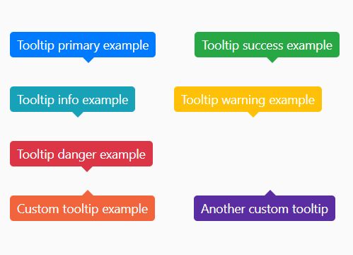
There are 5 predefined custom classes in CSS: .tooltip-primary, .tooltip-success, .tooltip-info, .tooltip-warning, .tooltip-danger.

Usage
- Use
data-custom-classattribute:
<button type="button" class="btn btn-default" data-toggle="tooltip" data-placement="top" data-custom-class="tooltip-custom" title="Custom tooltip example">Tooltip example</button>or
- Use
customClassparameter on plugin initialization:
$(function () { $('.my-element').tooltip({ customClass: 'tooltip-custom' }); });Setup
Use the appropriate files according to Bootstrap version that you use.
CSS
Include bootstrap-tooltip-custom-class.css in your project or use the .scss file:
<link rel="stylesheet" href="bootstrap-tooltip-custom-class.css" media="all" />SASS:
@import "bootstrap-tooltip-custom-class";Use the mixin tooltip-custom to create styles for your custom tooltip:
.tooltip-custom { @include tooltip-custom(#f2653c); }Javascript
Include the script after Bootstrap's main javascript file:
<script src="bootstrap.js"></script> <script src="bootstrap-tooltip-custom-class.js"></script>


