Bootstrap Responsive Tabs
By Invent Partners [http://inventpartners.com]
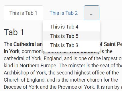
Bootstrap Responsive Tabs is a jQuery plugin which enables Bootstrap tab menus to work well in responsive layouts. When horizontal space is limited, the tab menu will display as many menu items as it can in tabs, and then collapse the remaining menu items into a drop down menu at the end of the tab list.
LICENSE
Copyright 2016 Invent Partners http://www.inventpartners.com
Licensed under an MIT style license
Demo
Check out the demos: Bootstrap 3 / Bootstrap 4.
Requirements
Bootstrap Responsive Tabs requires Bootstrap (CSS and JavaScript) and jQuery.
Please note that Bootstrap 4 users should use the files in the /bootstrap4 folder.
Usage
$(function() { $('.nav-tabs').responsiveTabs(); });More details here: [http://www.inventpartners.com/open-source/bootstrap-responsive-tabs]


