


Bootoast 🔥
Make your toast notifications with Bootstrap 3 or 4
alerts.
Demo!
Default Settings
bootoast.toast({ message: 'Bootoast!', type: 'info', position: 'bottom-center', icon: null, timeout: null, animationDuration: 300, dismissible: true });Options Settings
To use your own settings, take the default example above and replace with your values. You can also remove the keys you will not change.
| Option | Default Value | Descrition |
|---|---|---|
message | 'Helo!' | Any, any, HTML String! |
type | 'info' | A raw string that can be any of Bootstrap 3 alert type classes without the alert- preffix. Available types. |
icon | based on choosen type OR undefined | An icon following the standard Bootstrap 3 glyphicons name without the glyphicon- preffix. Icons choosen by type. |
position | 'bottom-center' | A raw string with two segments of align separated by hypehn follo0wing the pattern: vertical-horizontal. Supported positions. |
timeout | false | The time in seconds for hide the notification (.alert element). If false or 0, the notification will not auto-hide. |
dismissible | true | Shows or hides the dismiss × button. It can be true or false. |
animationDuration | 300 | The notification hide animation duration in milliseconds (ms). |
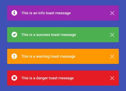
Supported Types
By default, Bootoast supports all Bootstrap 3 alert types:
- info
- success
- warning
- danger
See more about Bootsrap alerts.
Supported Positions
| Supported | Sinonymus |
|---|---|
top-center | top |
top-left | left-top |
top-right | right-top |
bottom-center | bottom |
bottom-left | left-bottom |
bottom-right | right-bottom |
Icon Defaults
By default, if it's not defined, it will turn into an icon choosen by the type:
| Bootoast type | Bootstrap icon |
|---|---|
| warning | exclamation-sign |
| success | ok-sign |
| danger | remove-sign |
| info | info-sign |
Versioning
Closest as possible to semver (Semantic Versioning).
Good Luck. :-)


