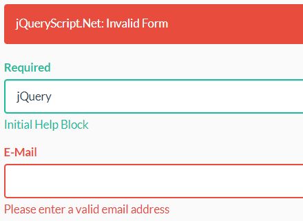
jQuery Bootstrap Form Validation
Getting started
- download
validator.jsfrom repository - include this file to your project
- make sure your HTML-syntax looks like this:
<div class="form-group"> <label class="control-label" for="input_id">Required</label> <input type="text" id="input_id" class="form-control" name="input_name"> </div>- initialize form validation with
var form = new Validation('#form_id', { fields: [{ name: 'input_name', rule: { type: 'validation_type', // check if input value matches validation-type prompt: 'enter error prompt message', // displays error help block if value is not valid showSuccess: false // do not show success status on form-group if value is valid } }, // add more fields ], submitOnValid: false, // do not submit html form; triggers 'is-valid'-callback errorMessageText: "Custom Error Message", // set text for error alert errorGroupClass: "has-error has-feedback", // set error class for form-group successGroupClass: "has-success has-feedback" // set success class for form group });- validation gets triggered when user submits the form
reset your form with:
form.reset();open index.html with your browser for live demo
Validation Rules
| Pattern | Explanation |
|---|---|
| required | any word characters |
| any valid e-mail address | |
| date | valid date formats: YYYY-MM-DD or MM.DD.YYYY or MM DD YYYY IMPORTANT: only checks if the format is valid |
| minLength:X | value must be at least X characters long |
| maxLength:X | value cannot be longer than X characters |
| regex:X | regex check for value |
| checked | check if checkbox / radio is checked |
Parameter Options
| Option | Explanation | default |
|---|---|---|
fields.name | HTML input name to identify input element | none |
fields.rule.type | Specify validation pattern for this input name. See Validation Rules for more information | none |
fields.rule.prompt | Create .help-block with prompt text to display error message on invalid input | none |
fields.rule.showSuccess | Show success status for .form-group on valid input | true |
submitOnValid | Action after form validation - true: submit form and navigate to form action route - false: triggered callback See Form Callbacks for more information | true |
showErrorMessage | Show alert-danger on invalid form | true |
errorMessageText | Customize alert-danger message | "Please check the fields below." |
errorGroupClass | Set your own error-class for .form-group on error | "has-error" |
successGroupClass | Set your own success-class for .form-group on success | "has-success" |
Form Callbacks
is-validcallback for valid form fields on subimt submitis-invalidcallback for invalid form fields on form submit
Tested Systems
- Chrome v62 on Windows
- Firefox v56 on Windows
- Internet Explorer v11 on Windows
- Microsoft Edge v25 on Windows
- Chrome v62 on Mac
- Firefox v56 on Mac
- Safari v11 on Mac
Changelog
- 1.2.0: Added date validation rule
- 1.1.0: Added custom error and success class options for
form-group


