React Timeseries Charts
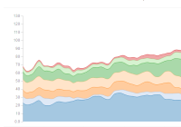
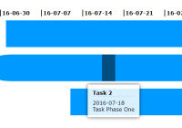
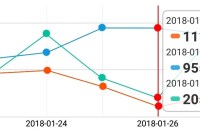
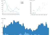
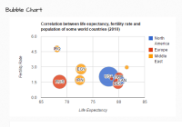
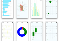
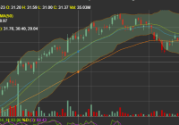
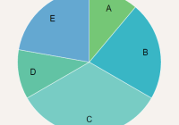
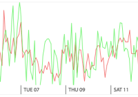
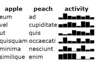
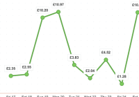
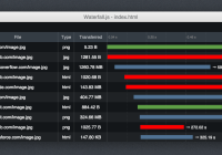
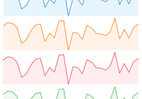
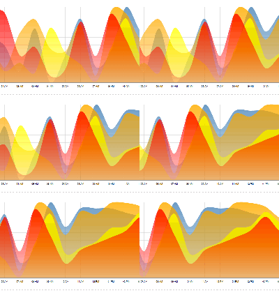
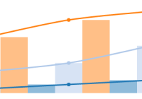
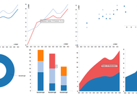
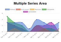
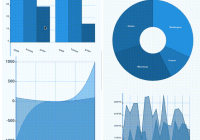
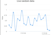
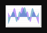
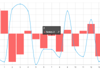
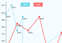
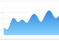
This library contains a set of modular charting components used for building flexible interactive charts. It was built for React from the ground up, specifically to visualize timeseries data and network traffic data in particular. Low level elements are constructed using d3, while higher level composability is provided by React. Charts can be stacked as rows, overlaid on top of each other, or any combination, all in a highly declarative manner.
The library is used throughout the public facing ESnet Portal.
Current features of the library include:
- Declarative layout of charts using JSX
- Interactivity, including pan and zoom
- Add new chart types or overlays
- Multiple axis, multiple rows
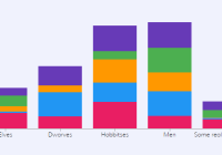
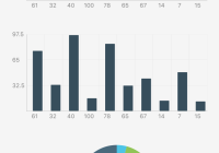
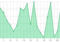
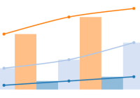
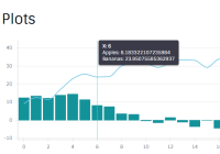
- Line, area, scatter, bar and boxplot charts
- Brushing
- Legends
- Overlay markers
Please browse the examples for a feel for the library.
Getting started
This charts library is intended to be installed with npm and the built into your project with a tool like Webpack. It expects React to be present, as well as our TimeSeries abstraction library, pond.js. More on this below. To install:
npm install react-timeseries-charts pondjs --save Once installed, you can import the necessary components from the library:
import { Charts, ChartContainer, ChartRow, YAxis, LineChart } from "react-timeseries-charts"; Then we construct our chart in the render() function of our component. For a simple example we create a chart with two line charts on it, specified in JSX:
<ChartContainer timeRange={series1.timerange()} width={800}> <ChartRow height="200"> <YAxis id="axis1" label="AUD" min={0.5} max={1.5} width="60" type="linear" format="$,.2f"/> <Charts> <LineChart axis="axis1" series={series1}/> <LineChart axis="axis2" series={series2}/> </Charts> <YAxis id="axis2" label="Euro" min={0.5} max={1.5} width="80" type="linear" format="$,.2f"/> </ChartRow> </ChartContainer> At the outer most layer, we add a <ChartContainer> which contains our time range for the x-axis. All charts within a ChartContainer share the same x-axis. In this case we get the TimeRange from the TimeSeries itself, but you could specify one yourself. You also need to provide a width for the chart, or wrap the chart in a <Resizable> component and that will inject a width for you.
For the next layer of the layout we make a <ChartRow>. We can have multiple charts stacked on top of each other by using more than one row. In this case we just have one row. Each row has a specific height in the layout, so we specify that as 200px high here.
Next up we want to put something in our row. Rows contain two parts:
- a central flexible sized area in which charts can be added and
- axes on either the left or right of the central area.
This central area is surrounded in the JSX by the <Charts> tag. Each chart in this area is composited on top of each other. In this case we are adding two <LineChart>s, one for each of our timeseries. As a result they will be drawn on top of each other. (Note that as of v0.9, it is also possible to draw multiple channels of a TimeSeries as multiple line charts). For scaling each chart will reference an axis that will define the scale as well as display that scale visually as the y-axis.
Finally, we specify the axes that the charts reference. These go either before or after the <Charts> group, depending on if you want the axis before (to the left) or after the charts (to the right). You can specify any number of axes on either side. For each <YAxis> you specify the id so that a chart can reference it, the label you want displayed alongside the axis and, importantly, the scale using min and max. You can also specify the type of the axis (linear, log, etc), a non-default width and the format.
For more details, please see the API docs.
Data format
This charting library is built on the ESnet timeseries library called pond.js. Pond.js was created to provide a common representation for things like time series, time ranges, events and other structures as well as to implement common operations on those structures.
For the purpose of using the charting library, you need to create a TimeSeries object as your time series, which will be rendered by the chart code. Constructing a TimeSeries is pretty simple. You just need to pass it an object that contains, at a minimum, the column names as an array, and a list of points.
For example:
import { TimeSeries, TimeRange } from "pondjs"; const data = { name: "traffic", columns: ["time", "in", "out"], points: [ [1400425947000, 52, 41], [1400425948000, 18, 45], [1400425949000, 26, 49], [1400425950000, 93, 81], ... ] }; const timeseries = new TimeSeries(data); Generally columns must have 'time' as the first column (see the Pond.js docs for other options), and points is of the format:
[[time, value], [time, value], ...] Note that there are several ways to construct a TimeSeries. The above is what we call our wire format.
To specify a ChartContainer you also need to provide the time range to plot on the x-axis. This is done with a pond.js TimeRange. You could either get the TimeRange from the TimeSeries directly:
var timerange = timeseries.timerange() Or construct a new one:
var timerange = new TimeRange([begin, end]); where begin and end are times (Javascript Dates, usually).
How you manage this is application specific. We often have pages where the current time range being shown is kept in the this.state of the component and is updated during pan and zoom, both via interaction with the charts or via other controls on the page.
Developing
The repo contains the examples website. This is very helpful in developing new functionality. Within a cloned repo, you first need to run:
yarn install This will install the development dependencies into your node_modules directory.
You can then start up the test server:
npm run start-website Then, point your browser to:
Before submitting a Pull Request, run:
npm run build In case you want to demonstrate an issue with the library via an example, you can use CodeSandBox.
A simple BarChart example has been built here - https://codesandbox.io/s/3j0540mo5
Supported Browsers
The most recent release of Firefox or Chrome is recommended.
License
This code is distributed under a BSD style license, see the LICENSE file for complete information.
Copyright
ESnet's React Timeseries Charts, Copyright (c) 2015 - present, The Regents of the University of California, through Lawrence Berkeley National Laboratory (subject to receipt of any required approvals from the U.S. Dept. of Energy). All rights reserved.
If you have questions about your rights to use or distribute this software, please contact Berkeley Lab's Technology Transfer Department at [email protected].
NOTICE. This software is owned by the U.S. Department of Energy. As such, the U.S. Government has been granted for itself and others acting on its behalf a paid-up, nonexclusive, irrevocable, worldwide license in the Software to reproduce, prepare derivative works, and perform publicly and display publicly. Beginning five (5) years after the date permission to assert copyright is obtained from the U.S. Department of Energy, and subject to any subsequent five (5) year renewals, the U.S. Government is granted for itself and others acting on its behalf a paid-up, nonexclusive, irrevocable, worldwide license in the Software to reproduce, prepare derivative works, distribute copies to the public, perform publicly and display publicly, and to permit others to do so.
