react-d3-speedometer
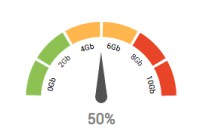
react-d3-speedometer is a react component library for showing speedometer like gauge using d3.


Usage:
NPM: npm install --save react-d3-speedometer
Yarn: yarn add react-d3-speedometer
// import the component import ReactSpeedometer from "react-d3-speedometer" // and just use it <ReactSpeedometer />Configuration Options:
| prop | type | default | comments |
|---|---|---|---|
| value | number | 0 | Make sure your value is between your minValue and maxValue |
| minValue | number | 0 | |
| maxValue | number | 1000 | |
| segments | number | 5 | Number of segments in the speedometer. Please note, segments is calculated with d3-ticks which is an approximate count that is uniformly spaced between min and max. Please refer to d3-ticks and d3-array ticks for more detailed info. |
| maxSegmentLabels | number | value from 'segments' prop | Limit the number of segment labels to displayed. This is useful for acheiving a gradient effect by giving arbitrary large number of segments and limiting the labels with this prop. See Live Example. Please note, maxSegmentLabels is calculated with d3-ticks which is an approximate count that is uniformly spaced between min and max. Please refer to d3-ticks and d3-array ticks for more detailed info. |
| forceRender | boolean | false | After initial rendering/mounting, when props change, only the value is changed and animated to maintain smooth visualization. But, if you want to force rerender the whole component like change in segments, colors, dimensions etc, you can use this option to force rerender of the whole component on props change. |
| width | number | 300 | diameter of the speedometer and the width of the svg element |
| height | number | 300 | height of the svg element. Height of the speedometer is always half the width since it is a semi-circle. For fluid width, please refere to fluidWidth config |
| fluidWidth | boolean | false | If true takes the width of the parent component. See Live Example for more details |
| needleColor | string | steelblue | Should be a valid color code - colorname, hexadecimal name or rgb value. Should be a valid input for d3.interpolateHsl |
| startColor | string | #FF471A | Should be a valid color code - colorname, hexadecimal name or rgb value. Should be a valid input for d3.interpolateHsl |
| endColor | string | #33CC33 | Should be a valid color code - colorname, hexadecimal name or rgb value. Should be a valid input for d3.interpolateHsl |
| segmentColors | array (of colors) | [] | Custom segment colors can be given with this option. Should be an array of valid color codes. If this option is given startColor and endColor options will be ignored. |
| needleTransition | string | easeQuadInOut | d3-easing-identifiers - easeLinear, easeQuadIn, easeQuadOut, easeQuadInOut, easeCubicIn, easeCubicOut, easeCubicInOut, easePolyIn, easePolyOut, easePolyInOut, easeSinIn, easeSinOut, easeSinInOut, easeExpIn, easeExpOut, easeExpInOut, easeCircleIn, easeCircleOut, easeCircleInOut, easeBounceIn, easeBounceOut, easeBounceInOut, easeBackIn, easeBackOut, easeBackInOut, easeElasticIn, easeElasticOut, easeElasticInOut, easeElastic |
| needleTransitionDuration | number | 500 | Time in milliseconds. |
| needleHeightRatio | float (between 0 and 1) | 0.9 | Control the height of the needle by giving a number/float between 0 and 1. Default height ratio is 0.9. |
| ringWidth | number | 60 | Width of the speedometer ring. |
| textColor | string | #666 | Should be a valid color code - colorname, hexadecimal name or rgb value. Used for both showing the current value and the segment values |
| valueFormat | string | should be a valid format for d3-format. By default, no formatter is used. You can use a valid d3 format identifier (for eg: d to convert float to integers), to format the values. Note: This formatter affects all the values (current value, segment values) displayed in the speedometer | |
| currentValueText | string | ${value} | Should be provided a string which should have ${value} placeholder which will be replaced with current value. By default, current value is shown (formatted with valueFormat). For example, if current Value is 333 if you would like to show Current Value: 333, you should provide a string Current Value: ${value}. See Live Example |
| currentValuePlaceholderStyle | string | ${value} | Should be provided a placeholder string which will be replaced with current value in currentValueTextProp. For example: you can use ruby like interpolation by giving following props - <ReactSpeedometer currentValueText="Current Value: #{value}" currentValuePlaceholderStyle={"#{value}"} />. This is also helpful if you face no-template-curly-in-string eslint warnings and would like to use different placeholder for current value |
Examples
You can view Live Examples here
Default with no config - Live Example
<ReactSpeedometer />With configurations - Live Example
<ReactSpeedometer maxValue={500} value={473} needleColor="red" startColor="green" segments={10} endColor="blue" />Custom Segment Colors - Live Example
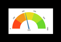
<ReactSpeedometer value={333} segments={5} segmentColors={[ "#bf616a", "#d08770", "#ebcb8b", "#a3be8c", "#b48ead", ]} // startColor will be ignored // endColor will be ignored />Fluid Width Example - Live Example
// Speedometer will take the width of the parent div (500) // any width passed will be ignored <div style={{ width: "500px", height: "300px", background: "#EFEFEF" }}> <ReactSpeedometer fluidWidth={true} minValue={100} maxValue={500} value={473} needleColor="steelblue" /> </div>Needle Transition Example - Live Example
<ReactSpeedometer value={333} needleColor="steelblue" needleTransitionDuration={4000} needleTransition="easeElastic" />Force Render component on props change - Live Example
// By default, when props change, only the value prop is updated and animated. // This is to maintain smooth visualization and to ignore breaking appearance changes like segments, colors etc. // You can override this behaviour by giving forceRender: true // render a component initially <ReactSpeedometer width={200} height={200} /> // Now, if given forceRender: true, and change the appearance all together, the component will rerender completely on props change <ReactSpeedometer forceRender={true} segments={15} width={500} height={500} />Needle Height Configuration Example - Live Example
<ReactSpeedometer value={333} needleHeightRatio={0.7} />You can give a value between 0 and 1 to control the needle height.
Gradient Like Effect - Live Example
<ReactSpeedometer value={333} maxSegmentLabels={5} segments={1000} />Todos:
- Test coverage (with enzyme)
- Convert entire code base to ES6
Tests:
react-d3-speedometer comes with a test suite using enzyme.
// navigate to root folder and run npm test // or 'yarn test' if you are using yarnFeature Updates:
- Custom segment colors in
v0.6.0. Live Example
Changelog:
Credits:
react-d3-speedometer was started as a react port of the following d3 snippet - http://bl.ocks.org/msqr/3202712. Component template bootstrapped with React CDK. Also, many thanks to d3 and react ecosystem contributors.
Contributing:
PRs are welcome. Please create a issue/bugfix/feature branch and create an issue with your branch details. Probably I will create a similar branch in the upstream repo so that PRs can be raised against that branch instead of master.
Notes
0.xversions are compatible with React & React DOM Versions (16.x) For every subsequent major react upgrade,react-d3-speedometerwill be bumped to next major versions. For example1.xwill be compatible withReact 17.xso on and so forth ...