react-native-svg-charts


Welcome to react-native-svg-charts!
Looking for maintainers! I alone don't have the time to maintain this library anymore. Preferably looking for somebody who uses this library in their proffesional work (how I originally got the time to maintain).
version 5 is now available!
A much improved decorator system has been introduced, allowing for greater flexibility and less complexity. See releases for more information.
In order to not bloat this README to much we've moved some examples over to react-native-svg-charts-examples. There we will try to showcase the really cool things you can do with this library. This README will try to keep things as simple as possible so that everybody can get up and running as fast as possible.
Prerequisites
This library uses react-native-svg to render its graphs. Therefore this library needs to be installed AND linked into your project to work.
Other than the above dependency this library uses pure javascript and supports both iOS and Android
Motivation
Creating beautiful graphs in React Native shouldn't be hard or require a ton of knowledge. We use react-native-svg in order to render our SVG's and to provide you with great extensibility. We utilize the very popular d3 library to create our SVG paths and to calculate the coordinates.
We built this library to be as extensible as possible while still providing you with the most common charts and data visualization tools out of the box. We're very proud of our "decorator" support. All charts can be extended with "decorators", a component that somehow styles or enhances your chart. Simply pass in a react-native-svg compliant component as a child to the graph and it will be called with all the necessary information to layout your decorator. See each chart for information on what data the decorator will be called with.
Feedback and PR's are more than welcome
Running
If you want to test out the library you can clone this repository and run it. We suggest that you test out the storybooks that we've implemented. Most of the charts are implemented with knobs so that you can tweak most properties and see their behavior live.
Clone the repo and run the following:
yarn # for iOS (cd ios && pod install) react-native run-ios # for Android react-native run-android yarn storybook # and then reload your deviceCommon Props
| Property | Default | Description |
|---|---|---|
| data | required | An array of arbitrary data - use prop xAccessor/yAccessorto tell the chart about the data structure |
| yAccessor | ({ item }) => item | A function that takes each entry of data (named "item") as well as the index and returns the y-value of that entry |
| xAccessor | ({ index }) => index | Same as yAccessor but returns the x-value of that entry |
| yScale | d3Scale.scaleLinear | A function that determines the scale of said axis (only tested with scaleLinear, scaleTime & scaleBand ) |
| xScale | d3Scale.scaleLinear | Same as yScale but for the x axis |
| svg | {} | an object containing all the props that should be passed down to the underlying react-native-svg component. See available props |
| animate | false | PropTypes.bool |
| animationDuration | 300 | PropTypes.number |
| style | undefined | Supports all ViewStyleProps |
| curve | d3.curveLinear | A function like this |
| contentInset | { top: 0, left: 0, right: 0, bottom: 0 } | An object that specifies how much fake "margin" to use inside of the SVG canvas. This is particularly helpful on Android where overflow: "visible" isn't supported and might cause clipping. Note: important to have same contentInset on axis's and chart |
| numberOfTicks | 10 | We use d3-array to evenly distribute the grid and dataPoints on the yAxis. This prop specifies how many "ticks" we should try to render. Note: important that this prop is the same on both the chart and on the yAxis |
| showGrid | true | Whether or not to show the grid lines |
| yMin | undefined | Alter how the chart bounds are calculated |
| yMax | undefined | Alter how the chart bounds are calculated |
| xMin | undefined | Alter how the chart bounds are calculated |
| xMax | undefined | Alter how the chart bounds are calculated |
| children | undefined | One or many react-native-svg components that will be used to enhance your chart |
Common arguments to children
| Property | Description |
|---|---|
| x | a function that normally accepts the index of a data point an returns its 'x' location on the canvas |
| y | a function that normally accepts the value of a data point an returns its 'y' location on the canvas |
| width | the width of the canvas in pixels |
| height | the height of the canvas in pixels |
| data | the same data array provided to the chart, use this to map over your data points if you want decorators on each point |
| ticks | if numberOfTicks has been provided to the chart this array will include the calculated tick values (useful for grids) |
Components
This library currently provides the following components
Also see
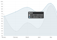
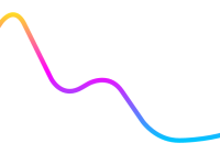
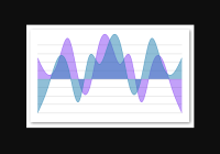
AreaChart
Example
import React from 'react' import { AreaChart, Grid } from 'react-native-svg-charts' import * as shape from 'd3-shape' class AreaChartExample extends React.PureComponent { render() { const data = [50, 10, 40, 95, -4, -24, 85, 91, 35, 53, -53, 24, 50, -20, -80] return ( <AreaChart style={{ height: 200 }} data={data} contentInset={{ top: 30, bottom: 30 }} curve={shape.curveNatural} svg={{ fill: 'rgba(134, 65, 244, 0.8)' }} > <Grid /> </AreaChart> ) } }Props
See Common Props
| Property | Default | Description |
|---|---|---|
| start | 0 | The value of which the area should start (will always end on the data point) |
Arguments to children
Supports all Common arguments to children
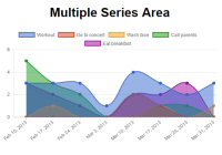
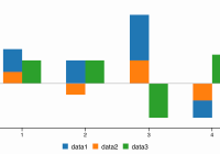
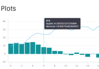
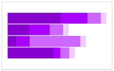
StackedAreaChart
Very similar to an area chart but with multiple sets of data stacked together. We suggest that you read up on d3 stacks in order to better understand this chart and its props See Area stack chart with Y axis to see how to use a YAxis with this component Use the svgs prop to pass in react-native-svg compliant props to each area.
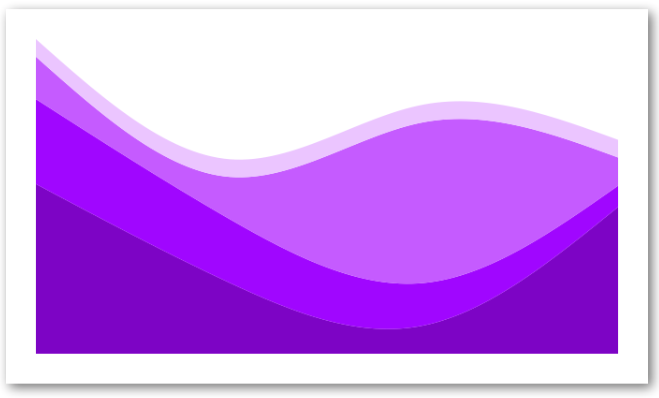
Example
import React from 'react' import { StackedAreaChart } from 'react-native-svg-charts' import * as shape from 'd3-shape' class StackedAreaExample extends React.PureComponent { render() { const data = [ { month: new Date(2015, 0, 1), apples: 3840, bananas: 1920, cherries: 960, dates: 400, }, { month: new Date(2015, 1, 1), apples: 1600, bananas: 1440, cherries: 960, dates: 400, }, { month: new Date(2015, 2, 1), apples: 640, bananas: 960, cherries: 3640, dates: 400, }, { month: new Date(2015, 3, 1), apples: 3320, bananas: 480, cherries: 640, dates: 400, }, ] const colors = ['#8800cc', '#aa00ff', '#cc66ff', '#eeccff'] const keys = ['apples', 'bananas', 'cherries', 'dates'] const svgs = [ { onPress: () => console.log('apples') }, { onPress: () => console.log('bananas') }, { onPress: () => console.log('cherries') }, { onPress: () => console.log('dates') }, ] return ( <StackedAreaChart style={{ height: 200, paddingVertical: 16 }} data={data} keys={keys} colors={colors} curve={shape.curveNatural} showGrid={false} svgs={svgs} /> ) } }Props
| Property | Default | Description |
|---|---|---|
| data | required | An array of the data entries |
| keys | required | This array should contain the object keys of interest (see above example) |
| colors | required | An array of equal size as keys with the color for each key |
| order | d3.stackOrderNone | The order in which to sort the areas |
| offset | d3.stackOffsetNone | A function to determine the offset of the areas |
Also see Common Props
Arguments to children
| Property | Description |
|---|---|
| x | a function that normally accepts the index of a data points an returns its 'x' location on the canvas |
| y | a function that normally accepts the value of a data points an returns its 'y' location on the canvas |
| width | the width of the canvas in pixels |
| height | the height of the canvas in pixels |
| ~~the same data array provided to the chart, use this to map over your data points if you want decorators on each point~ | |
| ticks | if numberOfTicks has been provided to the chart this array will include the calculated tick values (useful for grids) |
This chart does not call a child with the data argument. This is due to the fact that a lot of calculations go into creating the stacked chart, meaning that the original data prop doesn't provide especially valuable information when trying to layout decorators. It does however call with the rest of the common arguments
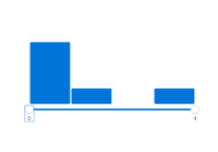
BarChart
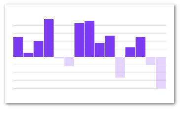
Example
import React from 'react' import { BarChart, Grid } from 'react-native-svg-charts' class BarChartExample extends React.PureComponent { render() { const fill = 'rgb(134, 65, 244)' const data = [50, 10, 40, 95, -4, -24, null, 85, undefined, 0, 35, 53, -53, 24, 50, -20, -80] return ( <BarChart style={{ height: 200 }} data={data} svg={{ fill }} contentInset={{ top: 30, bottom: 30 }}> <Grid /> </BarChart> ) } }Props
Also see Common Props
| Property | Default | Description |
|---|---|---|
| data | required | The data prop in a barChart can look exactly like in a Line- or AreaChart, i.e an array of just numbers or complex objects. It can however also be an array with several data sets. A data object can contain a svg property which allows you two override styles on that specific object. See the examples repo |
| horizontal | false | Boolean whether or not the bars should be horizontal |
| svg | {} | Default svg props for all bars. Supports all svg props an svg path normally supports. This styles will be overriden if there are specific styles for a given data object |
| spacingInner | 0.05 | Spacing between the bars (or groups of bars) |
| spacingOuter | 0.05 | Spacing outside of the bars (or groups of bars). Percentage of one bars width |
| contentInset | { top: 0, left: 0, right: 0, bottom: 0 } | PropTypes.shape |
Arguments to children
| Property | Description |
|---|---|
| bandwidth | the width of a band (a.k.a bar) |
Also supports all Common arguments to children
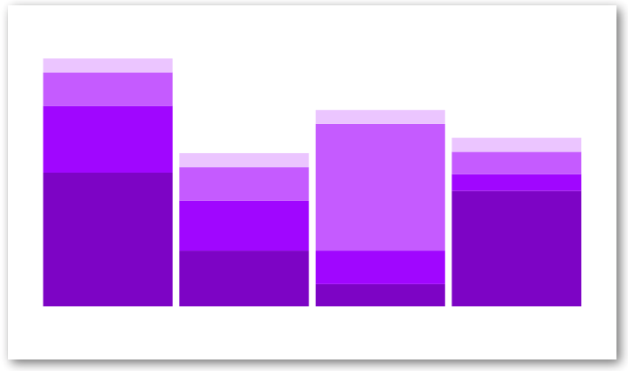
StackedBarChart
The same as the StackedAreaChart except with bars (and different svgs prop). We suggest that you read up on d3 stacks in order to better understand this chart and its props
The svgs prop here is not based on keys, but rather entries, as the user might want to specify different props for each entry in each bar. Therefore each key entry can contain a complex object that contains e.g an svg prop. See this example for inspiration
Example
import React from 'react' import { StackedBarChart } from 'react-native-svg-charts' class StackedBarChartExample extends React.PureComponent { render() { const data = [ { month: new Date(2015, 0, 1), apples: 3840, bananas: 1920, cherries: 960, dates: 400, oranges: 400, }, { month: new Date(2015, 1, 1), apples: 1600, bananas: 1440, cherries: 960, dates: 400, }, { month: new Date(2015, 2, 1), apples: 640, bananas: 960, cherries: 3640, dates: 400, }, { month: new Date(2015, 3, 1), apples: 3320, bananas: 480, cherries: 640, dates: 400, }, ] const colors = ['#7b4173', '#a55194', '#ce6dbd', '#de9ed6'] const keys = ['apples', 'bananas', 'cherries', 'dates'] return ( <StackedBarChart style={{ height: 200 }} keys={keys} colors={colors} data={data} showGrid={false} contentInset={{ top: 30, bottom: 30 }} /> ) } }Props
| Property | Default | Description |
|---|---|---|
| data | required | An array of the data entries: each value can be a number or a complex object with custom svg props for example |
| keys | required | This array should contain the object keys of interest (see above example) |
| colors | required | An array of equal size as keys with the color for each key |
| valueAccessor | ({ item, key }) => item[key] | Very similar to the yAccessor of the other charts, usually needed when using complex objects as values |
| horizontal | false | Boolean whether or not the bars should be horizontal |
| order | d3.stackOrderNone | The order in which to sort the areas |
| offset | d3.stackOffsetNone | A function to determine the offset of the areas |
Also see Common Props
Arguments to children
| Property | Description |
|---|---|
| x | a function that normally accepts the index of a data points an returns its 'x' location on the canvas |
| y | a function that normally accepts the value of a data points an returns its 'y' location on the canvas |
| width | the width of the canvas in pixels |
| height | the height of the canvas in pixels |
| ticks | if numberOfTicks has been provided to the chart this array will include the calculated tick values (useful for grids) |
This chart does not call a child with the data argument. This is due to the fact that a lot of calculations go into creating the stacked chart, meaning that the original data prop doesn't provide especially valuable information when trying to layout decorators. It does however call with the rest of the common arguments
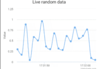
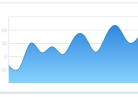
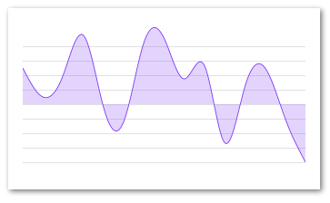
LineChart
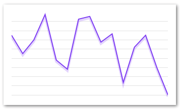
Example
import React from 'react' import { LineChart, Grid } from 'react-native-svg-charts' class LineChartExample extends React.PureComponent { render() { const data = [50, 10, 40, 95, -4, -24, 85, 91, 35, 53, -53, 24, 50, -20, -80] return ( <LineChart style={{ height: 200 }} data={data} svg={{ stroke: 'rgb(134, 65, 244)' }} contentInset={{ top: 20, bottom: 20 }} > <Grid /> </LineChart> ) } }Props
See Common Props
Arguments to children
Supports all Common arguments to children
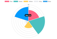
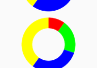
PieChart
The PieChart is a really nice component with great support for custom behavior. See more examples in the examples repo
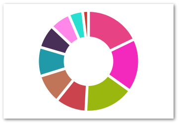
Example
import React from 'react' import { PieChart } from 'react-native-svg-charts' class PieChartExample extends React.PureComponent { render() { const data = [50, 10, 40, 95, -4, -24, 85, 91, 35, 53, -53, 24, 50, -20, -80] const randomColor = () => ('#' + ((Math.random() * 0xffffff) << 0).toString(16) + '000000').slice(0, 7) const pieData = data .filter((value) => value > 0) .map((value, index) => ({ value, svg: { fill: randomColor(), onPress: () => console.log('press', index), }, key: `pie-${index}`, })) return <PieChart style={{ height: 200 }} data={pieData} /> } }Props
| Property | Default | Description |
|---|---|---|
| data | required | Very similar to the data prop of our other charts, the only exception is that the PieChart only accepts complex objects (not just numbers). An item can also contain the arc property which allows you two override settings on that specific arc. See examples repo |
| valueAccessor | ({ item }) => item.value | Very similar to the yAccessor of the other charts |
| outerRadius | "100%" | The outer radius, use this to tweak how close your pie is to the edge of it's container. Takes either percentages or absolute numbers (pixels) |
| innerRadius | "50%" | The inner radius, use this to create a donut. Takes either percentages or absolute numbers (pixels) |
| labelRadius | undefined | The radius of the circle that will help you layout your labels. Takes either percentages or absolute numbers (pixels) |
| padAngle | The angle between the slices | |
| startAngle | 0 | The start angle in radians of the entire pie |
| endAngle | Math.PI * 2 | The end angle in radians of the entire pie |
| sort | (a,b) => b.value - a.value | Like any normal sort function it expects either 0, a positive or negative return value. The arguments are each an object from the dataPoints array |
Arguments to children
| Property | Description |
|---|---|
| width | the width of the canvas in pixels |
| height | the height of the canvas in pixels |
| slices | an array of the pie chart slices. See source code and examples for what it includes |
| data | the same data array provided to the chart, use this to map over your data points if you want decorators on each point |
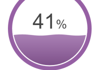
ProgressCircle
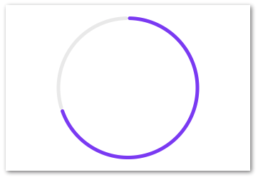
Example
import React from 'react' import { ProgressCircle } from 'react-native-svg-charts' class ProgressCircleExample extends React.PureComponent { render() { return <ProgressCircle style={{ height: 200 }} progress={0.7} progressColor={'rgb(134, 65, 244)'} /> } }Props
| Property | Default | Description |
|---|---|---|
| progress | required | PropTypes.number.isRequired |
| progressColor | 'black' | PropTypes.any |
| backgroundColor | '#ECECEC' | PropTypes.any |
| startAngle | 0 | PropTypes.number |
| endAngle | Math.PI * 2 | PropTypes.number |
| strokeWidth | 5 | PropTypes.number |
| cornerRadius | 45 | PropTypes.number |
Arguments to children
| Property | Description |
|---|---|
| width | the width of the canvas in pixels |
| height | the height of the canvas in pixels |
| data | the same data array provided to the chart, use this to map over your data points if you want decorators on each point |
YAxis
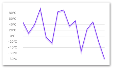
A helper component to layout your Y-axis labels on the same coordinates as your chart. It's very important that the component has the exact same view bounds (preferably wrapped in the same parent view) as the chart it's supposed to match. If the chart has property contentInset set it's very important that the YAxis has the same vertical contentInset.
Example
import React from 'react' import { LineChart, YAxis, Grid } from 'react-native-svg-charts' import { View } from 'react-native' class YAxisExample extends React.PureComponent { render() { const data = [50, 10, 40, 95, -4, -24, 85, 91, 35, 53, -53, 24, 50, -20, -80] const contentInset = { top: 20, bottom: 20 } return ( <View style={{ height: 200, flexDirection: 'row' }}> <YAxis data={data} contentInset={contentInset} svg={{ fill: 'grey', fontSize: 10, }} numberOfTicks={10} formatLabel={(value) => `${value}ºC`} /> <LineChart style={{ flex: 1, marginLeft: 16 }} data={data} svg={{ stroke: 'rgb(134, 65, 244)' }} contentInset={contentInset} > <Grid /> </LineChart> </View> ) } }Props
(see Common Props)
| Property | Default | Description |
|---|---|---|
| scale | d3Scale.scaleLinear | Should be the same as passed into the charts yScale, or d3Scale.scaleBand if used in conjunction with a horizontal BarChart |
| svg | {} | supports all svg props an svg text normally supports |
| spacingInner | 0.05 | Spacing between the labels. Only applicable if scale=d3Scale.scaleBand and should then be equal to spacingInner prop on the actual BarChart |
| spacingOuter | 0.05 | Spacing outside of the labels. Only applicable if scale=d3Scale.scaleBand and should then be equal to spacingOuter prop on the actual BarChart |
| formatLabel | value => {} | A utility function to format the text before it is displayed, e.g `value => "$" + value |
| contentInset | { top: 0, bottom: 0 } | Used to sync layout with chart (if same prop used there) |
| min | undefined | Used to sync layout with chart (if gridMin is used there) |
| max | undefined | Used to sync layout with chart (if gridMax is used there) |
Arguments to children
No arguments
XAxis
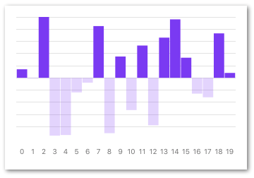
A helper component to layout your X-axis labels on the same coordinates as your chart. It's very important that the component has the exact same view bounds (preferably wrapped in the same parent view) as the chart it's supposed to match. If the chart has property contentInset set it's very important that the XAxis has the same horizontal contentInset.
The XAxis also supports the xAccessor prop, if it's not supplied it will assume that you're only interested in the index of the data set.
Example
import React from 'react' import { LineChart, XAxis, Grid } from 'react-native-svg-charts' import { View } from 'react-native' class XAxisExample extends React.PureComponent { render() { const data = [50, 10, 40, 95, -4, -24, 85, 91, 35, 53, -53, 24, 50, -20, -80] return ( <View style={{ height: 200, padding: 20 }}> <LineChart style={{ flex: 1 }} data={data} gridMin={0} contentInset={{ top: 10, bottom: 10 }} svg={{ stroke: 'rgb(134, 65, 244)' }} > <Grid /> </LineChart> <XAxis style={{ marginHorizontal: -10 }} data={data} formatLabel={(value, index) => index} contentInset={{ left: 10, right: 10 }} svg={{ fontSize: 10, fill: 'black' }} /> </View> ) } }Props
| Property | Default | Description |
|---|---|---|
| data | required | An array of values or objects to render on the xAxis. Should preferably have the same length as the chart's dataPoints. If a complex object is used instead of a simple value, a xAccessor prop is required to calculate the axis' extent. A data object can contain a svg property which allows you to override styles on that specific object |
| scale | d3Scale.scaleLinear | Should be the same as passed into the charts xScale |
| spacingInner | 0.05 | Spacing between the labels. Only applicable if scale=d3Scale.scaleBand and should then be equal to spacingInner prop on the actual BarChart |
| spacingOuter | 0.05 | Spacing between the labels. Only applicable if scale=d3Scale.scaleBand and should then be equal to spacingOuter prop on the actual BarChart |
| svg | {} | Default svg props for all labels. Supports all svg props an svg text normally supports. This styles will be overriden if there are specific styles for a given data object |
| formatLabel | value => value | A utility function to format the text before it is displayed, e.g value => "day" + value. Passes back the value provided by the xAccessor |
| contentInset | { left: 0, right: 0 } | Used to sync layout with chart (if same prop used there) |
Arguments to children
No arguments
Children
New for version 5.0. Each chart (and axes) component now accepts React children. Important note is that all children must be a react-native-svg component on order for it to be rendered by the chart. This API deprecates the old one with extras and decorators. Everything that should be rendered above or below the chart should now be supplied as a child to said chart. This allows you to declare the order in which your decorators should be rendered. If you want anything rendered below the chart, simply add the prop belowChart={true}. There's a ton of examples in the examples repo, go and have a look.
Grid
This library provides a helper component for drawing grids. Simply place it as child to the chart of your choice and (if necessary) set its direction.
Props
| Property | Default | Description |
|---|---|---|
| svg | {} | an object containing all the props that should be passed down to the underlying react-native-svg component. See available props |
| direction | Grid.Direction.HORIZONTAL | The direction of the grid lines. |
| belowChart | true | whether or not to render below the chart |
Examples
There are tons of examples over at react-native-svg-chart-examples