react-digraph
Overview
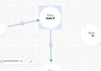
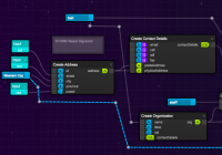
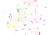
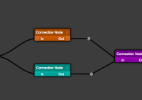
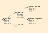
A React component which makes it easy to create a directed graph editor without implementing any of the SVG drawing or event handling logic.
Important v5.0.0 Information
Version 5.0.0 is a breaking change to some of the API interfaces. Many of the component attributes are the same, and the data format is the same, but there have been some necessary changes to improve the API, make the component faster, and add new features. Many changes will be listed below in the deprecation notes section. If you notice a problem, please use the ^4.0.0 versions of the package and refer to the legacy documentation in the v4.x.x git branch.
Installation
npm install --save react-digraphIf you don't have the following peerDependenies, make sure to install them:
npm install --save react react-domUsage
The default export is a component called 'GraphView'; it provides a multitude of hooks for various graph editing operations and a set of controls for zooming. Typically, it should be wrapped in a higher order component that supplies various callbacks (onCreateNode, onCreateEdge etc...).
All nodes and edges can have a type attribute set - nodes also support a subtype attribute. These can be passed to GraphView via the nodeTypes, nodeSubtypes, and edgeTypes props. GraphView will look up the corresponding SVG elements for the node's type/subtype and the edge's type and draw it accordingly.
It is often convenient to combine these types into a configuration object that can be referred to elsewhere in the application and used to associate events fired from nodes/edges in the graphView with other actions in the application. Here is an abbreviated example:
import { GraphView, // required Edge, // optional type IEdge, // optional Node, // optional type INode, // optional type LayoutEngineType, // required to change the layoutEngineType, otherwise optional BwdlTransformer, // optional, Example JSON transformer GraphUtils // optional, useful utility functions } from 'react-digraph'; const GraphConfig = { NodeTypes: { empty: { // required to show empty nodes typeText: "None", shapeId: "#empty", // relates to the type property of a node shape: ( <symbol viewBox="0 0 100 100" id="empty" key="0"> <circle cx="50" cy="50" r="45"></circle> </symbol> ) }, custom: { // required to show empty nodes typeText: "Custom", shapeId: "#custom", // relates to the type property of a node shape: ( <symbol viewBox="0 0 50 25" id="custom" key="0"> <ellipse cx="50" cy="25" rx="50" ry="25"></ellipse> </symbol> ) } }, NodeSubtypes: {}, EdgeTypes: { emptyEdge: { // required to show empty edges shapeId: "#emptyEdge", shape: ( <symbol viewBox="0 0 50 50" id="emptyEdge" key="0"> <circle cx="25" cy="25" r="8" fill="currentColor"> </circle> </symbol> ) } } } const NODE_KEY = "id" // Allows D3 to correctly update DOM class Graph extends Component { constructor(props) { super(props); this.state = { graph: sample, selected: {} } } /* Define custom graph editing methods here */ render() { const nodes = this.state.graph.nodes; const edges = this.state.graph.edges; const selected = this.state.selected; const NodeTypes = GraphConfig.NodeTypes; const NodeSubtypes = GraphConfig.NodeSubtypes; const EdgeTypes = GraphConfig.EdgeTypes; return ( <div id='graph' style={styles.graph}> <GraphView ref='GraphView' nodeKey={NODE_KEY} nodes={nodes} edges={edges} selected={selected} nodeTypes={NodeTypes} nodeSubtypes={NodeSubtypes} edgeTypes={EdgeTypes} onSelectNode={this.onSelectNode} onCreateNode={this.onCreateNode} onUpdateNode={this.onUpdateNode} onDeleteNode={this.onDeleteNode} onSelectEdge={this.onSelectEdge} onCreateEdge={this.onCreateEdge} onSwapEdge={this.onSwapEdge} onDeleteEdge={this.onDeleteEdge}/> </div> ); } }A typical graph that would be stored in the Graph component's state looks something like this:
{ "nodes": [ { "id": 1, "title": "Node A", "x": 258.3976135253906, "y": 331.9783248901367, "type": "empty" }, { "id": 2, "title": "Node B", "x": 593.9393920898438, "y": 260.6060791015625, "type": "empty" }, { "id": 3, "title": "Node C", "x": 237.5757598876953, "y": 61.81818389892578, "type": "custom" }, { "id": 4, "title": "Node C", "x": 600.5757598876953, "y": 600.81818389892578, "type": "custom" } ], "edges": [ { "source": 1, "target": 2, "type": "emptyEdge" }, { "source": 2, "target": 4, "type": "emptyEdge" } ] } For a detailed example, check out src/examples/graph.js. To run the example:
npm install npm run serveA webpage will open in your default browser automatically.
- To add nodes, hold shift and click on the grid.
- To add edges, hold shift and click/drag to between nodes.
- To delete a node or edge, click on it and press delete.
- Click and drag nodes to change their position.
All props are detailed below.
Props
| Prop | Type | Required | Notes |
|---|---|---|---|
| nodeKey | string | true | Key for D3 to update nodes(typ. UUID). |
| nodes | array | true | Array of graph nodes. |
| edges | array | true | Array of graph edges. |
| selected | object | true | The currently selected graph entity. |
| nodeTypes | object | true | Config object of available node types. |
| nodeSubtypes | object | true | Config object of available node subtypes. |
| edgeTypes | object | true | Config object of available edge types. |
| onSelectNode | func | true | Called when a node is selected. |
| onCreateNode | func | true | Called when a node is created. |
| onUpdateNode | func | true | Called when a node is moved. |
| onDeleteNode | func | true | Called when a node is deleted. |
| onSelectEdge | func | true | Called when an edge is selected. |
| onCreateEdge | func | true | Called when an edge is created. |
| onSwapEdge | func | true | Called when an edge 'target' is swapped. |
| onDeleteEdge | func | true | Called when an edge is deleted. |
| onBackgroundClick | func | false | Called when the background is clicked. |
| canDeleteNode | func | false | Called before a node is deleted. |
| canCreateEdge | func | false | Called before an edge is created. |
| canDeleteEdge | func | false | Called before an edge is deleted. |
| afterRenderEdge | func | false | Called after an edge is rendered. |
| renderNode | func | false | Called to render node geometry. |
| renderNodeText | func | false | Called to render the node text |
| renderDefs | func | false | Called to render svg definitions. |
| renderBackground | func | false | Called to render svg background. |
| readOnly | bool | false | Disables all graph editing interactions. |
| maxTitleChars | number | false | Truncates node title characters. |
| gridSize | number | false | Overall grid size. |
| gridSpacing | number | false | Grid spacing. |
| gridDotSize | number | false | Grid dot size. |
| minZoom | number | false | Minimum zoom percentage. |
| maxZoom | number | false | Maximum zoom percentage. |
| nodeSize | number | false | Node bbox size. |
| edgeHandleSize | number | false | Edge handle size. |
| edgeArrowSize | number | false | Edge arrow size. |
| zoomDelay | number | false | Delay before zoom occurs. |
| zoomDur | number | false | Duration of zoom transition. |
| showGraphControls | boolean | false | Whether to show zoom controls. |
| layoutEngineType | typeof LayoutEngineType | false | Uses a pre-programmed layout engine, such as 'SnapToGrid' |
| rotateEdgeHandle | boolean | false | Whether to rotate edge handle with edge when a node is moved |
| centerNodeOnMove | boolean | false | Weather the node should be centered on cursor when moving a node |
| initialBBox | typeof IBBox | false | If specified, initial render graph using the given bounding box |
onCreateNode
You have access to d3 mouse event in onCreateNode function.
onCreateNode = (x, y, mouseEvent) => { // we can get the exact mouse position when click happens with this line const {pageX, pageY} = mouseEvent; // rest of the code for adding a new node ... };Prop Types:
nodes: any[]; edges: any[]; minZoom?: number; maxZoom?: number; readOnly?: boolean; maxTitleChars?: number; nodeSize?: number; edgeHandleSize?: number; edgeArrowSize?: number; zoomDelay?: number; zoomDur?: number; showGraphControls?: boolean; nodeKey: string; gridSize?: number; gridSpacing?: number; gridDotSize?: number; backgroundFillId?: string; nodeTypes: any; nodeSubtypes: any; edgeTypes: any; selected: any; onBackgroundClick?: (x: number, y: number) => void; onDeleteNode: (selected: any, nodeId: string, nodes: any[]) => void; onSelectNode: (node: INode | null) => void; onCreateNode: (x: number, y: number, event: object) => void; onCreateEdge: (sourceNode: INode, targetNode: INode) => void; onDeleteEdge: (selectedEdge: IEdge, edges: IEdge[]) => void; onUpdateNode: (node: INode) => void; onSwapEdge: (sourceNode: INode, targetNode: INode, edge: IEdge) => void; onSelectEdge: (selectedEdge: IEdge) => void; canDeleteNode?: (selected: any) => boolean; canDeleteEdge?: (selected: any) => boolean; canCreateEdge?: (startNode?: INode, endNode?: INode) => boolean; afterRenderEdge?: (id: string, element: any, edge: IEdge, edgeContainer: any, isEdgeSelected: boolean) => void; onUndo?: () => void; onCopySelected?: () => void; onPasteSelected?: () => void; renderBackground?: (gridSize?: number) => any; renderDefs?: () => any; renderNode?: ( nodeRef: any, data: any, index: number, selected: boolean, hovered: boolean ) => any; renderNodeText?: (data: any, id: string | number, isSelected: boolean) => any; layoutEngineType?: LayoutEngineType; rotateEdgeHandle?: boolean; centerNodeOnMove?: boolean; initialBBox?: IBBox; Imperative API
You can call these methods on the GraphView class using a ref.
| Method | Type | Notes |
|---|---|---|
| panToNode | (id: string, zoom?: boolean) => void | Center the node given by id within the viewport, optionally zoom in to fit it. |
| panToEdge | (source: string, target: string, zoom?: boolean) => void | Center the edge between source and target node IDs within the viewport, optionally zoom in to fit it. |
Deprecation Notes
| Prop | Type | Required | Notes |
|---|---|---|---|
| emptyType | string | true | 'Default' node type. |
| getViewNode | func | true | Node getter. |
| renderEdge | func | false | Called to render edge geometry. |
| enableFocus | bool | false | Adds a 'focus' toggle state to GraphView. |
| transitionTime | number | false | Fade-in/Fade-out time. |
| primary | string | false | Primary color. |
| light | string | false | Light color. |
| dark | string | false | Dark color. |
| style | object | false | Style prop for wrapper. |
| gridDot | number | false | Grid dot size. |
| graphControls | boolean | true | Whether to show zoom controls. |
