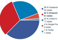
react-svg-piechart
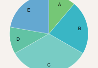
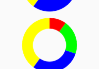
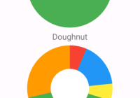
A lightweight responsive React pie chart component using only SVG
Getting started
You can download react-svg-piechart from the NPM registry via the npm or yarn commands
yarn add react-svg-piechart npm install react-svg-piechart --saveIf you don't use package manager and you want to include react-svg-piechart directly in your html, you could get it from the UNPKG CDN
https://unpkg.com/react-svg-piechart/umd/react-svg-piechart.jsDemo
See Demo page
Usage
import React from "react" import ReactSvgPieChart from "react-svg-piechart" const data = [ {title: "Data 1", value: 100, color: "#22594e"}, {title: "Data 2", value: 60, color: "#2f7d6d"}, {title: "Data 3", value: 30, color: "#3da18d"}, {title: "Data 4", value: 20, color: "#69c2b0"}, {title: "Data 5", value: 10, color: "#a1d9ce"}, ] const MyCompo = () => ( <ReactSvgPieChart data={data} // If you need expand on hover (or touch) effect expandOnHover // If you need custom behavior when sector is hovered (or touched) onSectorHover={(d, i, e) => { if (d) { console.log("Mouse enter - Index:", i, "Data:", d, "Event:", e) } else { console.log("Mouse leave - Index:", i, "Event:", e) } }} /> )Props
| Name | PropType | Description | Default |
|---|---|---|---|
| data | Array of data Objects | One data is {value: number (required), color: string, title: string, expanded: bool, href: string} | [] |
| expandedIndex | Number | Pass in an index to manually control the expanded sector of the pie | |
| expandOnHover | Boolean | Active hover and touch (mobile) effects | false |
| onSectorHover | Function | Callback when one sector is hovered or touched (mobile) - ex: (data, index, event) => {} | null |
| expandSize | Number | expand size, in pixels. Used if expandOnHover is active or one data has expanded attribute set to true | |
| strokeColor | String | Sector stroke color | "#fff" |
| startAngle | Number | Angle to start drawing sectors from measured clockwise from the x-axis | 0 |
| angleMargin | Number | Angle of margin between sectors | 0 |
| strokeLinejoin | String | Sector stroke line join (One of miter, round, bevel) | "round" |
| strokeWidth | Number | Sector width, in pixels (0 to disable stroke) | 1 |
| viewBoxSize | Number | SVG viewbox width and height | 100 |
| transitionDuration | String | CSS property for transition-duration, set to 0s to disable transition | "0s" |
| transitionTimingFunction | String | CSS Property for transition-timing-function | "ease-out" |
Contributing
- ⇄ Pull/Merge requests and ★ Stars are always welcome.
- For bugs and feature requests, please create an issue.
- Pull requests must be accompanied by passing automated tests (
npm test).
See CONTRIBUTING.md guidelines
Changelog
See changelog
License
This project is licensed under the MIT License - see the LICENCE.md file for details
