react-liquid-gauge 


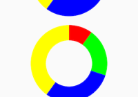
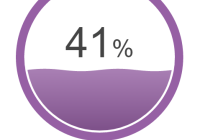
React Liquid Gauge component. It's heavily inspired by D3 Liquid Fill Gauge and react-liquidchart.

Demo: http://trendmicro-frontend.github.io/react-liquid-gauge
The sample code can be found in the examples directory.
Installation
npm install --save react react-dom react-liquid-gauge Usage
import { color } from 'd3-color'; import { interpolateRgb } from 'd3-interpolate'; import React, { Component } from 'react'; import ReactDOM from 'react-dom'; import LiquidFillGauge from 'react-liquid-gauge'; class App extends Component { state = { value: 50 }; startColor = '#6495ed'; // cornflowerblue endColor = '#dc143c'; // crimson render() { const radius = 200; const interpolate = interpolateRgb(this.startColor, this.endColor); const fillColor = interpolate(this.state.value / 100); const gradientStops = [ { key: '0%', stopColor: color(fillColor).darker(0.5).toString(), stopOpacity: 1, offset: '0%' }, { key: '50%', stopColor: fillColor, stopOpacity: 0.75, offset: '50%' }, { key: '100%', stopColor: color(fillColor).brighter(0.5).toString(), stopOpacity: 0.5, offset: '100%' } ]; return ( <div> <LiquidFillGauge style={{ margin: '0 auto' }} width={radius * 2} height={radius * 2} value={this.state.value} percent="%" textSize={1} textOffsetX={0} textOffsetY={0} textRenderer={(props) => { const value = Math.round(props.value); const radius = Math.min(props.height / 2, props.width / 2); const textPixels = (props.textSize * radius / 2); const valueStyle = { fontSize: textPixels }; const percentStyle = { fontSize: textPixels * 0.6 }; return ( <tspan> <tspan className="value" style={valueStyle}>{value}</tspan> <tspan style={percentStyle}>{props.percent}</tspan> </tspan> ); }} riseAnimation waveAnimation waveFrequency={2} waveAmplitude={1} gradient gradientStops={gradientStops} circleStyle={{ fill: fillColor }} waveStyle={{ fill: fillColor }} textStyle={{ fill: color('#444').toString(), fontFamily: 'Arial' }} waveTextStyle={{ fill: color('#fff').toString(), fontFamily: 'Arial' }} onClick={() => { this.setState({ value: Math.random() * 100 }); }} /> <div style={{ margin: '20px auto', width: 120 }} > <button type="button" className="btn btn-default btn-block" onClick={() => { this.setState({ value: Math.random() * 100 }); }} > Refresh </button> </div> </div> ); } } ReactDOM.render( <App />, document.getElementById('container') );API
Properties
| Name | Type | Default | Description |
|---|---|---|---|
| id | String | A unique identifier (ID) to identify the element. Defaults to a unique random string. | |
| width | Number | 400 | The width of the component. |
| height | Number | 400 | The height of the component. |
| value | Number | 0 | The percent value (0-100). |
| percent | String|Node | '%' | The percent string (%) or SVG text element. |
| textSize | Number | 1 | The relative height of the text to display in the wave circle. A value of 1 equals 50% of the radius of the outer circle. |
| textOffsetX | Number | 0 | |
| textOffsetY | Number | 0 | |
| textRenderer | Function(props) | Specifies a custom text renderer for rendering a percent value. | |
| riseAnimation | Boolean | false | Controls if the wave should rise from 0 to it's full height, or start at it's full height. |
| riseAnimationTime | Number | 2000 | The amount of time in milliseconds for the wave to rise from 0 to it's final height. |
| riseAnimationEasing | String | 'cubicInOut' | d3-ease options. See the easing explorer for a visual demostration. |
| riseAnimationOnProgress | Function({ value, container }) | Progress callback function. | |
| riseAnimationOnComplete | Function({ value, container }) | Complete callback function. | |
| waveAnimation | Boolean | false | Controls if the wave scrolls or is static. |
| waveAnimationTime | Number | 2000 | The amount of time in milliseconds for a full wave to enter the wave circle. |
| waveAnimationEasing | String | 'linear' | d3-ease options. See the easing explorer for a visual demostration. |
| waveAmplitude | Number | 1 | The wave height as a percentage of the radius of the wave circle. |
| waveFrequency | Number | 2 | The number of full waves per width of the wave circle. |
| gradient | Boolean | false | Whether to apply linear gradients to fill the wave circle. |
| gradientStops | Node|Array | An array of the <stop> SVG element defines the ramp of colors to use on a gradient, which is a child element to either the <linearGradient> or the <radialGradient> element. | |
| onClick | Function(event) | onClick event handler. | |
| innerRadius | Number | 0.9 | The radius of the inner circle. A value of 0.9 equals 90% of the radius of the outer circle. |
| outerRadius | Number | 1.0 | The radius of the outer circle. A value of 1 equals 100% of the radius of the outer circle. |
| margin | Number | 0.025 | The size of the gap between the outer circle and wave circle as a percentage of the radius of the outer circle. A value of 0.025 equals 2.5% of the radius of the outer circle. |
| circleStyle | Object | { fill: 'rgb(23, 139, 202)' } | The style of the outer circle. |
| waveStyle | Object | { fill: 'rgb(23, 139, 202)' } | The style of the fill wave. |
| textStyle | Object | { fill: 'rgb(0, 0, 0)' } | The style of the text when the wave does not overlap it. |
| waveTextStyle | Object | { fill: 'rgb(255, 255, 255)' } | The style of the text when the wave overlaps it. |
License
MIT