jQuery.Stacky
Stacky makes it easy to create UIs with panels that open horizontally using jQuery.
Panels can be opened, closed, expanded and collapsed. A panel can be opened either next to a given panel or a the end, in regular mode (pushed next to a panel) or in floating mode (absolute position). Additionally, the open and close events can optionally call functions to, for instance, set or retrieve data to/from panels.
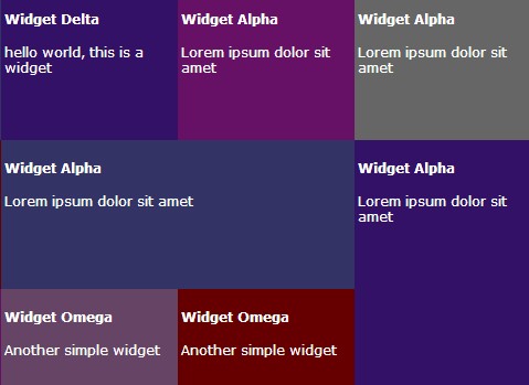
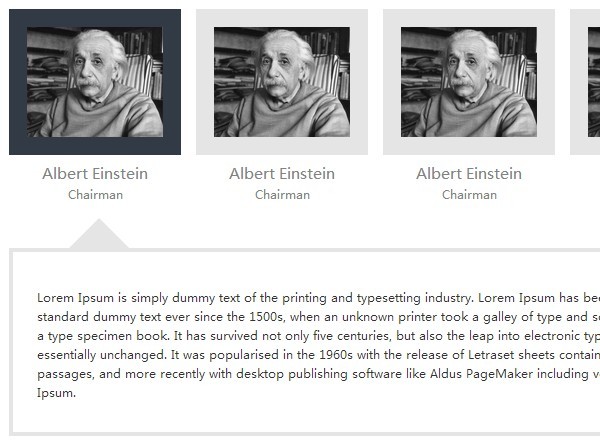
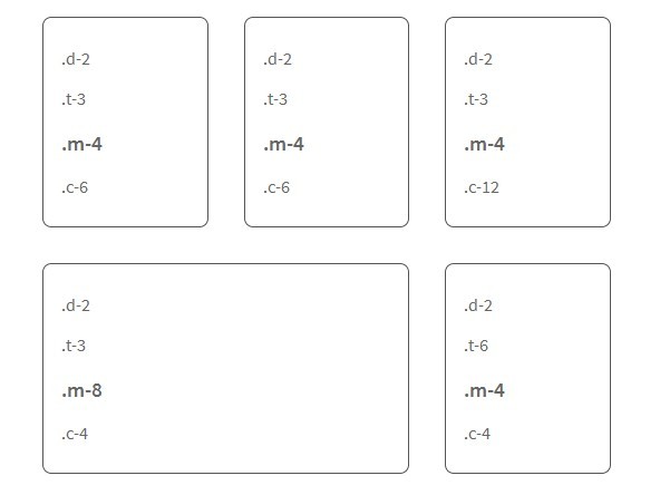
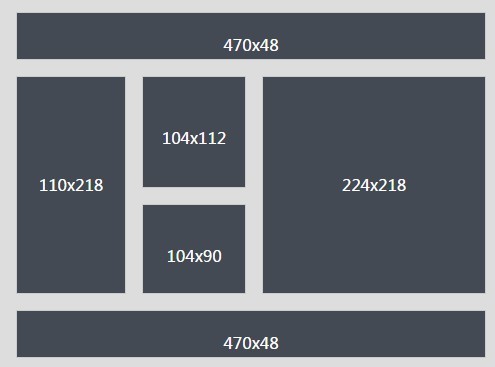
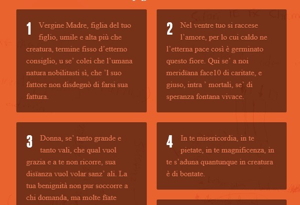
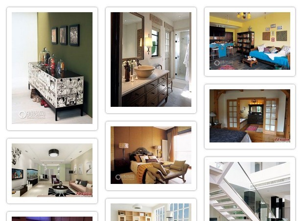
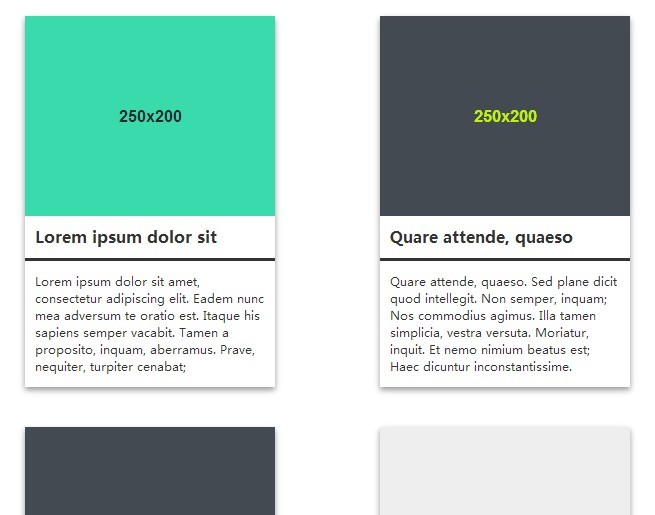
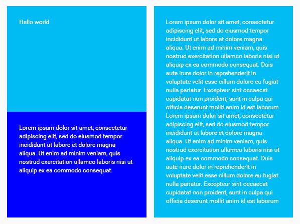
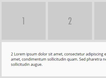
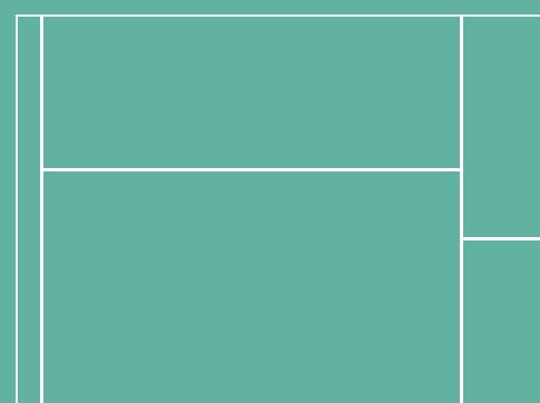
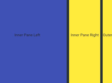
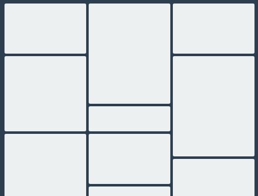
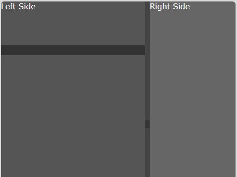
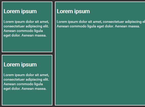
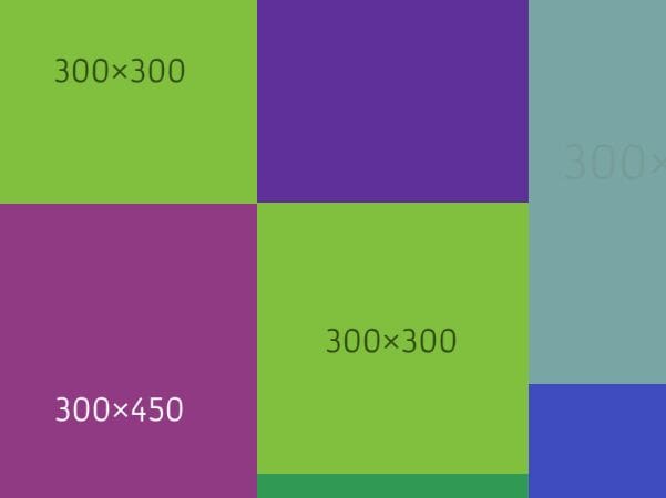
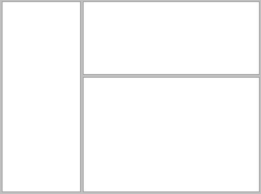
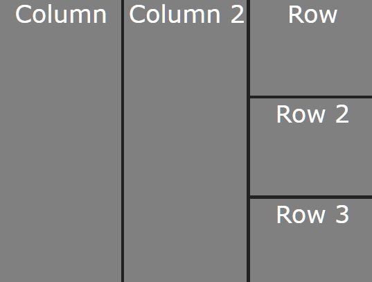
With this plugin you can easily achieve user interfaces like this:
## Install
The plugin requires jQuery 1.7 or higher. Install via npm, bower or download as a zip:
npm install jquery.stacky bower install jquery.stacky ## Demo
Live demonstration:
You can find the demo files in here.
Usage
Include the jQuery library, the stacky plugin and its CSS styles. These files can be found in the dist/ folder.
<script src="path/to/jquery.js"></script> <script src="path/to/jquery.stacky.min.js"></script> <link rel="stylesheet" type="text/css" href="path/to/jquery.stacky.css" />Then, initialize the plugin in the element that will hold the panels:
$( document ).ready(function() { var default_options = { ... }; var container = $( '#container' ).Stacky( default_options ); });To push in a new panel use the push method:
var panel_options = { ... }; container.data( 'Stacky' ).push( panel_options );## AMD
Stacky can also be used with require.js. You can find an example in demo/basic-requirejs.html.
Options
Options can be set either in the plugin initialization or when pushing in a new panel.
Plugin initialization options
fadeInSpeed: Integer | 'fast' | 'slow'
The fade in speed (in milliseconds when it's an integer) when making a new panel visible.
scrollToSpeed: Integer | 'fast' | 'slow'
The speed (in milliseconds when it's an integer) with which the scroll bar moves when adding, expanding or collapsing panels.
panelDefaults: Object
An object containing default options to be applied to all new panels. These are the same Panel pushing options described in the next subsection.
Panel pushing options
after: jQuery object
If different than undefined, the new panel is inserted after this jQuery element (a panel).
content: string
HTML to be inserted into the panel.
floating: boolean
Indicates if the new panel should be placed either after the 'after' panel [true] or after the other panels (at the end) [false]
id: string
The id attribute of the new panel.
class: string
The class attribute of the new panel. The CSS styles include the helper classes thin, regular, medium, and wide to set the panel's width. The expaned class can be configured in the CSS to control the expand behavior (default width is 100%)
onBeforeOpen: function ( $panel )
It's called before fading in the new panel.
onBeforeClose: function ( $panel )
It's called before hiding and removing the panel. To indicate that the panel must remain opened, a false value should be returned.
Util methods
These are utility functions built-in within the plugin. The usage is similar to the push method.
closeActive: function ( )
Closes the current active panel (or panels holding the active class)
highlight: function ( $panel )
Moves the scroll bar to show the given panel, and then highlights it. This simply shows a left and right shadow for 1 second.
goTo: function ( $panel, callback )
Moves the scroll bar to show the given panel, and then executes the callback, if given.
Theming
Stacky panels come with the minimum styling. If you want to customize the appearance you can modify the styles in src/sass/styles.scss, and then re-run the grunt command to generate the distribution files again.
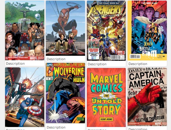
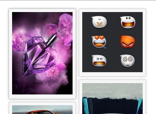
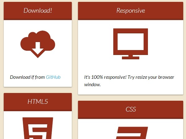
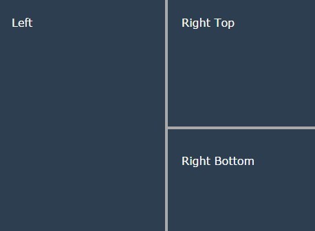
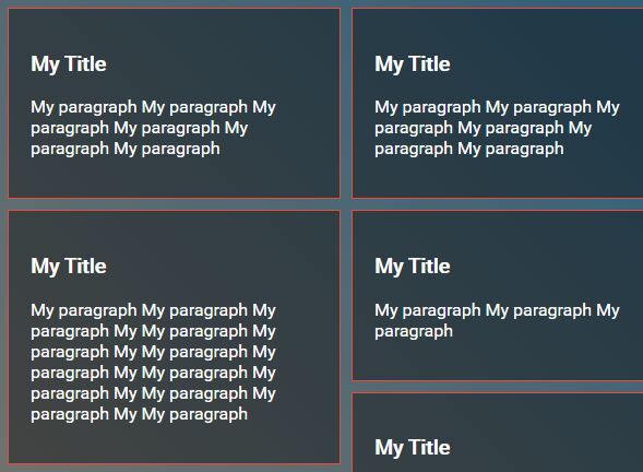
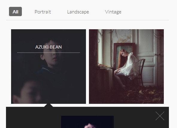
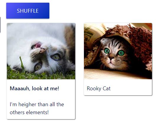
With Stacky, and some CSS effort, you can easily develop UIs like this:
Contributing
You are invited to contribute code and suggestions to this project. The more the merrier.
Got something to say? let's get in touch: @jachinte. Please let me know if you're using Stacky, it's always nice to see what you're using it for!
