#BoxFish.js
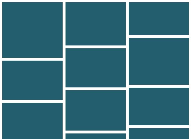
Boxfish is a jQuery plugin that allows you to have dynamically resizing content boxes based on columns and breakpoints. This is different from similar solutions such as masonry in that it is designed to be a lightweight solution to dynamic box sizing. Where libraries like Masonry will rearrange a grid dynamically, this plugin will only normalize the grid and make it responsive using breakpoints.
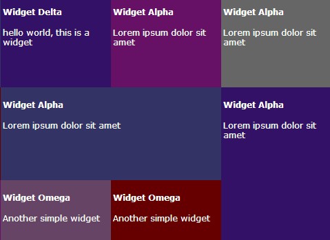
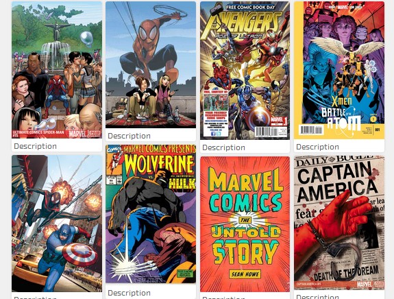
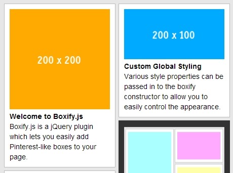
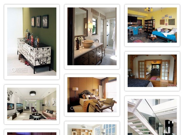
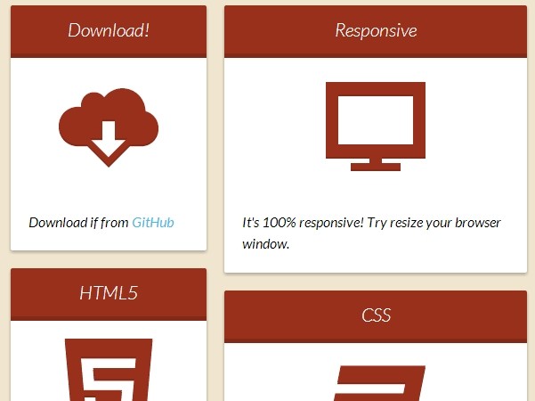
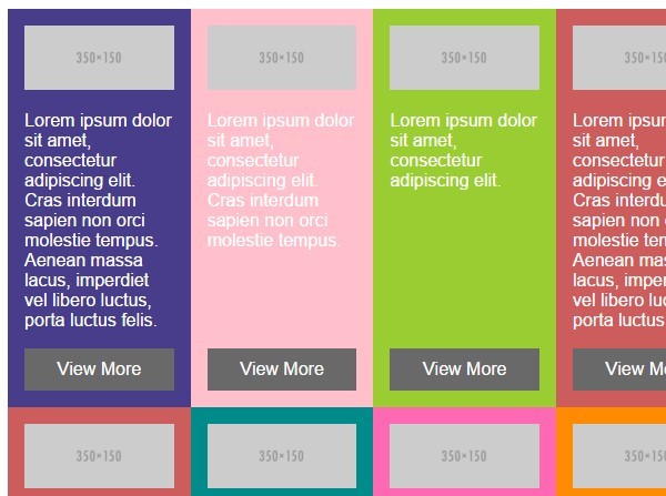
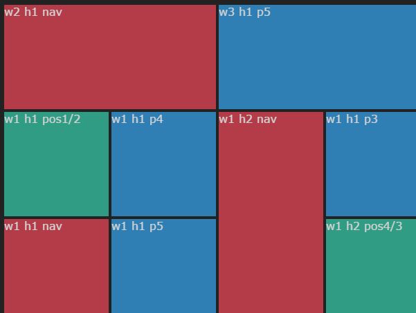
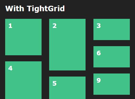
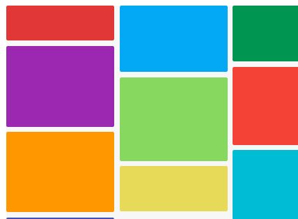
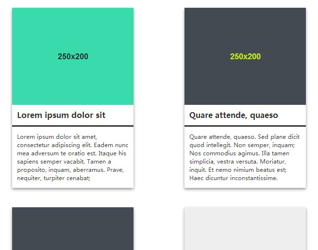
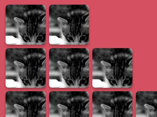
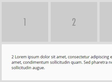
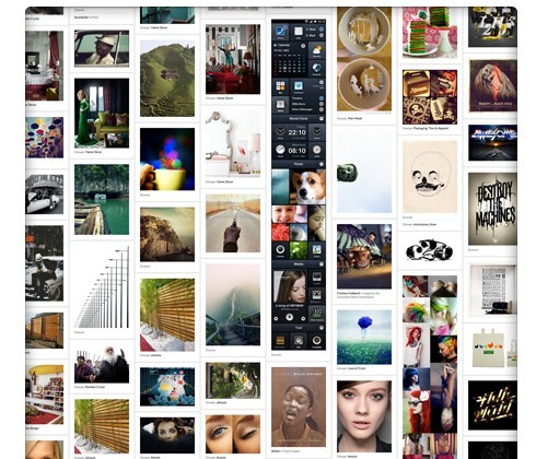
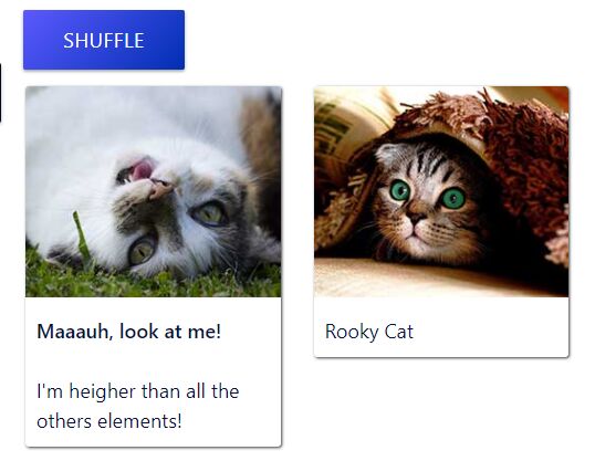
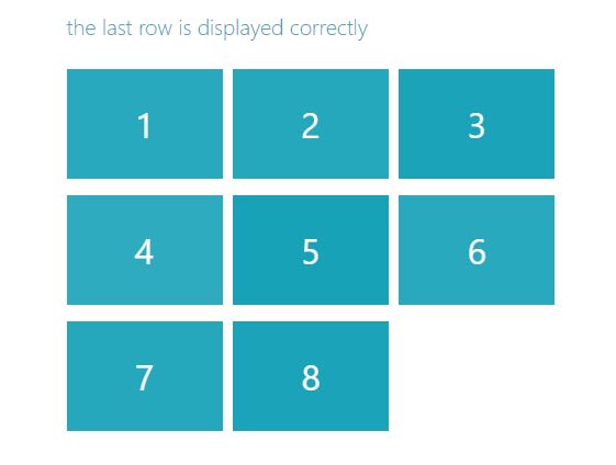
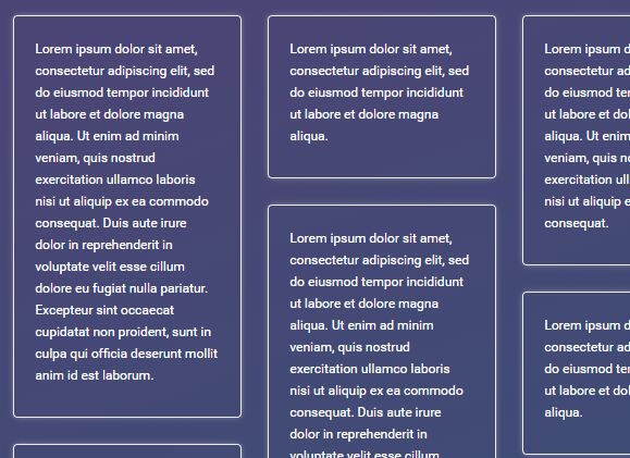
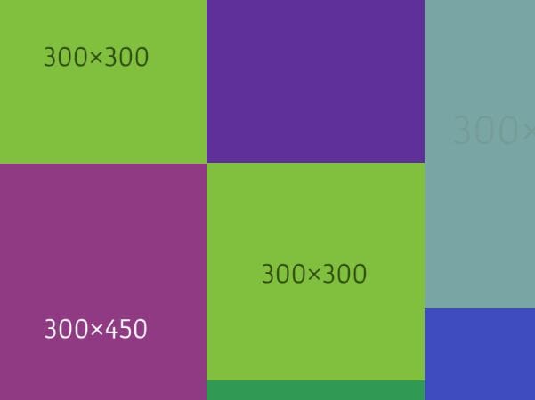
To further understand how this works and what it can offer, take a look at some of the examples below.
##Getting Started
BoxFish is a breeze to use. It comes with sane defaults for breakpoints, which can easily be overridden or customized. A breakpoint, in the context of Boxfish, essentially means "if the width of the container is less than or equal to X, then show Y number of columns". The built in defaults are as follows:
| Container Width | # of Columns |
|---|---|
| 0px to 300px | 1 Column |
| 301px to 480px | 2 Columns |
| 481px to 768px | 3 Columns |
| 769px to 1024px | 4 Columns |
| 1025px to 1280px | 5 Columns |
| > 1280px | 5 Columns |
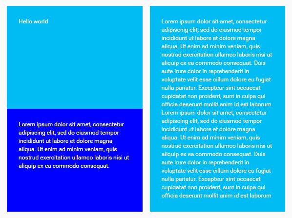
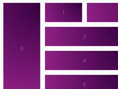
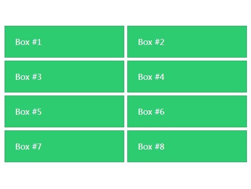
To get started, your HTML markup should have a block level container of some type, usually a div. Each div or "box" within the container must have a common class name so that you can instantiate the plugin for them. In my examples I tend to stick with a class called "box", but if that conflicts with your page, feel free to use whatever you want.
HTML
<div class="container"> <div class="box"> Box #1 </div> <div class="box"> Box #2 </div> <div class="box"> Box #3 </div> <div class="box"> Box #4 </div> <div class="box"> Box #5 </div> <div class="box"> Box #6 </div> </div> Once you have the HTML structure in place, you can instantiate the plugin. Remember: This plugin is dependent on jQuery. Make sure jQuery is loaded before trying to use Boxfish!
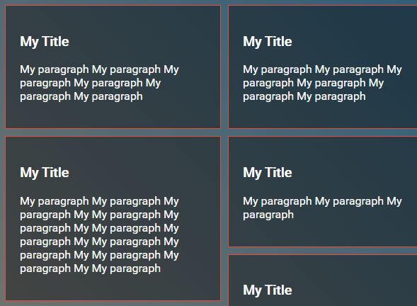
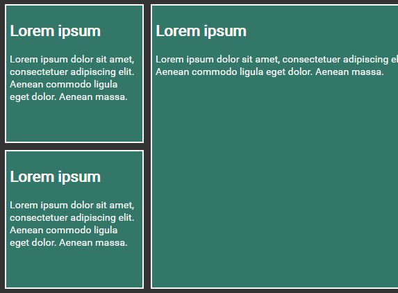
Basic Example
$('.box').boxfish(); Defaults
Changing Breakpoints via Config
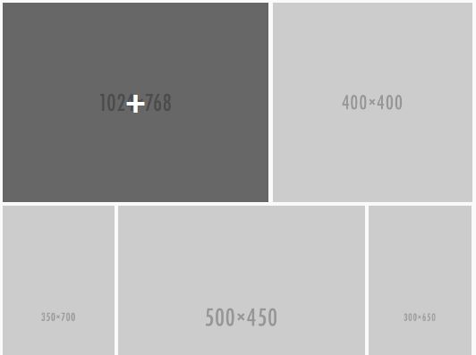
If you are not happy with the values pre-configured, you can easily customize them on initialization with the breakpoints parameter:
$('.box').boxfish({ breakpoints: [ [1024, 3], [700, 2], [300, 1] ] }); The parameter expects an array of arrays where each inside arrays are two numbers:
- The maximum number of pixels for the breakpoint.
- How many columns to display when the container is greater than or equal to the pixel breakpoint and less than any larger breakpoints.
Using the above example, if the container width is less than 1024px wide, it will show 3 columns. If it is less than 700px wide, it will show 2 columns. And finally, if it is less than 300px wide, it will show one column. In the event that the width is greater than the largest breakpoint, it uses the number of columns specified in the largest breakpoint -- so in this case any width greater than 1024px will still use three columns.
GOTCHA #1: This plugin calculates based on the container width, not the page width. This allows you to use boxfish in smaller portions of your application.
GOTCHA #2: Due to issues with calculating the proper width and taking into account the margin and padding of elements, the breakpoint may sometimes occur a few pixels before or after. This is generally not a big deal as the boxes resize to fill the container anyway.
Adding Breakpoints
The method above overwrites the internal default breakpoints. If you would like to just add an extra one, you can use the addBreakpoint() method, passing it a pixel value and number of columns.
$('.box').boxfish().addBreakpoint(1680, 6); ##Issues
If you find an issue, please add it to the issues on this project. I also gladly accept pull requests!
##Planned
- Refactor to be cleaner/faster
- Add unit testing