GridTab jQuery Plugin
GridTab is a lightweight jQuery plugin to create grid based responsive tabs.
Demo
http://gopalraju.github.io/gridtab
Features
- Responsive
- Lightweight and based on CSS3 flexbox
- Set Grid for each breakpoint
- Switch between Grid and Tab layout
- Next, previous and close controls
- Scroll to current tab
- Custom selectors
- Right-To-Left Support
Package Managers
# Bower bower install --save gridtab # NPM npm install gridtab Usage
Setting up GridTab is really simple
HTML Markup
Your markup should look something like this
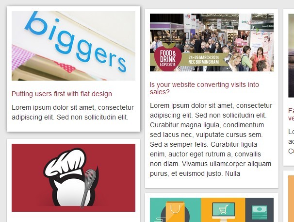
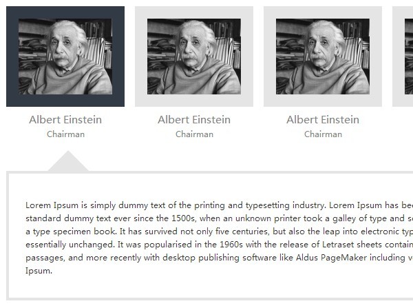
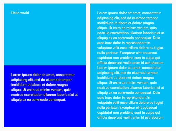
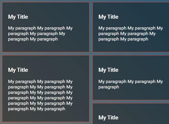
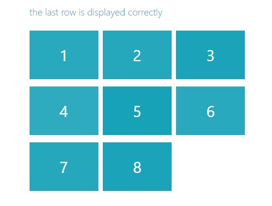
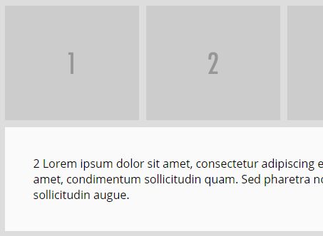
<dl id="gridtab-1"> <dt>Tab 1</dt> <dd>Tab 1 Description</dd> <dt>Tab 2</dt> <dd>Tab 2 Description</dd> <dt>Tab 3</dt> <dd>Tab 3 Description</dd> <dt>Tab 4</dt> <dd>Tab 4 Description</dd> <dt>Tab 5</dt> <dd>Tab 5 Description</dd> <dt>Tab 6</dt> <dd>Tab 6 Description</dd> </dl> Where, <dt> contains the title of the tab nad <dd> contains the description to be shown on click.
Stylesheet
Just add a link to the css file in your :
<link rel="stylesheet" type="text/css" href="gridtab.min.css"/>
jQuery Plugin
Then, before your closing <body> tag add:
<script type="text/javascript" src="gridtab.min.js"></script>
and initialize the plugin as shown below:
<script> $(document).ready(function() { $('#gridtab-1').gridtab({ grid:3 }); }); </script> Where grid is the number of grids/tabs in a row
Settings
| Basic Settings | Type | Default | Description |
|---|---|---|---|
| grid | integer | 4 | Number of grids or tabs per row |
| borderWidth | integer | 2 | Width of the borders. |
| tabBorderColor | string | '#ddd' | border color of the tabs (Hex Color Code). |
| tabPadding | integer | 25 | padding/spacing around the tabs. |
| contentBorderColor | string | '#ddd' | border color of the content section (Hex Color Code). |
| contentPadding | integer | 25 | padding/spacing around content section. |
| contentBackground | string | '#fff' | Background color for the content section (Hex Color Code). |
| activeTabBackground | string | '#fff' | Background color for the active tab (Hex Color Code). |
| responsive | Array | null | Array of objects having breakpoints and settings object which is enabled at a given breakpoint. |
| selectors | Object | see table below | Object with options to set custom selectors. |
| config | Object | see table below | Object with options to enable features like, setting initially active tab, next/prev controls, close button, transition speed etc. |
| callbacks | Object | open:false, close:false | Callbacks for the open and close states of the content section. |
| selectors | Type | Default | Description |
|---|---|---|---|
| tab | string | '> dt' | By default, the click event is triggered on the entire tab ('dt'). This can be replaced with any custom selector within the dt. For example: '.readmore'. |
| closeButton | string | '.gridtab__close' | Custom class for the close button, if 'showClose' is set to true. |
| nextArrow | string | '.gridtab__next.gridtab__arrow' | Custom class for the next button, if 'showArrows' is set to true. |
| prevArrow | string | '.gridtab__prev.gridtab__arrow' | Custom class for the prev button, if 'showArrows' is set to true. |
| disabledArrow | string | '.is-disabled' | Custom class for the disabled state of next/prev buttons, if 'showArrows' is set to true. |
| config | Type | Default | Description |
|---|---|---|---|
| layout | string | 'grid' | Change the value to 'tab' for a tab layout. By default, the layout is 'grid' based. |
| keepOpen | Boolean | false | If set to true keeps the active tab open (Disables toggle). |
| speed | integer | 500 | Transition speed in milliseconds. |
| activeTab | integer | 0 | Initially active tab. For example, 1 enables the first tab. |
| showClose | Boolean | false | Shows the close button if set to true. |
| showArrows | Boolean | false | Shows the next/prev buttons if set to true. |
| scrollToTab | Boolean | false | Scrolls to the active tab on click |
| RTL | Boolean | false | Converts tab to RTL |
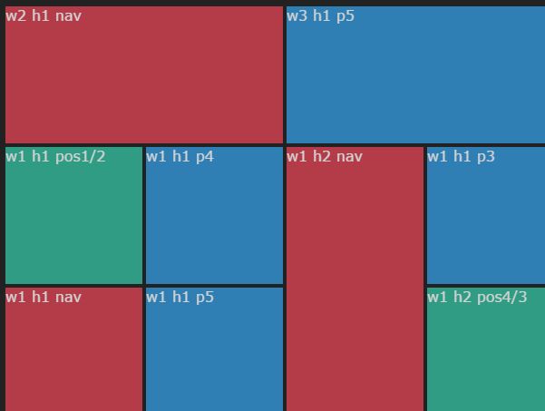
Responsive Example
The responsive settings is where you reset the grids and other properties at a given breakpoint.
$('#gridtab-1').gridtab({ grid:5, contentPadding: 40, responsive:[{ breakpoint: 1024, settings:{ grid:3, contentPadding: 30 } },{ breakpoint:767, settings:{ grid:2, contentPadding: 25 } },{ breakpoint:520, settings:{ grid:1, contentPadding: 20 } }] }); All properties under basic settings like: borderWidth, tabPadding, tabBorderColor, contentBorderColor, contentPadding, contentBackground and activeTabBackground, can be updated with the responsive settings.
Version
2.1.1
Browser support
GridTab works on IE10+ in addition to other modern browsers like Chrome, Firefox and Safari
Dependencies
jQuery 1.8.3 +
License
Licensed under the MIT license.