Flexgrid
A css grid system and simple framework with some powerful jQuery helper functions
Flexgrid by Jon Paul Miles
I am preparing this framework for production and I was hoping some of you would help me test it and see if everything is working properly. If you do test it and provide feedback you are free to use this software under the Creative Commons Attribution-ShareAlike 4.0 International License.
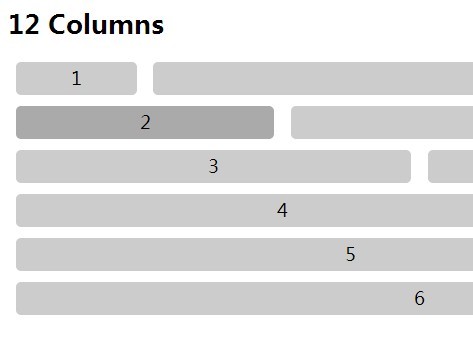
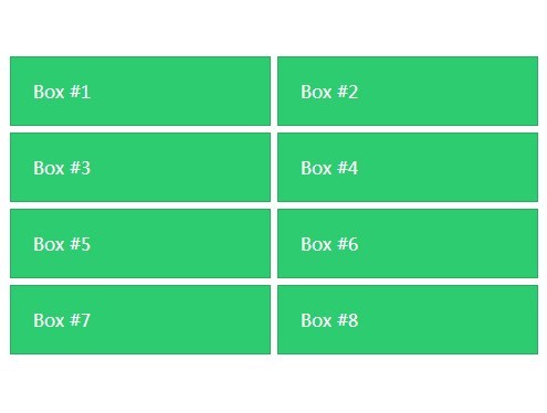
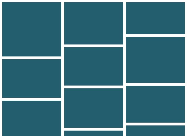
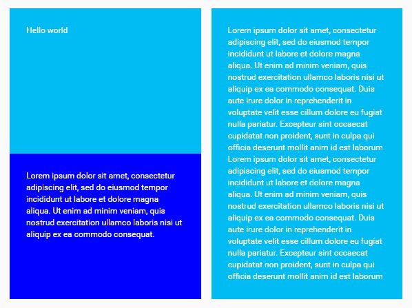
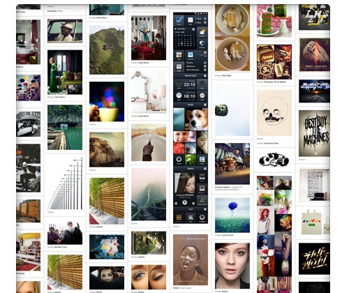
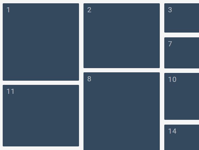
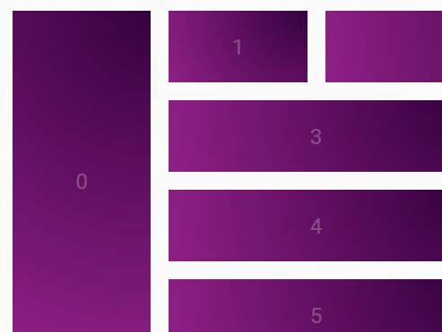
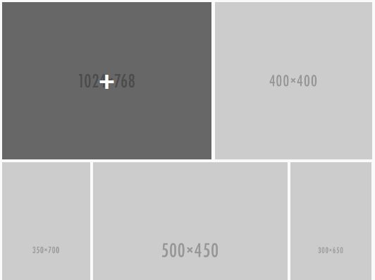
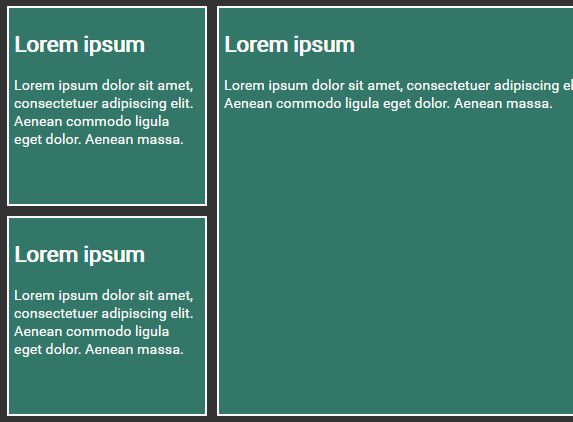
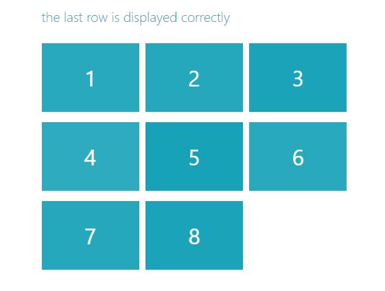
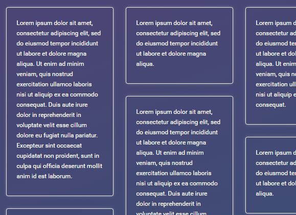
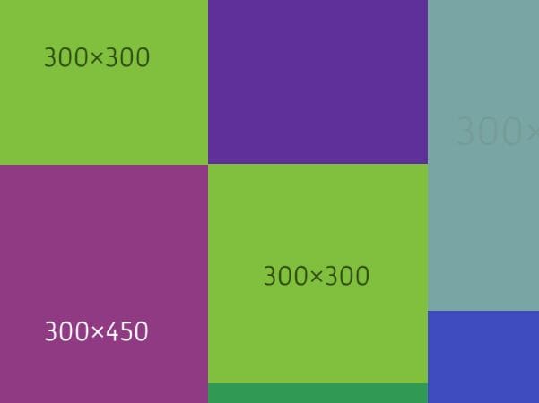
Description: Flexgrid is a 12 column & 5 column responsive fluid grid system with a few extra jQuery functions that are helpful in creating layouts. Columns can be infinitely nested.
Here is a prezi slideshow explaining what is does
Flexgrid is now on jsDelivr CDN, just add these links to your html
<link rel="stylesheet" type="text/css" href="http://cdn.jsdelivr.net/flexgrid/1.5.1/flexgrid.min.css"> <script src="http://code.jquery.com/jquery-1.11.0.min.js"></script> <script src="http://cdn.jsdelivr.net/flexgrid/1.5.2/flexgrid.min.js"></script> Grid Classes
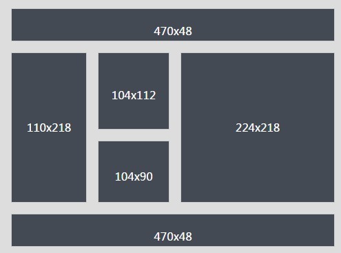
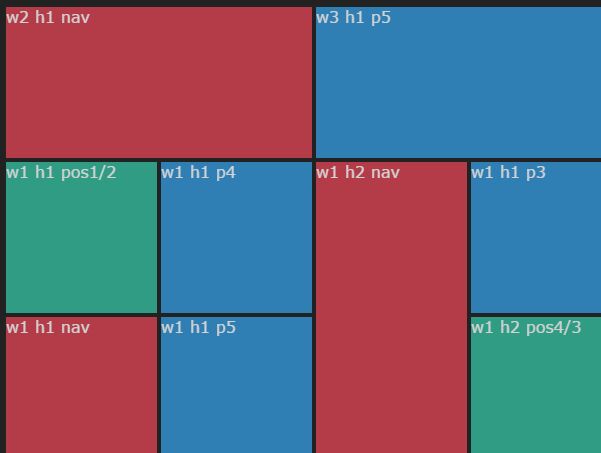
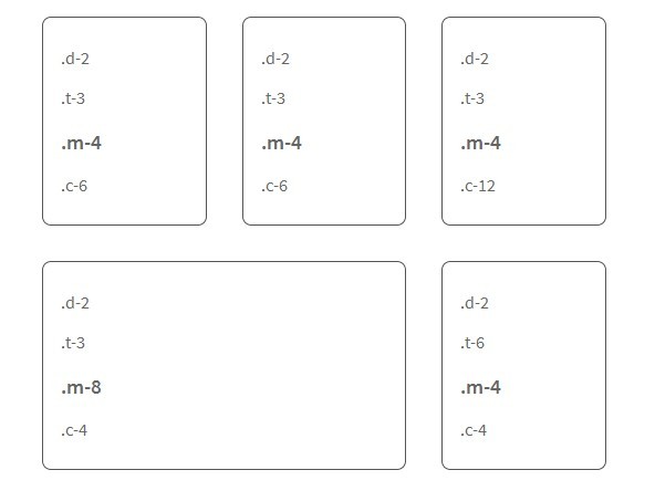
a = all d = desktop t = tablet h = handheld m = mobile c = cell words = desktop and tablet a-1 d-1 t-1 h-1 m-1 c-1 one a-2 d-2 t-2 h-2 m-2 c-2 two a-3 d-3 t-3 h-3 m-3 c-3 three a-4 d-4 t-4 h-4 m-4 c-4 four a-5 d-5 t-5 h-5 m-5 c-5 five a-6 d-6 t-6 h-6 m-6 c-6 six a-7 d-7 t-7 h-7 m-7 c-7 seven a-8 d-8 t-8 h-8 m-8 c-8 eight a-9 d-9 t-9 h-9 m-9 c-9 nine a-10 d-10 t-10 h-10 m-10 c-10 ten a-11 d-11 t-11 h-11 m-11 c-11 eleven a-12 d-12 t-12 h-12 m-12 c-12 twelve a-20 d-20 t-20 h-20 m-20 c-20 twenty a-40 d-40 t-40 h-40 m-40 c-40 fourty a-60 d-60 t-60 h-60 m-60 c-60 sixty a-80 d-80 t-80 h-80 m-80 c-80 eighty Handheld and Cell are override classes. If the jump in layout between tablet and mobile or mobile and smaller mobile (c) is too great, H and C are inbetween classes that help smooth the transition. For instance, tablets apply to the screen sizes between 640 and 960px. Handhelds apply to 640 to 768px. So whatever rules are in the handhelds class will override the tablet rules during that fraction of a screen size. Mobile is from 640 below, while cell is from 480px and below. Grid classes can override other grid classes. a-4 will make the column 1/3rd width for all screen sizes. But if you also apply a t-6 class, then it will be 1/3rd width for all screen sizes except for tablet in which it would be 50%. Ex: "three t-4 m-6 c-12" This will result in desktop being 25%, tablet being 33.33%, mobile being 50%, and cell being 100% .inner
All elements with flexgrid classes cannot have margins changed. If you wish to change the margin of a flexgrid container you should wrap a div directly inside of the that element and apply your margins and styling to that div. If you add the class .inner to it, then it will stretch to fill the height of it's parent container. Each parent may only have one .inner child container, having more will cause a glitch.Ex: <p> <div class="four m-6 c-12"> <div class="inner your-class-name"> Content Here </div> </div> </p> Basic jQuery helper functions: (They run automatically)
equalHeights() responsiveVideo() - equalHeights()
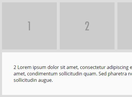
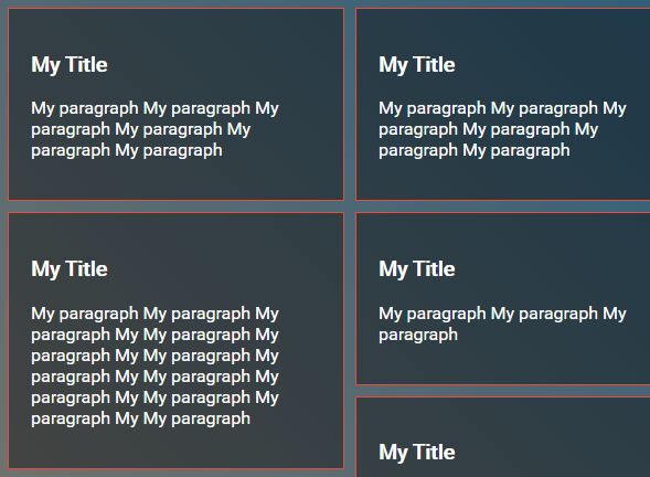
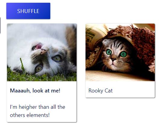
- equalHeights() is called by adding the .equal class to parents of grid containers. Every grid container on the same row that is a child of .equal will be set to the height of the tallest container on that row
- responsiveVideo()
- Wraps video in a container that allows you to scale video in responsive layouts
Other Helpful classes
Flexgrid allows you to toggle display of elements based on screen size by adding classes such as: desktop-only mobile-only tablet-hide Since Flexgrid is defined in inline-block, you may change the alignment of the grid items. .center {text-align: center;} .right {text-align: right} .left {text-align: left;} .justify {text-align: justify;} .top {vertical-align: top;} .middle {vertical-align: middle;} .bottom {vertical-align: bottom;} .float-right {float: right;} .float-left {float: left;} These classes only affect CHILDREN of the element that has the class. So if you wanted a grid element inside of it's parent to be moved to the right, you would add .right to the parent element. For .middle to work, at least two columns on the same row have to both be set to .middle These can be attached only to certain screen sizes if you specify one of the screen sizes... .d-center {text-align: center;} .d-right {text-align: right} .d-left {text-align: left;} .d-justify {text-align: justify;} .d-top {vertical-align: top;} .d-middle {vertical-align: middle;} .d-bottom {vertical-align: bottom;} .d-float-right {float: right;} .d-float-left {float: left;}