Check out an example at the website
Table of Contents
- Intro and Descriptions
- MosaicCSS
- MosaicJS
- Documentation
- MosaicCSS
- Characteristics of MosaicCSS
- mosaic.scss
- mosaic.mobile.scss
- HTML
- Using MosaicCSS With MosaicJS
- MosaicJS
- Options
- Defaults
- Sizing
- Breakpoints
- Positioning Tiles
- Position Breakpoints
- Demos
#Mosaic
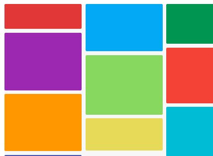
Mosaic is a layout framework that allows you to position "tiles" easily in a premade grid and then auto-layout more tiles around them.
Inspired by Masonry, and similar to Packery (both by desandro), Mosaic is great for mixing dynamic and static content in the same layout.
Like Packery, you can specify tiles that you want to essentially keep the same position. Unlike Packery, your positioned tiles are positioned relative to the grid you're using, and so is already entirely integrated into your layout.
Mosaic comes with two libraries: a CSS library and a JS library.
MosaicCSS creates a grid framework based on columns and rows. The column width and row height will be the same, and this will be enforced using padding-bottom for the row height (meaning the height of the tiles will be a percentage of the width instead of the height of the container). A normal tile, then, will be a square spanning one column and one row, but it's easy to make the rowspan or column span different.
MosaicJS lays out the grid so that everything fits together, instead of stacking elements of odd heights and widths with gaps in between. In addition, allows you to specify positions for your tiles within the grid, and will make all the necessary calculations for you. Also allows for breakpoints and other options.
#Documentation
##MosaicCSS
The CSS for Mosaic provides a grid framework that works well with MosaicJS, although it doesn’t have to be used in conjunction. The files are in .scss, and should be compiled into CSS before use.
####Characteristics of MosaicCSS:
-
Everything’s in percentages
-
The tiles are square, unless you change the column or row span
-
The height of the tiles is done with padding-bottom, so the height is based on width
####mosaic.scss
- The main stylesheet. Here you specify the number of columns and the gutter size as integers.
####mosaic.mobile.scss
- A stylesheet that will cover one mobile breakpoint at a time. Specify the breakpoint, column number, and gutter size as integers. Compile and add together as many as you want.
###HTML
- For a square tile that spans only one column and one row, all you need to add is the class
mosaic-tile:
<div class="mosaic-tile"></div> - For a tile that spans more than one column, add the class
width-<#>, where<#>is a number from 1 to 10:
<div class="mosaic-tile width-4"></div> - For a tile that spans more than one row, add the class
height-<#>, where<#>is a number from 1 to 10:
<div class="mosaic-tile height-2"></div> widthandheightcan be mixed and matched to make different tile sizes:
<div class="mosaic-tile width-3 height-2"></div> ###Using MosaicCSS With MosaicJS
-
To use MosaicCSS with MosaicJS, make sure the container you’re using for your grid is the one containing the mosaic tiles with the appropriate classes.
-
Check that the number of columns in the CSS matches the number of columns in the JS
-
Check that the gutter sizes in the CSS and JS are equal
-
No need to specify a tileModel, colWidth, or rowHeight
-
In the JS,
heightFromWidth: true -
In the JS,
layoutInPercent: true(this is set by default)
#MosaicJS
Initializing:
$(/* Container Selector */).mosaic({ // options go here }); ####Options
{int} columns
- An integer representing the number of columns to appear in your grid (default: 1)
{int} rows
- An integer representing the number of rows to appear in your grid (default: null, meaning infinite)
{double} gutter
- A number (in either pixels or percent) representing the margin around each of the tiles (default: 0)
{double} || {string} colWidth
- A number representing the width (in either pixels or percent) of a column in your grid OR the selector of an element with a width corresponding to the column width (default: null, meaning the column width will be found programmatically, or through the tileModel)
{double} || {string} rowHeight
- A number representing the height (in either pixels or percent) of a row in your grid OR the selector of an element with a height corresponding to the row height (default: null, meaning the row height will be found programmatically, or through the tileModel)
{string} tileModel
- The selector of an element whose height and width correspond to the height of a row and the width of a column, respectively (default: null, meaning the sizes will be found programmatically, or through the assigned sizes)
{boolean} layoutInPercent
- True if your layout sizes are in percentages, false if they’re in pixels. Note that Mosaic does not support different types of sizes--your sizes must either all be in percent or all be in pixels. (default: true)
{boolean} heightFromWidth
- If your row and tile heights are dependent on page width instead of page height (i.e. if they are given height through padding-bottom as opposed to the height attribute, as with MosaicCSS). This is important for figuring out the heights of tiles relative to the row height. If you are using MosaicCSS, set this to true. (default: false)
{object[]} breakpoints
- If at different page widths you want your grid to have different options (e.g. a different number of columns, or a different gutter size), you can specify those options with an array of breakpoint objects. (default: null)
####Defaults ``` $.fn.mosaic.defaults = { columns: 1, rows: null, gutter: 0, colWidth: null, rowHeight: null, tileModel: null,
// If your layout is all in percentages layoutInPercent: true, // If your height is actually padding-bottom, it depends on the width, not the height, of the parent heightFromWidth: false, // To be used if the grid layout should be changed with different browser widths breakpoints: null }; <br /> ####Sizing The size of your tiles is the root of your grid, so sizing is extremely important when setting up Mosaic. There are a few different ways to do it: * Only specify columns - Mosaic will figure out your column width programmatically by dividing up the container width by the number of columns. Row size will be the same as column size. - If layoutInPercent = true, it will divide 100 by the number of columns, and will take this as a percentage. - If given a gutter size, it will take the gutter into account when programmatically finding the size. $("#mosaic-grid").mosaic({ columns: 10 });
* Only specify rows - Mosaic will figure out your row height programmatically by dividing up the container height by the number of columns. Columns will equal 1 by default, and so will have a width of 100% (minus gutter). - IF layoutInPercent = true, it will divide 100 by the number of columns and will take this as a percentage. - If given a gutter size, it will take the gutter into account when programmatically finding the size. $("#mosaic-grid").mosaic({ rows: 10 });
* Both rows and columns are specified - The first steps of each of the previous will occur, each being set separately. $("#mosaic-grid").mosaic({ columns: 10, rows: 10 });
* A tileModel is given - Mosaic will find the element specified with tileModel and will pull its width and height (which will depend on your heightFromWidth, which by default is false). - If layoutInPercent = true, it will pull the height and width and then convert those values into percents based on the container. $("#mosaic-grid).mosaic({ columns: 10, tileModel: '.sizer' });
* A colWidth is specified - Mosaic recognizes if the given value is a number value, in which case it directly assigns the value, or a string, in which case it’s taken as a selector. If it’s taken as a selector, it will find the appropriate element and pull its width. - If layoutInPercent = true, the width found from either method will be taken as/converted into a percent, respectively. - rowWidth will be set to the same value. $("#mosaic-grid).mosaic({ columns: 10, colWidth: 10 // Default unit type is percent });
$("#mosaic-grid).mosaic({ columns: 10, colWidth: '.width-sizer' });
* A rowHeight is specified - Mosaic recognizes if the given value is a number value, in which case it directly assigns the value, or a string, in which case it’s taken as a selector. If it’s taken as a selector, it will find the appropriate element and pull its height. - If layoutInPercent = true, the height found from either method will be taken as/converted into a percent, respectively. $("#mosaic-grid).mosaic({ columns: 10, rowHeight: '.height-sizer' });
- colWidth will be set to the same value. * Both colWidth and rowHeight are specified. - The first two steps of the previous two will occur. $("#mosaic-grid).mosaic({ columns: 10, colWidth: 10, rowHeight: 15 });
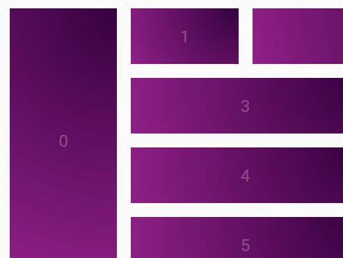
<br /> ####Breakpoints Mosaic doesn’t automatically decide how many columns is appropriate for your grid, but you can easily give it that information. Adding breakpoints allows you to change not just the number of column or rows with changes in screen width, but also to change any option you could possibly specify. Breakpoints are handed to the initial Mosaic call as an array of objects. An object will look like this: { size: <number>, // The minimum width for the breakpoint … // Any of the possible options } Example: { …, // Original options breakpoints: [{size: 1200, columns: 10}, {size: 700, columns: 8}] } <br /> ####Positioning Tiles Mosaic’s true power comes when you want to relatively position any of your tiles inside of your grid. Let’s say you have a grid with five columns, and you want one of your tiles to be on the third row, in the second column. With a library like Masonry, you’d have no guarantee that that tile will remain in the position you want it to. Mosaic will figure out all the positioning (and, if you use the CSS library, the sizing) for you, and make sure that your tile stays where you want it to (assuming your position is valid given the constraints of your grid). To position a tile, all you need to do is add: `data-mosaic-row="<int>"` This specifies the row in which to place your tile `data-mosaic-col="<int>"` This specifies the column in which to place your tile **Note that the rows and columns are zero-indexed** _Example:_ This tile will be positioned in the 1st row, 4th column, starting from the top left ####Position Breakpoints
If you want your positioned tile(s) to change their relative position at the breakpoints you specified in your options (that is, if you set any breakpoints), Mosaic can handle this as well.
Instead of giving data-mosaic-row or data-mosaic-col an integer, you can give either/both something like an object:
data-mosaic-row="<number> breakpoint:<int> row, breakpoint:row, ..."
data-mosaic-col="<number> breakpoint:<int> col, breakpoint:col, ..."
Note: Your breakpoints should correspond with the breakpoints you gave the Mosaic object.
A breakpoint at width 0 will correspond to your default options (i.e. the options you specify outside of your breakpoints).
Example: This tile will always be in row 1, but will change its column position based on the given breakpoints and columns
`<div data-mosaic-row="1" data-mosaic-col="0: 0, 700: 4, 1200: 5" class="mosaic-tile”></div>` #Demos
####Coming soon!