Wallyti (beta)
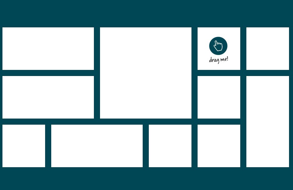
Wallyti is a simple jQuery plugin that can be used to generate a wall of tiled blocks. It is currently in beta! If you find a bug or have any suggestions please let me know.
The plugin uses these values to compute the number of column that can fit in the container width:
- the minimum block width
- the maximum block width
- the margin between blocks
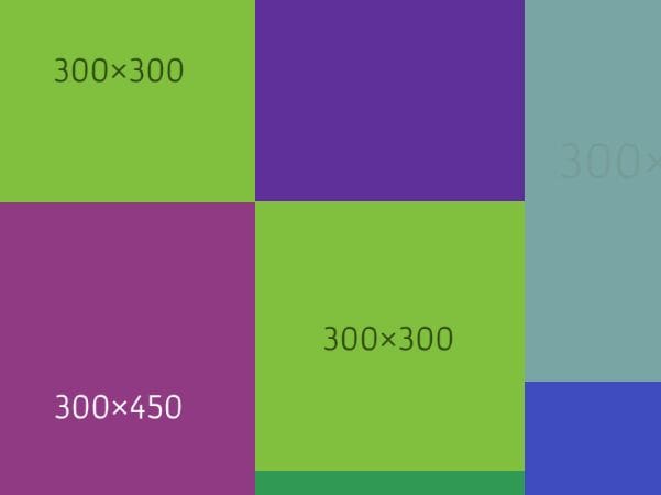
These values are intended to give the script some "boundaries" to find how many columns there should be. Wallity can override maximum and minimum block widths if it's needed. This happens when:
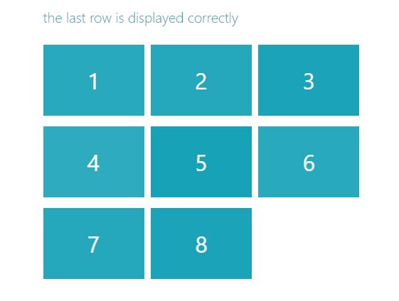
- there is only one column: the width of the block will always be 100%,
- there's no column number for blocks to fit in the container width: the script will make them fit someway :)
However the margin will never change.
Installation
Include script after the jQuery library:
<script src="/path/to/jquery.wallyti.min.js"></script>Remember to not include the script directly from GitHub!
##Options:
- blockMaxWidth - (default: 360) sets the maximum width of the single block (in pixels)
- blockMinWidth - (default: 240) sets the minimum width of the single block (in pixels)
- blockMargin - (default: 35) sets the margin between the block (in pixels)
The above values can also be set using attributes on the container's tag:
<div id="myContainer" wallyti-block-max="300" wallyti-block-min="210" wallyti-block-margin="20" > </div>- delayOnResize - (default: 60) milleseconds to wait for the window to be resized
- disableTransitions - (default: false) disable all css transitions
- cssTransition - (default: 'all 0.2s ease-in-out') css style for attribute transitions applied to the blocks
- onComplete - callback function to execute everytime all blocks are arranged
The css transition can be set also directly in the stylesheet, in the usual way:
.box { transition: all .25s ease-in-out; -webkit-transition: all .25s ease-in-out; -moz-transition: all .25s ease-in-out; -o-transition: all .25s ease-in-out; }##Usage:
You can call Wallyti in document.ready or in body.onload. It will initialize and run every time the method is called.
Once initialized, it is automatically attached to the window resize event, so there's no need to do this yourself.
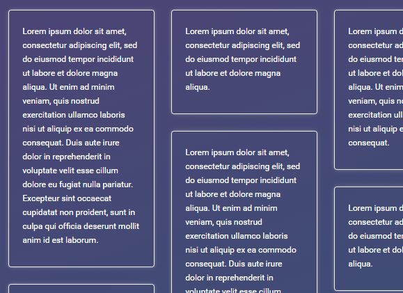
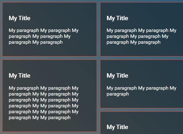
$(function(){ /* initialize with default parameters */ $('#myContainer').wallyti(); /* initialize with margin and a callback function */ $('#myContainer').wallyti({ blockMargin: 30, onComplete: function(){ // DO STUFF } }); /* initialize only with callback function */ $('#myContainer').wallyti(function(){ // DO STUFF }); /* initialize with a transitions and widths */ $('#myContainer').wallyti({ blockMaxWidth: 100, blockMinWidth: 60, blockMargin:5, cssTransition: "all 1s ease-in-out", disableTransitions: Modernizr.touch // disable transitions on touch devices }); });There is no specific css needed, you're free to customize container and blocks. Wallyti will set the necessary attributes, for example box-sizing and position will be overwritten by the plugin script. The class 'wallity-moving' will be added to the block while they are moving.
#myContainer { width:80%; } .myBox { transition: opacity .25s ease-in-out; -webkit-transition: opacity .25s ease-in-out; -moz-transition: opacity .25s ease-in-out; -o-transition: opacity .25s ease-in-out; } /* if a css transition is on the way, this is the class applied until it's finished */ .myBox.wallity-moving { opacity:0.5; }The html is very simple:
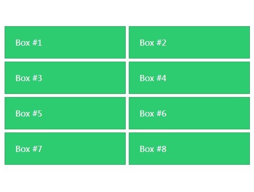
<div id="myContainer" wallyti-block-margin="10" wallyti-block-min="200"> <div class="myBox"></div> <div class="myBox"></div> <div class="myBox"></div> <div class="myBox"></div> <div class="myBox"></div> <div class="myBox"></div> <div class="myBox"></div> <div class="myBox"></div> </div>