Flex Gallery
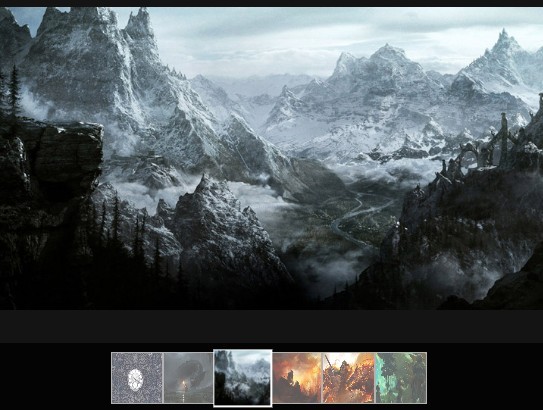
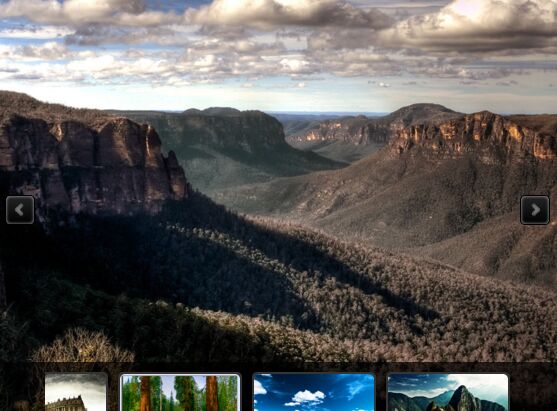
Demo: https://elvisyjlin.github.io/flex-gallery/examples/demo.html

Flex Gallery is a flexible responsive justified image gallery with CSS and jQuery.
A good layout is the key to grab readers' attention. Up to today, many people have dedicated to presenting awesome ways to display contents on webpages. Websites like Google Photos or Pexels did a great job on the so-called justified layout. Yet most of the current implementations are based on calculations in javascripts.
Thanks to the innovation of flexible box layout in CSS3, autolayouting images in a web page became much easier than before. Moreover, justifying images with pure CSS is no longer difficult. The Flex Gallery is implemented by mainly CSS and some jQuery code (unavoidable pre-calculating spaces for images), utilizing the effectiveness and efficiency of the flexible box layout.
- Easy to use: simply include Flex Gallery's js and css files.
- Easy to load: either the size of sources or computation time is pretty lightweight.
- Easy to integrate: no requirement for server side programming.
How to use it?
To Include
Flex Gallery needs jQuery and Dynamics.js.
<!-- Include jQuery locally --> <script type="text/javascript" src="../src/js/jquery-3.2.1.min.js"></script> <!-- Include jQuery from a CDN --> <script src="https://code.jquery.com/jquery-3.2.1.min.js" integrity="sha256-hwg4gsxgFZhOsEEamdOYGBf13FyQuiTwlAQgxVSNgt4=" crossorigin="anonymous"></script> <!-- Include Dynamics.js locally --> <script type="text/javascript" src="../src/js/dynamics.min.js"></script>Then include Flex Gallery's javascript source and css style sheet.
<script type="text/javascript" src="js/flex-gallery.js"></script> <link rel="stylesheet" type="text/css" href="css/flex-gallery.css">To Create
Flex Gallery can be built in a <div>. An element with an ID is recommended. An ID helps access and modify the element later. For example, I created a <div> with ID="container" here.
<div id="container"></div>To Call
Flex Gallery accepts an object, called as media, containing a list of images and a list of links.
Simply set images in a container by addFlexImages() and call flexGallery() to make it flex.
$('#container').addFlexImages(media).flexGallery();media looks like this. It is an object containing images you want to display and corresponding links. Only images is required.
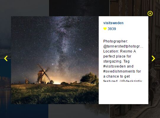
media = { images: ['img/image1_t.jpg', 'img/image2_t.jpg', 'img/image3_t.jpg'], links: ['img/image1.jpg', 'img/image2.jpg', 'img/image3.jpg'], texts: ['description 1', 'description 2', 'description 3'] }If you want the images displayed in a random order, set shuffling to true.
$('#container').addFlexImages(media, shuffling=true).flexGallery();To Customize
You can also construct the container by yourself. A container is supposed to be structured as shown below.
<div class="fg-container"> <div class="fg-item"> <a href="img/image1.jpg"> <img class="fg-img" fg-img-src="img/image1_t.jpg"> </a> <span class="fg-text">description 1</span> </div> <div class="fg-item"> <a href="img/image2.jpg"> <img class="fg-img" fg-img-src="img/image2_t.jpg"> </a> <span class="fg-text">description 2</span> </div> <!-- more images --> </div>Note that fg-container, fg-item, fg-img, and fg-text are essential class names for flex gallery. flexGallery() applies a series of operations on those elements.
Don't forget calling flexGallery() to make the container flex at the end.
$('#container').flexGallery();Moreover, custom parameters are accepted by flexGallery(). It is easy to arrange the layout of Flex Gallery.
/* These are default values for flexGallery() */ $('#container').flexGallery({ margin: '0.5vmin', minHeightRatioWindow: 0.25, fadeInDuration: 1000, checkPeriod: 100 });Optional Parameters
| Parameter | Description |
|---|---|
| margin | An string in CSS style specifies the width of half margin. E.g. '1vmin' or '2vh'. |
| minHeightRatioWindow | An float that specifies the min-height ratio of browser window height for each row. |
| minHeightRatioScreen | An float that specifies the min-height ratio of screen height for each row. |
| fadeInDuration | An integer that specifies the fade-in time of an images after it is loaded. |
| checkPeriod | An integer that specifies the period of checking the size of each image. |
If neither minHeightRatioWindow nor minHeightRatioScreen is specified, it will take 0.25 browser windo height in default. If both of them are specified, the smaller computed height will be applied to the page.
Note that margin can be either absolute (px, em) or relative (vw, vh, vmin) unit, while percentage (%) padding or margin in flex element is not supported by some browsers (e.g. Firebox, Edge, ...).
To Build
cd src/tool ./build.shThe files under dist/ will then get updated and also minimized.
How it works?
Flexible Box Layout
The main idea is to let images grow (or extend) by flexible box layout algorithm.
The elements styled
flex-grow: 1; /* the value is its allocating weight */in a container (such as <div>) with
display: flex; flex-wrap: wrap;will extend their size if there is space left.
So the images in a row can grow to the same height if their flex-grow are assigned in proportion to their aspect ratios (width / height).
Other modifications are done to deal with detailed problems.
addFlexImages()
addFlexImages() iterates through the given array and create <a> and <img> according to the URLs in it.
flexGallery()
flexGallery() assigned flex-gallery classes for <div>, <a>, and <img> of a Flex Gallery. Also, it configures the style of the gallery with input arguments, especially the fade-in effect for postponed displayed. Moreover, the image size pre-calculating is also performed in it. To be exact, setTimeInterval() is used to check the sizes periodically.
Why not simply wrap an image in a <img>?
An outer element of <img>, here we use a <a>, helps occupy the space for the image before it is fully loaded. Without the outer element, the view will flicker during the time it loads images. And the layout would not be consistent because images come in asynchronously. Therefore, I choose to set all images invisible first, read sizes, using naturalWidth and naturalHeight, and allocate spaces for images in advance. Each image will be displayed when loading completed.
Supported Browser
Most popular browsers would support Flex Gallery, such as Chrome, Firefox, Safari, Edge, Opera, and so on.
However, IE 10 or below does not support the flexible box layout, vmin property, and naturalWidth&naturalHeight image properties.
TODO
What I am planning to do in the future:
- To make Flex Gallery responsive when the window is resized.
- To allow Flex Gallery accept thumbnails as well as original images.
- To create a customizable min-height for developers to utilize.
- To implement lazy loading when dealing with a large amount of images.
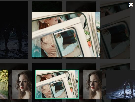
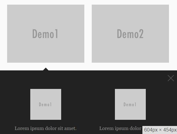
- To implement popup box with a caption after a image is clicked.
- To add a description for each flex image.
- Fly in images with animations beyond fading.
Reference
This project is inspired from a blog by xieranmaya, discussing about the justified image layout and introducing the implementation of flexible box layout in Google Photos-like or 500px-like image layout.
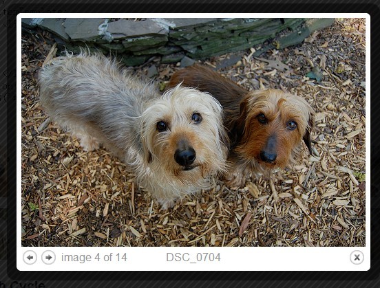
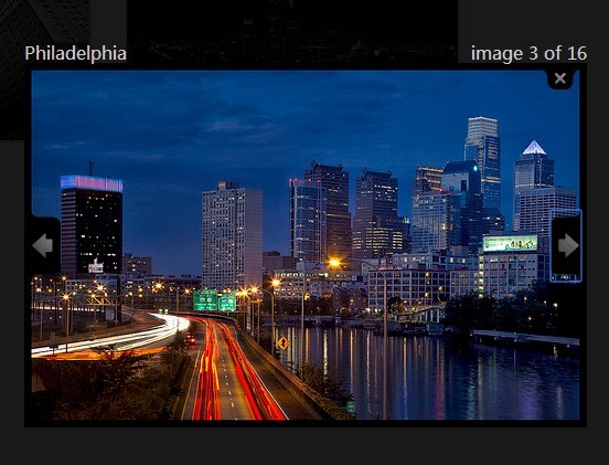
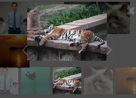
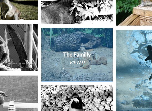
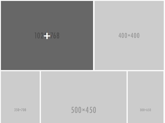
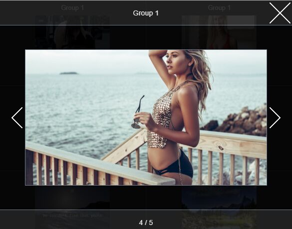
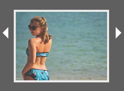
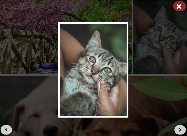
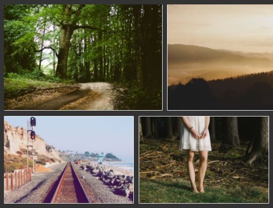
All images in the demo are from Pixabay, which is a Creative Commons image sharing platform. They are purely used for development and demonstration. The variety of aspect ratios helped a lot in revising the algorithm to justify images.