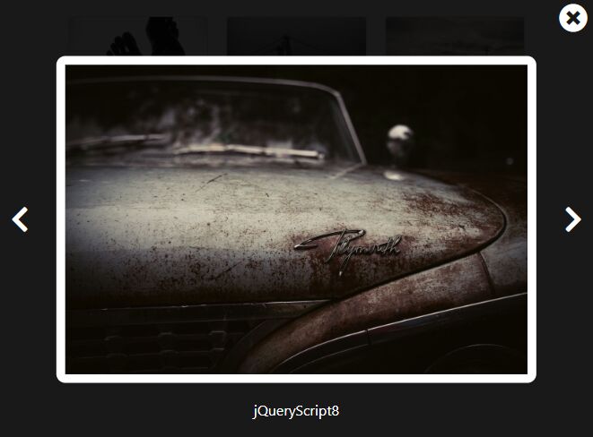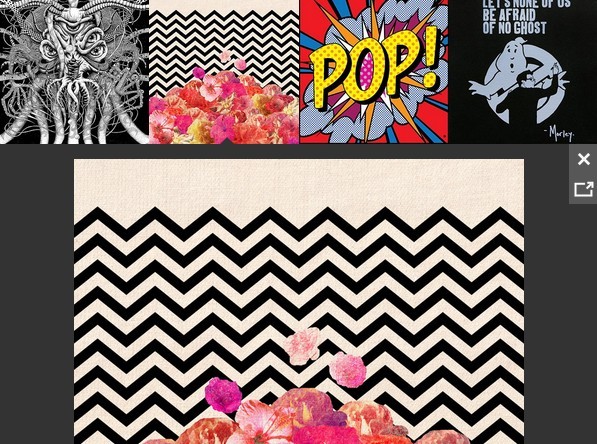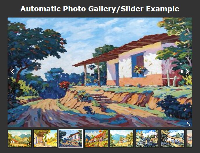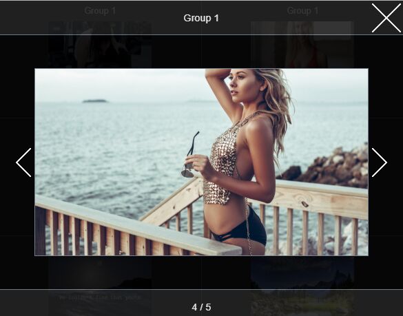
Gallery Plugin
This is a simple responsive jQuery gallery with thumbnails.
Install
Put the required stylesheet at the top of your markup:
<link rel="stylesheet" href="[your path]/gallery.css" />Put the script at the bottom of your markup right after jQuery:
<script src="[your path]/jquery.js"></script> <script src="[your path]/gallery.js"></script>Usage
Wrap your img's with a container element (div). You can use the class name whatever you want:
<div class="simple-gallery"> <img src="[your path]/img1.jpg"> <img src="[your path]/img2.jpg"> <img src="[your path]/img3.jpg"> <img src="[your path]/img4.jpg"> <img src="[your path]/img5.jpg"> <img src="[your path]/img6.jpg"> </div>Call the plugin function and your gallery is ready.
$(document).ready(function(){ $('.simple-gallery').gallery(); });Options
You're also able to use some of the options that let you customize it as you wish:
$('.simple-gallery').gallery({ height: 600, items: 6, thmbHeight: 100, showThumbnails: true, customControls: { /*you can insert html-elements like '<i class="fa fa-angle-right" aria-hidden="true"></i>'*/ prevButton: 'prev', nextButton: 'next' } });You can also set different optons depending on width of the parent container:
$('.simple-gallery').gallery({ height: 600, items: 6, 480: { items: 2, height: 400 }, 768: { items: 4, height: 450 }, 600: { //order doesn't matter items: 3 }, 992 : { height: 500 } } });Look at the demo.