Grid Horizontal (grid-horizontal)
Horizontal layout library. Spreads elements with defined dimensions (i.e. images) in container with horizontal priority. Requires jQuery.
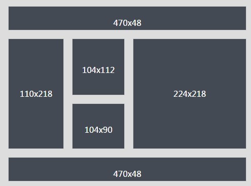
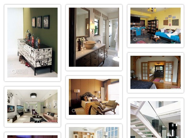
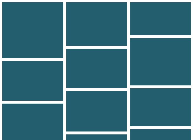
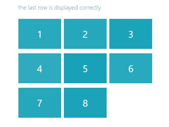
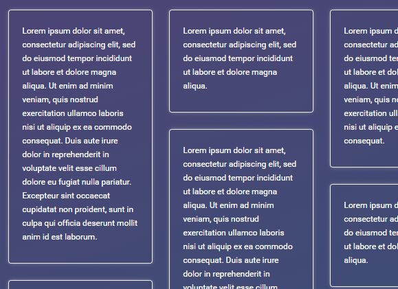
Screenshots

Notice
The script has been created during JavaScript and jQuery learning process. Both logic and syntax were not optimized enough yet, therefore consider it as beta version. Still lots to do..
Current features
- setting maximum row height
- setting optional minimum container width for starting calculation (if smaller, elements are displayed vertically in single column)
- gutters
- hide last elements which cannot create proper row
Installation
HTML (example):
<div class="container" style="position: relative"> <div class="item"> <a href="#"> <img class="cover" style="height: 100%" src="default.jpg" /> </a> </div> <div class="item" style="width:200px; height: 100px;"> Example content <img alt="Default UI image" src="defaultUIimg.jpg" /> </div> <!-- more items --> </div>JS + jQuery:
$('div.container').GridHorizontal({ item: '.item', imageClass: '.cover', minWidth: 400, maxRowHeight: 350, gutter: 15, hideOverload: false, })