
Resizeable.js
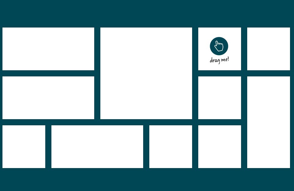
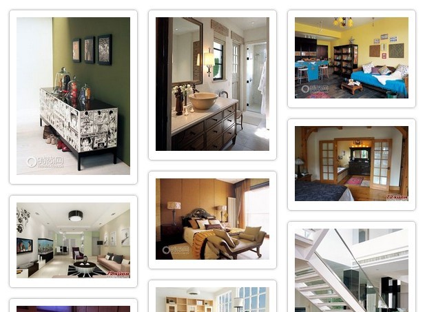
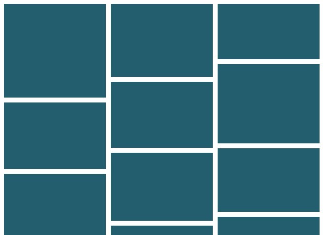
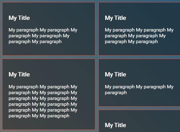
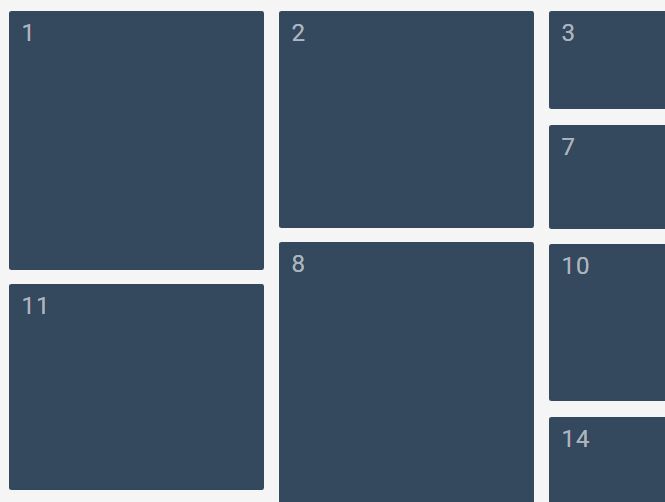
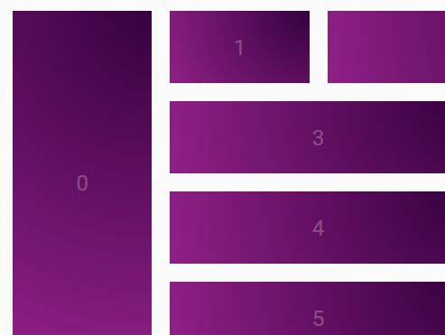
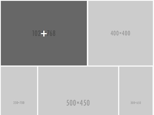
Resizeable.js is a responsive library for easily creating grid layouts that work well on every device, without the need to re-organize the layout of the grid. It is (and always will be) free to use and open source under the GNU GENERAL PUBLIC LICENSE
Prerequisites
Resizeable uses the following open source projects to work properly:
- jQuery - To easily manipulate the DOM
Installation
Resizeable requires jQuery to run.
Download the project files.
Copy the CSS and JS files into the appropriate directories, and load them (along with jQuery) in your HTML head.
<link rel="stylesheet" href="resizeable.css" type="text/css" /> <script src="https://code.jquery.com/jquery-3.1.1.min.js" integrity="sha256-hVVnYaiADRTO2PzUGmuLJr8BLUSjGIZsDYGmIJLv2b8=" crossorigin="anonymous"></script> <script src="resizeable.js"></script>Create a div within your HTML where you'd like the grid to be, and pass in the resizeable.js options object...
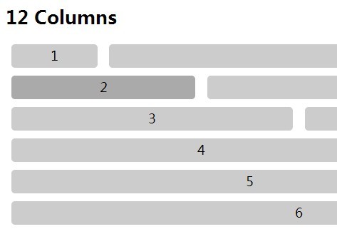
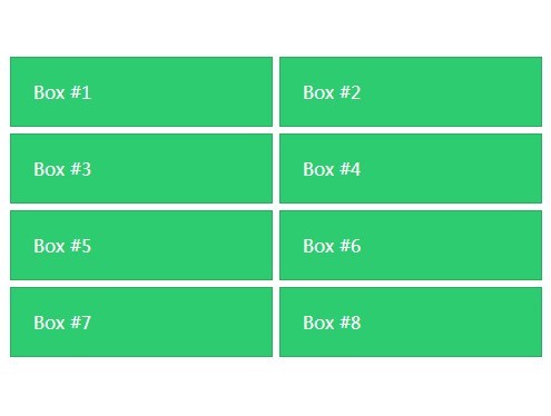
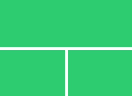
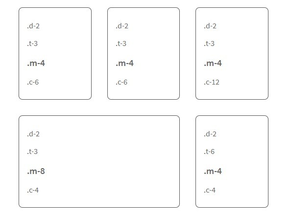
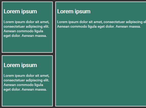
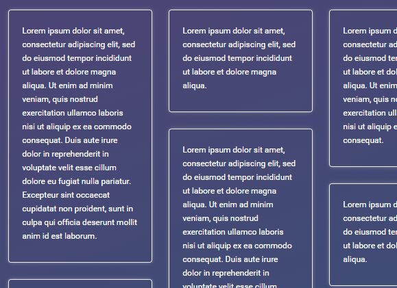
<div class="resizeable-container" data-resizeable='{"gutter": 2, "columns": 4}'> </div>Add your first resizeable.js row:
<div class="resizeable-row"> </div>Add content within the row, specifying how many columns each item should take up:
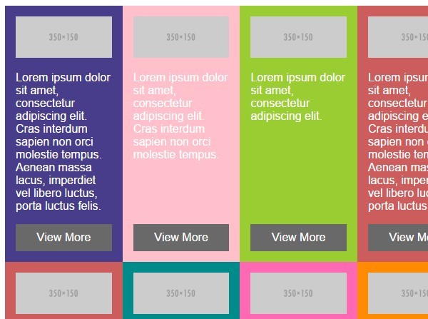
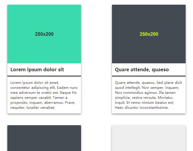
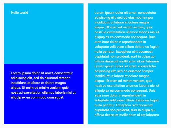
<div class="resizeable-row"> <div class="resizeable-item col-2"> </div> <div class="resizeable-item col-1"> </div> <div class="resizeable-item col-1"> </div> </div>Your full resizeable.js code should look something like this:
<!doctype html> <html> <head> <link rel="stylesheet" href="resizeable.css" type="text/css" /> <script src="https://code.jquery.com/jquery-3.1.1.min.js" integrity="sha256-hVVnYaiADRTO2PzUGmuLJr8BLUSjGIZsDYGmIJLv2b8=" crossorigin="anonymous"></script> <script src="resizeable.js"></script> </head> <body> <div class="resizeable-container" data-resizeable='{"gutter": 2, "columns": 4}'> <div class="resizeable-row"> <div class="resizeable-item col-2"> </div> <div class="resizeable-item col-1"> </div> <div class="resizeable-item col-1"> </div> </div> </div> </body> </html>And thats it!
Todos
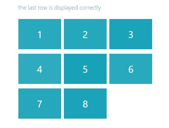
- Make it work on all devices (it currently only works on medium and large screens)
- Add Code Comments
License
GNU General Public License
Free Software, Hell Yeah!