Drystone.js
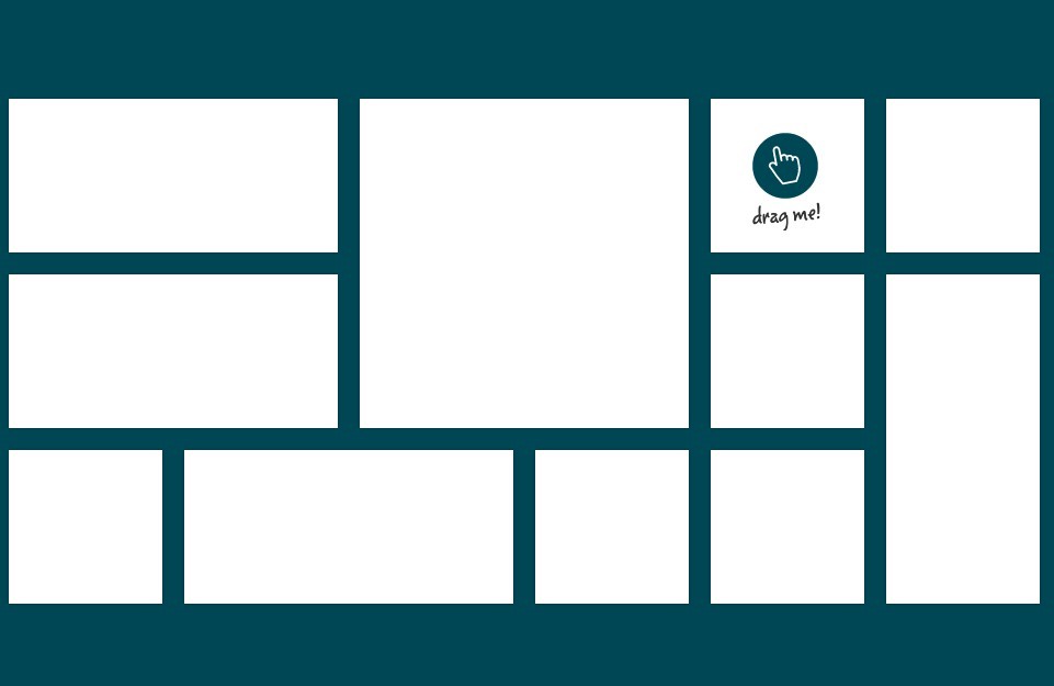
A simple responsive grid plugin for jQuery
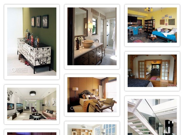
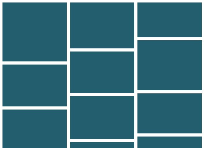
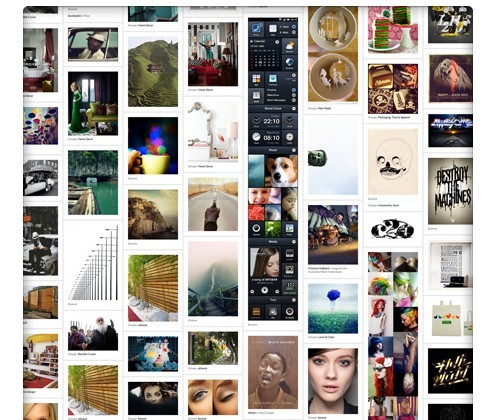
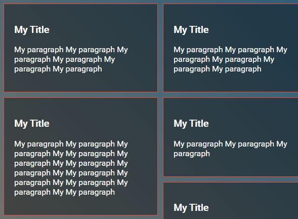
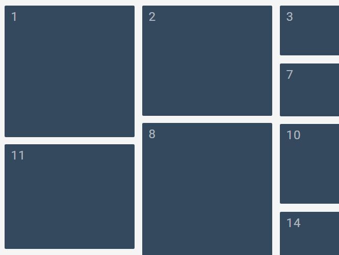
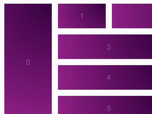
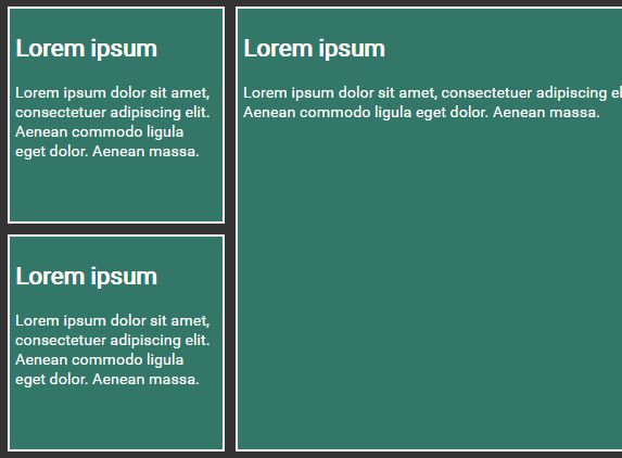
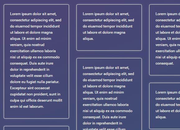
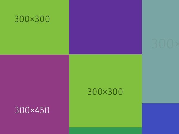
The Basics
//Call the drystone method on your grid element $('.grid').drystone({ /* Default Options */ //The selector for the items in the grid. item: '.grid-item', //The vertical and horizontal space between each item in the grid gutter: 10, //See below for explanation xs: [576, 1], sm: [768, 2], md: [992, 2], lg: [1200, 3], xl: 3, //Runs after plugin finishes onComplete: function() {} });Unlike many other grid plugins, drystone is built entirely with a responsive layout in mind. You don't set the widths of the grid items, but you can set the number of columns you want at various screen sizes.
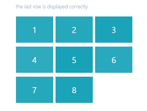
By default, drystone uses the Bootstrap v4 mobile first breakpoints. So xs: [576, 1] means that when the window size is <576px, then drystone will arange your grid items in 1 column.
The xl option is for every screen width that is larger than the lg breakpoint, which by default is 1200px.