
react-circle 

Renders a svg circle + percentage. It just works
Demo
https://zzarcon.github.io/react-circle
Install 🚀
$ yarn add react-circleUsage ⛏
Basic
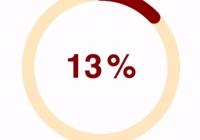
ReactCircle is opinionated and comes with default size and colors, just pass the progress prop to get them:
import Circle from 'react-circle'; <Circle progress={35} />Custom
Optionally, you can pass the following props and customize it as your will
import Circle from 'react-circle'; // All avaliable props for customization(illustrated by default values): // Details are ordered as: `<Type>: <Description>` <Circle animate={true} // Boolean: Animated/Static progress animationDuration="1s" // String: Length of animation responsive={false} // Boolean: Make SVG adapt to parent size size="100" // String: Defines the size of the circle. lineWidth="25" // String: Defines the thickness of the circle's stroke. progress="0" // String: Update to change the progress and percentage. progressColor="rgb(76, 154, 255)" // String: Color of "progress" portion of circle. bgColor="#ecedf0" // String: Color of "empty" portion of circle. textColor="#6b778c" // String: Color of percentage text color. textStyle={{ font: 'bold 4rem Helvetica, Arial, sans-serif' // CSSProperties: Custom styling for percentage. }} percentSpacing={10} // Number: Adjust spacing of "%" symbol and number. roundedStroke={false} // Boolean: Rounded/Flat line ends showPercentage={true} // Boolean: Show/hide percentage. showPercentageSymbol={true} // Boolean: Show/hide only the "%" symbol. />Features
- No external dependencies
- No external styles
- 2KB size => https://bundlephobia.com/result?p=react-circle


