react-native-progress
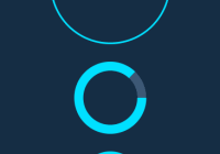
Progress indicators and spinners for React Native using ReactART.
Installation
$ npm install react-native-progress --save
ReactART based components
To use the Pie or Circle components, you need to include the ART library in your project on iOS, for android it's already included.
For CocoaPod users:
Add the ART subspec like so:
pod 'React', path: '../node_modules/react-native', subspecs: [ 'ART', ]Or manually:
Add the ART.xcodeproj (found in node_modules/react-native/Libraries/ART) to the Libraries group and add libART.a to Link Binary With Libraries under Build Phases. More info and screenshots about how to do this is available in the React Native documentation.
Usage
Note: If you don't want the ReactART based components and it's dependencies, do a deep require instead: import ProgressBar from 'react-native-progress/Bar';.
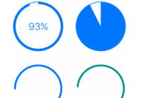
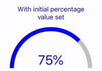
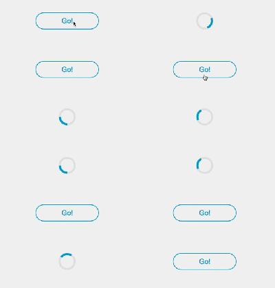
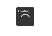
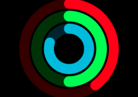
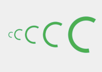
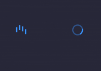
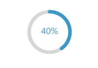
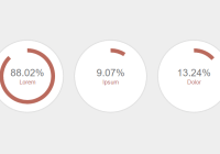
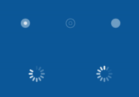
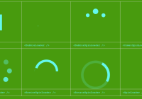
import * as Progress from 'react-native-progress'; <Progress.Bar progress={0.3} width={200} /> <Progress.Pie progress={0.4} size={50} /> <Progress.Circle size={30} indeterminate={true} /> <Progress.CircleSnail color={['red', 'green', 'blue']} />Properties for all progress components
| Prop | Description | Default |
|---|---|---|
animated | Whether or not to animate changes to progress. | true |
indeterminate | If set to true, the indicator will spin and progress prop will be ignored. | false |
indeterminateAnimationDuration | Sets animation duration in milliseconds when indeterminate is set. | 1000 |
progress | Progress of whatever the indicator is indicating. A number between 0 and 1. | 0 |
color | Fill color of the indicator. | rgba(0, 122, 255, 1) |
unfilledColor | Color of the remaining progress. | None |
borderWidth | Width of outer border, set to 0 to remove. | 1 |
borderColor | Color of outer border. | color |
Progress.Bar
All of the props under Properties in addition to the following:
| Prop | Description | Default |
|---|---|---|
width | Full width of the progress bar, set to null to use automatic flexbox sizing. | 150 |
height | Height of the progress bar. | 6 |
borderRadius | Rounding of corners, set to 0 to disable. | 4 |
useNativeDriver | Use native driver for the animations. | false |
animationConfig | Config that is passed into the Animated function. | { bounciness: 0 } |
animationType | Animation type to animate the progress, one of: decay, timing, spring. | spring |
Progress.Circle
All of the props under Properties in addition to the following:
| Prop | Description | Default |
|---|---|---|
size | Diameter of the circle. | 40 |
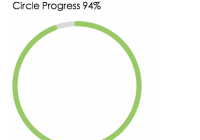
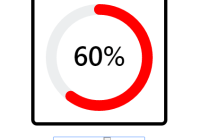
endAngle | Determines the endAngle of the circle. A number between 0 and 1. The final endAngle would be the number multiplied by 2π | 0.9 |
thickness | Thickness of the inner circle. | 3 |
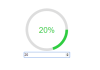
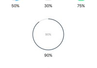
showsText | Whether or not to show a text representation of current progress. | false |
formatText(progress) | A function returning a string to be displayed for the textual representation. | See source |
textStyle | Styles for progress text, defaults to a same color as circle and fontSize proportional to size prop. | None |
allowFontScaling | Whether or not to respect device font scale setting. | true |
direction | Direction of the circle clockwise or counter-clockwise. | clockwise |
strokeCap | Stroke Cap style for the circle butt, square or round. | butt |
fill | Fill color of the inner circle. | None (transparent) |
Progress.Pie
All of the props under Properties in addition to the following:
| Prop | Description | Default |
|---|---|---|
size | Diameter of the pie. | 40 |
Progress.CircleSnail
| Prop | Description | Default |
|---|---|---|
animating | If the circle should animate. | true |
hidesWhenStopped | If the circle should be removed when not animating. | true |
size | Diameter of the circle. | 40 |
color | Color of the circle, use an array of colors for rainbow effect. | rgba(0, 122, 255, 1) |
thickness | Thickness of the circle. | 3 |
duration | Duration of animation. | 1000 |
spinDuration | Duration of spin (orbit) animation. | 5000 |
strokeCap | Stroke Cap style for the circle butt, square or round. | round |
Examples
Changelog
Thanks
To Mandarin Drummond for giving me the NPM name.
License
MIT License. © Joel Arvidsson 2015-
