
rc-progress
Progress Bar.


Example
http://react-component.github.io/progress/
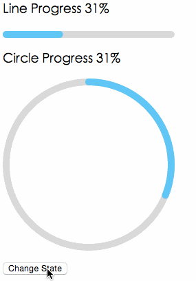
Screenshots
Browsers
- support IE9+, Chrome, Firefox, Safari
Install

Usage
import { Line, Circle } from 'rc-progress'; ReactDOM.render(<div> <Line percent="10" strokeWidth="4" strokeColor="#D3D3D3" /> <Circle percent="10" strokeWidth="4" strokeColor="#D3D3D3" /> </div>, container);API
props
| name | type | default | description |
|---|---|---|---|
| strokeWidth | Number | 1 | Width of the stroke. Unit is percentage of SVG canvas size. |
| strokeColor | String | #2db7f5 | Stroke color. |
| trailWidth | Number | 1 | Width of the trail stroke. Unit is percentage of SVG canvas size. Trail is always centered relative to actual progress path. If trailWidth are not defined, it same as strokeWidth. |
| trailColor | String | #D9D9D9 | Color for lighter trail stroke underneath the actual progress path. |
| strokeLinecap | String | 'round' | The shape to be used at the end of the progress bar, can be `butt`, `square` or `round`. |
| prefixCls | String | rc-progress | prefix className for component |
| className | String | customized className | |
| style | Object | style object will be added to svg element | |
| percent | Number | 0 | the percent of the progress |
| gapDegree | Number | 0 | the gap degree of half circle, 0 - 360 |
| gapPosition | String | top | the gap position, value: top, bottom, left, right. |
Installation
npm install --save rc-progress Development
npm install npm start License
rc-progress is released under the MIT license.


