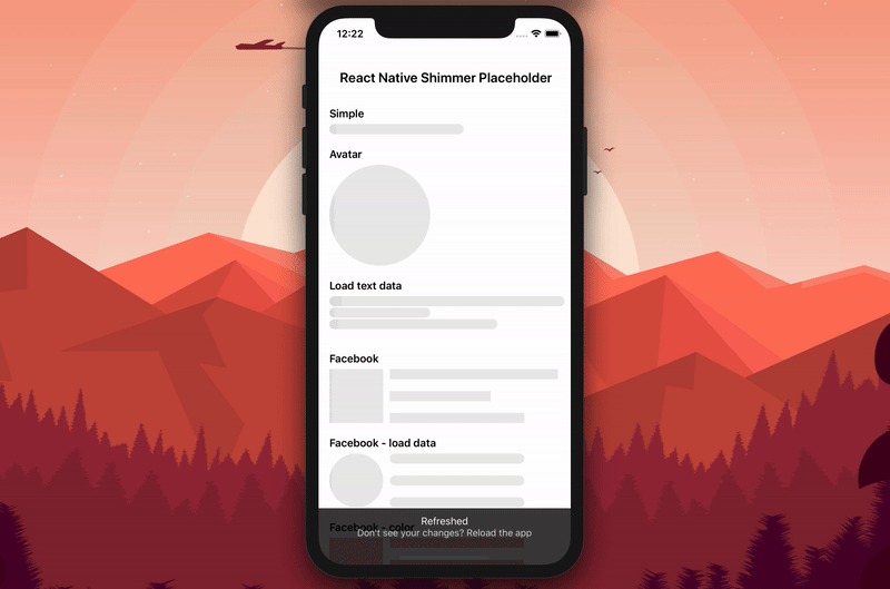
React Native Shimmer Placeholder
Placeholder for both IOS and Android
` 
Get Started
Installation
Step 1: Install react-native-linear-gradient (dependence)
npm i react-native-linear-gradient --save && react-native link react-native-linear-gradient
or
yarn add react-native-linear-gradient && react-native link react-native-linear-gradient
Step 2: Install this package
npm i react-native-shimmer-placeholder --save
or
yarn add react-native-shimmer-placeholder
That's all!
For who using Expo
Just install direct this package
npm install https://github.com/tomzaku/react-native-shimmer-placeholder.git#expo --save Usage
Simple
import ShimmerPlaceHolder from 'react-native-shimmer-placeholder' <ShimmerPlaceHolder autoRun={true} /> <ShimmerPlaceHolder autoRun={true} visible={isFetched}> <Text> Wow, awesome here. </Text> </ShimmerPlaceHolder> Connect more components
componentDidMount() { this.runPlaceHolder(); } runPlaceHolder() { if (Array.isArray(this.loadingAnimated) && this.loadingAnimated.length > 0) { Animated.parallel( this.loadingAnimated.map(animate => { if (animate&&animate.getAnimated) { return animate.getAnimated(); } return null; }), { stopTogether: false, } ).start(() => { this.runPlaceHolder(); }) } } _renderRows(loadingAnimated, numberRow, uniqueKey) { let shimmerRows = []; for(let index = 0; index < numberRow; index++ ){ shimmerRows.push( <ShimmerPlaceHolder key={`loading-${index}-${uniqueKey}`} ref={(ref) => loadingAnimated.push(ref)} style={{ marginBottom: 7 }} /> ) } return ( <View> {shimmerRows} </View> ) } render() { this.loadingAnimated = []; return( {this._renderRows(this.loadingAnimated, 3, '3rows')} ) }More Detail see this
Props
| Prop | Description | Type | Default |
|---|---|---|---|
visible | visible child components | boolean | false |
style | Styles applied to the container of Shimmer Placeholder | {backgroundColor: '#ebebeb',overflow: 'hidden'} | |
width | With of row | number | 200 |
duration | Duration of shimmer over a row | number | 300 |
height | height of row | number | 15 |
widthShimmer | percent of line placeholder | number | 1.0 |
reverse | Reverse direction | boolean | true |
autoRun | Run shimmer animated at begin | boolean | false |
isInteraction | Defines whether or not the shimmer animation creates an interaction handle on the InteractionManager | boolean | true |
colorShimmer | Color of the shimmer. | string | ['#ebebeb', '#c5c5c5', '#ebebeb'] |
backgroundColorBehindBorder | If you use border in style you have to set background behide(to force Android work). | string | 'white' |
Methods
| Method | Description | Type |
|---|---|---|
getAnimated | get Animated of Placeholder | Animated |
Contribute
Any help this module will be approciate!


