react-progressbar.js
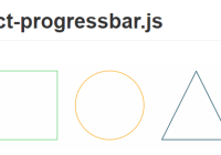
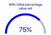
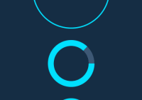
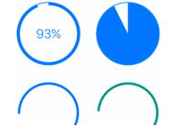
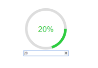
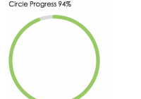
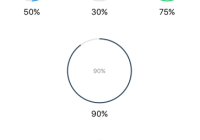
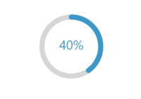
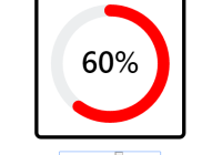
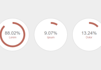
Responsive and slick progress bars for React. Line, Circle and SemiCircle shaped progress bars are provided and their animations are highly [customizable](https://github.com/kimmobrunfeldt/progressbar.js#custom-animations).
This module is a React wrapper for progressbar.js. That's why most of the documentation refers to the original documentation.
Shortcuts
- How to install
- API documentation
- Demos These demos use the original progressbar.js but the options are exactly the same for react-progressbar.js too
Get started
react-progressbar.js is lightweight, MIT licensed and supports all major browsers including IE9+.
How to install
Install the library using npm:
npm install --save react-progressbar.js Since React users are anyways using a CommonJS module loader, this module is published only in NPM.
Loading module
CommonJS
var ProgressBar = require('react-progressbar.js') var Circle = ProgressBar.Circle;How it works
See https://github.com/kimmobrunfeldt/progressbar.js#how-it-works.
API
NOTE: Line, Circle and SemiCircle all point to the same documentation which is named Shape. You almost certainly should replace it(Shape) with Line, Circle or SemiCircle.
Example: if documentation states <Shape />, replace it with <Circle />, simple. Shape is the internal base object for all progress bars.
Important: make sure that your container has same aspect ratio as the SVG canvas. For example: if you are using SemiCircle, set e.g.
#container { width: 300px; height: 150px; }Shape
Line, Circle or SemiCircle shaped progress bar. Appends SVG to container.
Example
var App = React.createClass({ render: function render() { var options = { strokeWidth: 2 }; // For demo purposes so the container has some dimensions. // Otherwise progress bar won't be shown var containerStyle = { width: '200px', height: '200px' }; return ( <Circle progress={this.state.progress} text={'test'} options={options} initialAnimate={true} containerStyle={containerStyle} containerClassName={'.progressbar'} /> ); } });With Line shape, you can control the width of the line by specifying e.g. height: 5px with CSS.
Props:
| Prop | Description |
|---|---|
| progress | Progress from 0 to 1. E.g. 67% progress would equal 0.67. Default 0. |
| text | Value for progress bar's text. Default null. |
| options | Options for path drawing. See progressbar.js documentation. |
| initialAnimate | If true, progress bar is animated to given progress when mounted. Default false. |
| containerStyle | Styles for progress bar container. Default {}. |
| containerClassName | Class name for progress bar container. Default .progressbar-container. |
