
React Loading Spinners 

A Highly Customizable React component to help you with loaders/spinners for specific part of your project or as a project loading, with built-in presets and the ability of using your own assets.
Online Demo
You can check out this little demo to get the feel of it: Online demo
Get started
It's very easy to use the tool, follow the instructions
Add the package
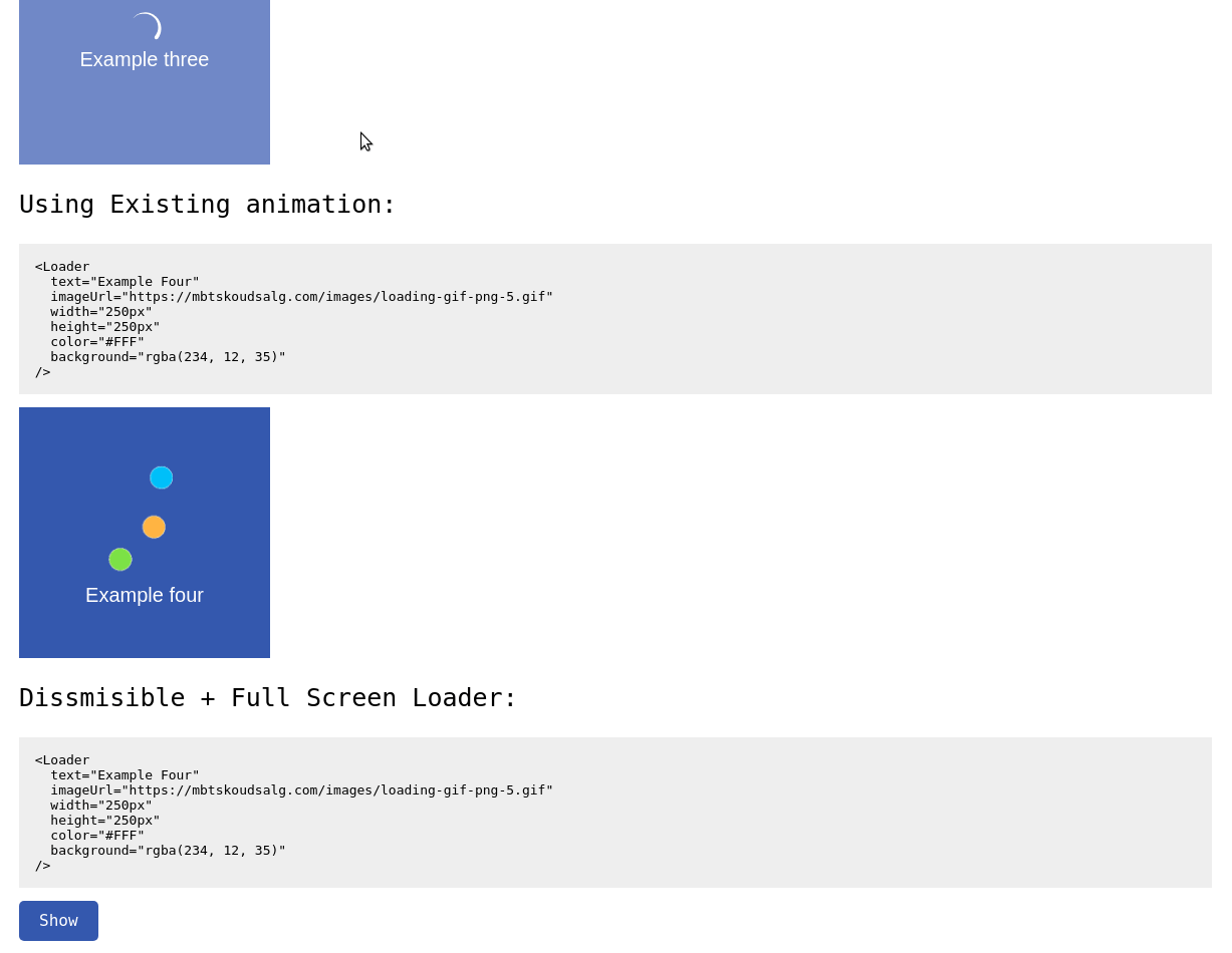
Install the package using npm
npm i react-spinners-loading Import the package into your react app
import Loader from 'react-spinners-loading' Pass the configuration props:
Example of the Configuraiton array:
<Loader text="Loader Text" animation="clock" width="250px" height="250px" color="#FFF" background="rgba(234, 12, 35, 0.7)" />And that's pretty much it!
Explanation of the different properties you can pass:
| Name | Type | Default | Description |
|---|---|---|---|
| text | String | 'Loading...' | Unique string that defines the element |
| animation | String | null | One of the built-in presets [bar, circle, clock, dots, double-circle, drop, spinner] |
| color | String | '#FFFFFF' | The color of the text/spinner in HEX,RGB or RGBa |
| background | String | 'rgba(0, 0, 0, 0.7)' | The background color of the whole Loader in HEX,RGB or RGBa |
| width | String | '100%' | The Width of the Loader in Px/rem/em/% |
| height | String | '100%' | The Height of the Loader in Px/rem/em/% |
| fullscreen | Boolean | false | If the Loader should be showed in full-screen (Width & Height shouldn't be specified) |
| show | Boolean | true | To control if the Loader has to be shown or not |
| imageUrl | String | null | The URL for the Loading animation (animation doesn't need to be specified) |
| dismissible | Boolean | false | Showing a Closing button to close the Loader |


