react-native-circular-progress
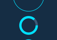
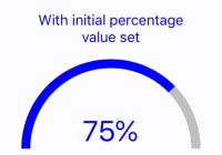
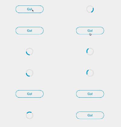
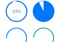
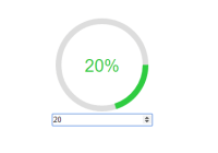
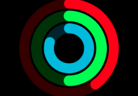
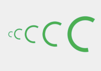
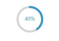
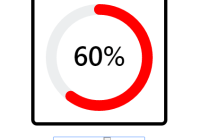
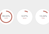
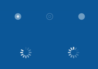
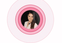
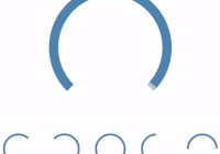
React Native component for creating animated, circular progress. Useful for displaying users points for example.
Example app
Installation
-
Install this component and
react-native-svg:npm i --save react-native-circular-progress react-native-svg -
Link native code for SVG:
react-native link react-native-svg
Usage
import { AnimatedCircularProgress } from 'react-native-circular-progress'; <AnimatedCircularProgress size={120} width={15} fill={100} tintColor="#00e0ff" onAnimationComplete={() => console.log('onAnimationComplete')} backgroundColor="#3d5875" />You can also define a function that'll receive current progress and for example display it inside the circle:
<AnimatedCircularProgress size={200} width={3} fill={this.state.fill} tintColor="#00e0ff" backgroundColor="#3d5875"> { (fill) => ( <Text> { this.state.fill } </Text> ) } </AnimatedCircularProgress>Finally, you can manually trigger a duration-based timing animation by putting a ref on the component and calling the animate(toValue, duration, easing) function like so:
<AnimatedCircularProgress ref={(ref) => this.circularProgress = ref} ... />this.circularProgress.animate(100, 8000, Easing.quad); // Will fill the progress bar linearly in 8 secondsThe animate-function returns the timing animation so you can chain, run in parallel etc.
Configuration
You can configure the CircularProgress-component by passing the following props:
| Name | Type | Default value | Description |
|---|---|---|---|
| size | number|Animated.Value | required | Width and height of circle |
| width | number | required | Thickness of the progress line |
| backgroundWidth | number | width | Thickness of background circle |
| fill | number (0-100) | 0 | Current progress / fill |
| tintColor | string | black | Color of the progress line |
| backgroundColor | string | If unspecified, no background line will be rendered | |
| rotation | number (-360 - 360) | 90 | Angle from which the progress starts from |
| lineCap | string | butt | Shape used at ends of progress line. Possible values: butt, round, square |
| arcSweepAngle | number (0-360) | 360 | If you don't want a full circle, specify the arc angle |
| style | ViewPropTypes.style | Extra styling for the main container | |
| children | function | Pass a function as a child. It receiveds the current fill-value as an argument | |
| childrenContainerStyle | ViewPropTypes.style | Extra styling for the children container |
The following props can further be used on AnimatedCircularProgress:
| Name | Type | Default value | Description |
|---|---|---|---|
| prefill | number (0-100) | 0 | Initial fill-value before animation starts |
| duration | number | 500 | Duration of animation in ms |
| easing | function | Easing.out(Easing.ease) | Animation easing function |
| onAnimationComplete | function | Function that's invoked when the animation completes (both on mount and if called with .animate()) |
AnimatedCircularProgress also exposes the following functions:
| Name | Arguments | Description |
|---|---|---|
| animate | (toVal: number, duration: number, ease: function) | Animate the progress bar to a specific value |
| reAnimate | (prefill: number, toVal: number, duration: number, ease: function) | Re-run animation with a specified prefill-value |
Running example app (Expo)
git clone https://github.com/bgryszko/react-native-circular-progress.git cd react-native-circular-progress/example yarn yarn startAuthors
- Bartosz Gryszko ([email protected])
- Markus Lindqvist
- Jacob Lauritzen
- Special thanks to all contributors!
License
MIT
Special thanks
Special thanks to Chalk+Chisel for creating working environment where people grow. This component was created for one of the projects we're working on.
