react-native-image-progress 

Progress indicator for networked images in React Native
Installation
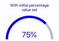
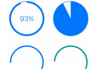
yarn add react-native-image-progress Note: Progress indicators has been broken out to a separate component; react-native-progress. To use them, please follow installation instructions for that package.
Usage
import Image from 'react-native-image-progress'; import ProgressBar from 'react-native-progress/Bar'; <Image source={{ uri: 'http://loremflickr.com/640/480/dog' }} indicator={ProgressBar} style={{ width: 320, height: 240, }}/>Properties
Any Image property and the following:
| Prop | Description | Default |
|---|---|---|
imageStyle | Styles applied to the inner image component. | None |
indicator | A component to display progress, will be passed a progress prop with a number between 0 and 1 and indeterminate a boolean wether or not component has started recieveing data. | ActivityIndicator |
indicatorProps | An object of props being passed to the indicator component. To disable indeterminate state, pass {indeterminate: false}. | None |
renderIndicator(progress, indeterminate) | Function to render your own custom indicator, useful for something very simple. If not, consider breaking it out to a separate component and use indicator prop instead. | None |
renderError(error) | Function to render your own custom error message or image fallback. | None |
threshold | Number of milliseconds after mount to wait before displaying the indicator. Basically a workaround for cached images not to flash a spinner. Set to 0 to disable. | 50 |
Note: onLoad* events are bubbled up, so if you want to do some custom thing when the image is loaded for example.
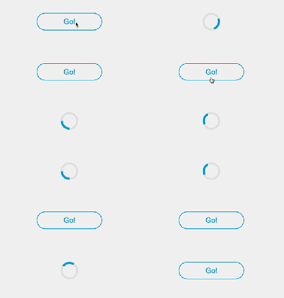
Demo
Example
Check full example in the Example folder.
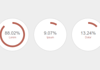
Pie
import Image from 'react-native-image-progress'; import Progress from 'react-native-progress'; <Image source={{ uri: 'http://loremflickr.com/640/480/dog' }} indicator={Progress.Pie} indicatorProps={{ size: 80, borderWidth: 0, color: 'rgba(150, 150, 150, 1)', unfilledColor: 'rgba(200, 200, 200, 0.2)' }} style={{ width: 320, height: 240, }}/>Using a custom image component
For some use cases such as better GIF support or more granular control over caching you might want to use a custom image component, to do this simply use the createImageProgress function:
import { createImageProgress } from 'react-native-image-progress'; import FastImage from 'react-native-fast-image'; const Image = createImageProgress(FastImage);NOTE: the alternative image implementation must conform to the core Image component life cycle props, notably onProgress, onError, onLoad and onLoadStart.
License
MIT License. © Joel Arvidsson


