react-loader-advanced
Show loader overlaying your component during async events.
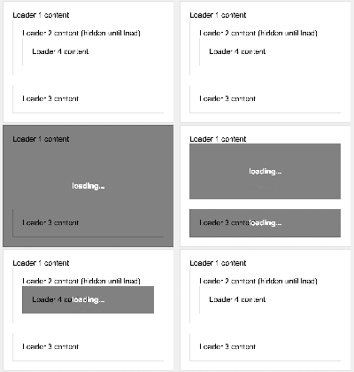
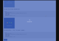
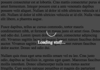
React-loader-advanced provides a component into which you can wrap an arbitrary React component. The loader will fill the area of the component and display a loading message. You may need multiple loader containers at different parts of your page. This loader also supports setting priority for the loaders so that the lower priority loaders will never show if there is another loader already showing. This is beneficial when you want to prevent transparent loaders overlapping, which would look ugly.
Install
npm install react-loader-advanced --saveCompatibility
Compatible with React versions 0.13.x, 0.14.x, ^15.0.0 and ^16.0.0.
Usage
1. Include Loader
Node:
import Loader from 'react-loader-advanced';2. Wrap your component inside the loader
<Loader show={true} message={'loading'}> <SomeComponent /> </Loader>3. Style the loader using foregroundStyle and backgroundStyle
<Loader foregroundStyle={{color: 'white'}} backgroundStyle={{backgroundColor: 'black'}}> ...You may optionally disable all default styling by setting property disableDefaultStyles to true.
4. Optionally if you wish, hack the loader using CSS styles knowing the class-hierarchy
<div class="Loader__background"> <div class="Loader__foreground"> <div class="Loader__message"> Loading </div> </div> </div>See more thorough structure in ./src/react-loader-advanced.js.
Options (props)
show (bool)
This is the only required prop. When true, loader overlay is displayed. When false, only actual content is displayed.
priority (int)
The loader(s) with the highest priority will always be the only loader(s) showing. If loaders with lower priorities stop loading before the one with the highest priority, they will never be shown. Default priority is 0.
hideContentOnLoad (bool)
Hide content underneath loader overlay when loading.
contentBlur (int = px)
Blur the background on browsers that support CSS filter().
message (node = element|string)
Set the displayed message on foreground while loading. Can be an arbitrary element like a spinner of your choice -- or just a simple string. Defaults to string "loading...".
messageStyle (obj)
Extends the message element style.
foregroundStyle (obj)
Set a style for the loader foreground. Extends default styles.
backgroundStyle (obj)
Set a style for the loader background. Extends default styles.
contentStyle (obj)
Extends the content wrapper element style.
disableDefaultStyles (bool)
Disables default styles for background, foreground and message if set to true (not recommended).
transitionConfig (object)
Configure ReactCSSTransitionGroup for the loader overlay to add e.g. fade animation. See: react-transition-group
FAQ
Can I use a spinner element?
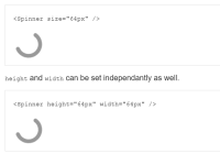
Yes, you can define a spinner element in the message-prop.
const spinner = <span>any-spinner-you-want</span>; <Loader message={spinner}> ... </Loader>License
MIT
