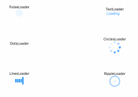
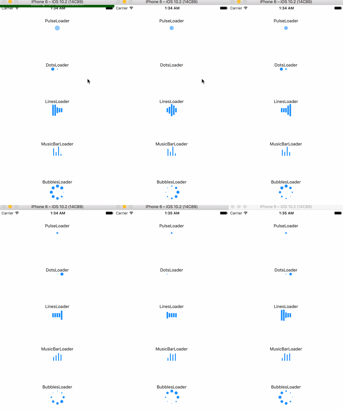
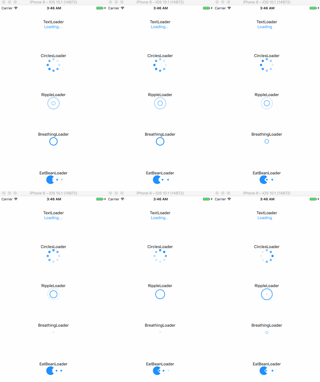
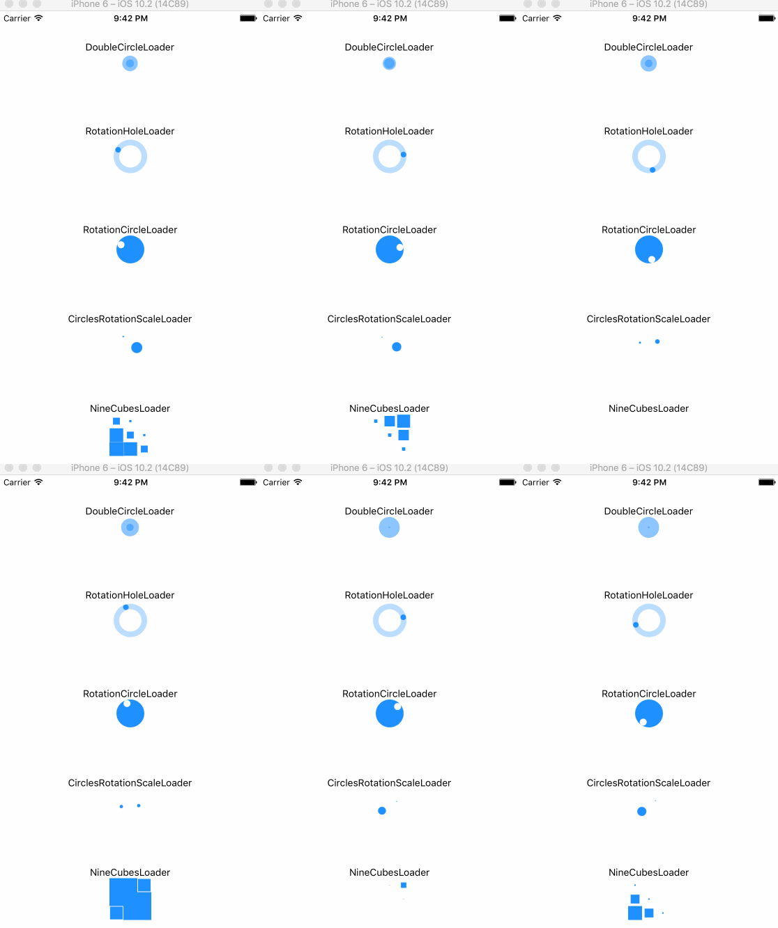
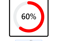
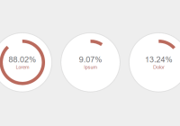
A useful indicator component for React Native
Make sure that you are in your React Native project directory and run:
$ npm install react-native-indicator --save It works, have fun!
Add ART.xcodeproj from node_modules/react-native/Libraries/ART to your Libraries then link libART.a. To see more details about Linking Libraries , jump to this .
Import react-native-indicator as a JavaScript module:
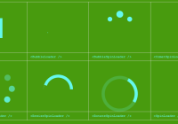
import {CirclesLoader, PulseLoader, TextLoader, DotsLoader, ...} from 'react-native-indicator'; Here is currently available types:
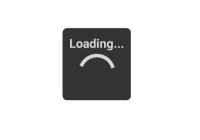
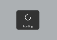
render(){ return( <View> <CirclesLoader /> <TextLoader text="Loading" /> </View> ); } prop type default description size number 30 circle's size color string '#1e90ff' indicator's color frequency number 1000 scale's frequency
prop type default description size number 10 dot's size color string '#1e90ff' indicator's color betweenSpace number 5 distance between two dots
prop type default description text string 'Loading' contents textStyle style inherited text's style
prop type default description size number 40 circle's size color string '#1e90ff' indicator's color dotRadius number 10 each dot's size
prop type default description size number 40 circle's size color string '#1e90ff' indicator's color dotRadius number 8 each dot's size
prop type default description size number 10 circle's size color string '#1e90ff' indicator's color strokeWidth number 3 outline width frequency number 800 scale's frequency
prop type default description size number 10 circle's size color string '#1e90ff' indicator's color strokeWidth number 3 outline width
prop type default description color string '#1e90ff' indicator's color barWidth number 5 each bar's width barHeight number 40 each bar's height barNumber number 5 the number of bar betweenSpace number 2 distance between two bars
prop type default description color string '#1e90ff' indicator's color barWidth number 3 each bar's width barHeight number 30 each bar's height betweenSpace number 5 distance between two bars
prop type default description color string '#1e90ff' indicator's color size number 30 indicator's size
prop type default description size number 30 circle's size color string '#1e90ff' indicator's color
prop type default description size number 30 indicator's size color string '#1e90ff' indicator's color rotationSpeed number 800 rotation speed
prop type default description size number 40 indicator's size color string '#1e90ff' indicator's color rotationSpeed number 800 rotation speed strokeWidth number 8 circle outline's width
prop type default description size number 50 indicator's size color string '#1e90ff' indicator's color
prop type default description size number 20 each cube's size color string '#1e90ff' indicator's color
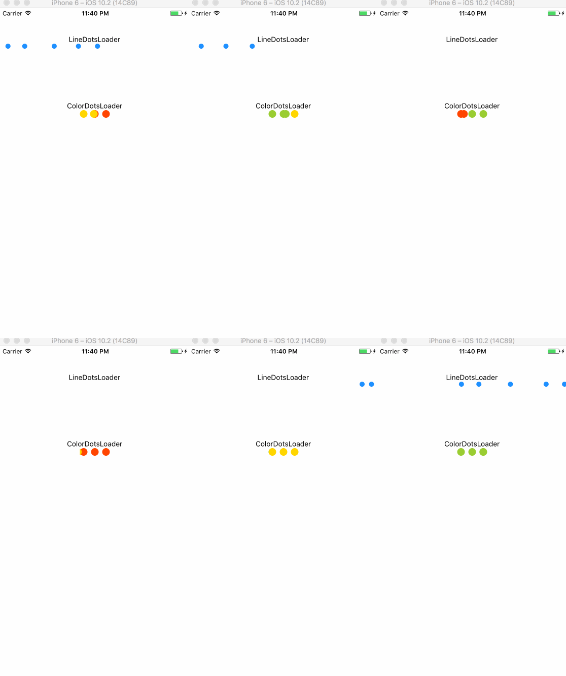
warning: this indicator will occupy a whole horizontal space automatically, which means you don't need to set any center props. Just keeping the direction of its parent View is vertical.
prop type default description size number 10 dot's size color string '#1e90ff' indicator's color dotsNumber number 5 the number of dots betweenSpace number 5 distance between two dots
prop type default description size number 15 each cube's size betweenSpace number 7 distance between two dots color1 string '#ff4500'(red) 1st color color2 string '#ffd700'(yellow) 2nd color color3 string '#9acd32'(green) 3rd color
prop type default description size number 10 dot's size color string '#1e90ff' indicator's color betweenSpace number 5 distance between two dots speed number 200 change speed
MIT
