Responsive React Native Animated Bar
Install
npm install react-native-animated-bar --save yarn add react-native-animated-bar Live Demo
https://snack.expo.io/Hk03E4Avb
Configuration Options
height- Configure the height. Default:10. AutoSize height of bar set to null (height={null})borderColor- Configures the border color. Default:#000.borderWidth- Configures the width of the border. Default:1.borderRadius- Configures border radius. Default:0.barColor- Configures the color of the progress bar. Default:#FFF.fillColor- Configures color behind progress bar. Default:rgba(0,0,0,.5).duration- Configures length of time in milliseconds the change in progress should take. Default:100.animate- Configures whether or not change in progress should be animated. Default:trueonAnimate- Callback listener for the animated value. Default:undefinedstyle- Pass in any styling for the outer containing view. This defines the general layout of the bar for column, row, and theheightprop.wrapStyle- Add arbitrary styling to the wrapping view. This is whereborderColor,borderWidth, andborderRadiusstylings are applied.fillStyle- Add arbitrary styling to inner fill(behind the bar), this is whatfillColoris applied to.barStyle- Add arbitrary styling to the bar, this si whatbarColoris applied to.
Any color above can be an animated interpolated value

Example Usage
import React, { Component } from 'react'; import { AppRegistry, StyleSheet, Text, View } from 'react-native'; import AnimatedBar from "react-native-animated-bar"; export default class example extends Component { render() { return ( <View style={styles.container}> <AnimatedBar /> </View> ); } } const styles = StyleSheet.create({ container: { flex: 1, justifyContent: 'center', alignItems: 'center', }, }); AppRegistry.registerComponent('example', () => example); The Big Examples
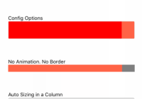
import React, { Component } from "react"; import { AppRegistry, StyleSheet, Text, View } from "react-native"; import AnimatedBar from "react-native-animated-bar"; export default class example extends Component { state = { progress: 0, }; componentDidMount() { const interval = setInterval(() => { if (this.state.progress > 0.9) return clearInterval(interval); this.setState(state => { return { progress: state.progress + 0.1, }; }); }, 1000); } render() { return ( <View style={styles.container}> <View> <Text>No configuration</Text> <AnimatedBar progress={this.state.progress} /> </View> <View> <Text>Config Options</Text> <AnimatedBar progress={this.state.progress} height={50} borderColor="#DDD" fillColor="tomato" barColor="red" borderRadius={5} /> </View> <View> <Text>No Animation. No Border</Text> <AnimatedBar progress={this.state.progress} height={20} borderColor="#DDD" barColor="tomato" borderRadius={5} borderWidth={0} animate={false} /> </View> <View> <Text>Auto Sizing in a Column</Text> <AnimatedBar progress={this.state.progress} height={null} borderColor="#DDD" barColor="tomato" borderRadius={5} borderWidth={5} duration={500} > <View style={[styles.row, styles.center]}> <Text style={[styles.barText, { fontSize: 30 }]}> {Math.round(this.state.progress * 100)}% </Text> </View> </AnimatedBar> </View> <View> <Text>Longer duration on transition</Text> <AnimatedBar progress={this.state.progress} height={20} borderColor="#DDD" barColor="tomato" borderRadius={5} borderWidth={5} duration={500} /> </View> <View style={styles.row}> <Text style={styles.rowText}>Progress with Children: </Text> <AnimatedBar progress={this.state.progress} height={40} borderColor="#DDD" barColor="tomato" borderRadius={5} borderWidth={5} duration={500} row > <View style={[styles.row, styles.center, { flex: 1 }]}> <Text style={styles.barText}> {Math.round(this.state.progress * 100)}% </Text> </View> </AnimatedBar> </View> <View style={styles.row}> <Text style={styles.rowText}>Auto Sizing to Children on Row: </Text> <AnimatedBar progress={this.state.progress} height={null} borderColor="#DDD" barColor="tomato" borderRadius={5} borderWidth={5} duration={500} row > <View style={[styles.row, styles.center]}> <Text style={[styles.barText, { fontSize: 30 }]}> {Math.round(this.state.progress * 100)}% </Text> </View> </AnimatedBar> </View> </View> ); } } const styles = StyleSheet.create({ container: { flex: 1, paddingTop: 30, paddingHorizontal: 30, justifyContent: "space-around", }, rowText: { marginRight: 20, }, row: { flexDirection: "row", }, center: { justifyContent: "center", alignItems: "center", }, barText: { backgroundColor: "transparent", color: "#FFF", }, }); AppRegistry.registerComponent("example", () => example); 


