React Spinners


A collection of loading spinners with React.js based on Halogen.
This package is bootstraped using react-npm-boilerplate
Demo
Installation
npm install react-spinners --saveUsage
Each loader has their own default properties. You can overwrite the defaults by passing props into the loaders.
Each loader accepts a loading prop as a boolean. The loader will not render anything if loading is false. The loading prop defaults to true.
IMPORTANT: This package uses emotion. Remember to add the plugin to .babelrc, for example:
{ "presets": ["@babel/preset-react", "@babel/preset-env], "plugins": ["emotion"] } Examples
import React from 'react'; import { css } from '@emotion/core'; // First way to import import { ClipLoader } from 'react-spinners'; // Another way to import import ClipLoader from 'react-spinners/ClipLoader'; const override = css` display: block; margin: 0 auto; border-color: red; `; class AwesomeComponent extends React.Component { constructor(props) { super(props); this.state = { loading: true } } render() { return ( <div className='sweet-loading'> <ClipLoader css={override} sizeUnit={"px"} size={150} color={'#123abc'} loading={this.state.loading} /> </div> ) } }Available Loaders, PropTypes, and Default Values
Common default props for all loaders:
loading: true color: '#000000' css: {}Note: css works exactly like the css works with the emotion package. You can directly write your css in css syntax without the dirty camelCase css in jss syntax. We recommend you to use this awesome library in your project. It supports Server side rendering with HTTP2 Stream! More info about using css here
For size, height, and width props, there are sizeUnit, heightUnit, and widthUnit prop that accepts px, %, or em. The default for the unit prop is px.
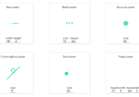
| Loader | size:int | height:int | width:int | radius:int | margin:str |
|---|---|---|---|---|---|
| BarLoader | 4 | 100 | |||
| BeatLoader | 15 | 2px | |||
| BounceLoader | 60 | ||||
| CircleLoader | 50 | ||||
| ClipLoader | 35 | ||||
| ClimbingBoxLoader | 15 | ||||
| DotLoader | 60 | 2px | |||
| FadeLoader | 15 | 5 | 2 | 2px | |
| GridLoader | 15 | ||||
| HashLoader | 50 | 2px | |||
| MoonLoader | 60 | 2px | |||
| PacmanLoader | 25 | 2px | |||
| PropagateLoader | 15 | ||||
| PulseLoader | 15 | 2px | |||
| RingLoader | 60 | 2px | |||
| RiseLoader | 15 | 2px | |||
| RotateLoader | 15 | 2px | |||
| ScaleLoader | 35 | 4 | 2 | 2px | |
| SyncLoader | 15 | 2px |


