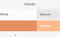
React Card Stack
Built for React, this component allows you to achieve a UI similar to the iOS passbook app.
Installation
react-cardstack requires React 15.3.0 or later.
npm install --save react-cardstack Demo & Example
Live demo: cameronbourke.github.io/react-cardstack
To build the example locally, clone this repo then run:
npm install npm start Then open localhost:8080 in a browser. Usage
React Card Stack exports an object with two components. These are CardStack and Card. The CardStack component is responsible for holding the state of it's child Card components. However, this is abstracted away which makes using the component a whole deal simpler. Note: there must be at least two instances of Card as children of CardStack, otherwise the component will throw an error.
An example use of React Card Stack looks like:
import { CardStack, Card } from 'react-cardstack'; <CardStack height={500} width={400} background='#f8f8f8' hoverOffset={25}> <Card background='#2980B9'> <h1>Number 1</h1> </Card> <Card background='#27AE60'> <h1>Number 2</h1> </Card> </CardStack>The Card component wraps around the content you want to render for each card. You can render both elements or components inside Card.
Figuring out the Header Height
When all Card components are collapsed, the top of each card will be visible. This is basically the header of the Card component. To calculate what size the header will be simply divide the height passed to CardStack by the number of child Card components. In the example above, the header height for each card will be 500 / 2, which equals 250.
Options
CardStack
| Property | Type | Default | Description |
|---|---|---|---|
| width | number | 350px | the width of the component |
| height | number | 500px | the height of the component |
| background | string | f8f8f8 | can be a hex, rgba, gradiant value or a url() |
| hoverOffset | number | 30px | how far the card will shift up when being hovered |
| initialCard | number | -1 | if provided, the card at i'th index will be initially visible |
Card
| Property | Type | Default | Description |
|---|---|---|---|
| background | string | undefined | can be a hex, rgba, gradiant value or a url() |
| cardClicked | func | undefined | read below for description on how to use |
cardClicked is a prop which can be passed to Card. It takes a function, acting as a callback, and will get invoked when a user clicks on the card in which you passed it to. For example, look below:
<Card background='#27AE60' cardClicked={this.handleCardClick.bind(this)}> <NumberTwo /> </Card> // example of the function being bound handleCardClick(isCardSelected) { console.log(isCardSelected); }When this.handleCardClick is invoked, it will receive the parameter cardSelected which will be a boolean describing whether there is currently a card selected or not.
Todo
- Add Unit Tests
License
MIT Licensed Copyright (c) Cameron Bourke 2018


