Intro
Automatically show a well-fitting placeholder for dumb component while its content is loading. [Demo here]


What is the meaning of the word
holdin this project? It's means keep(hold) the shape of the dumb component if it without content. You can also see it as an action which make the dumb component has a placeholder.
Install
npm i --save react-hold Usage
import React from 'react' import { render } from 'react-dom' import hold from 'react-hold' import MyComponent from './path/to/MyCompnent' // make the bulit-in component has a placeholder const P = hold('p', (props) => !props.children) // make the composite component has a placeholder const MyComponentWithPlaceholder = hold(MyComponent, (props) => !props.data) class App extends React.Component { constructor(...args) { super(...args) this.state = { title: '', data: null, } } render() { return ( <div className="my-class-name"> <P>{ this.state.title }</P> <MyComponentWithPlaceholder data={this.state.data} /> </div> ) } } render(<App />, document.body)If you want to make your component has a placeholder by default, try decorator.
import { holdify } from 'react-hold' @holdify((props) => !props.data) class MyComponent extends React.Component { render() { return <div className="add-some-style">{ this.props.data }</div> } }API
import hold, { holdify } from 'react-hold'hold(Component, condition, [defaultHolder], [holderDefaultProps])
This is a default API, and it's a higher-order component. Use it to create a Hold component as a manager to manage the original component and placeholder component.
Arguments
Component(Component) [Required]: The target(original) component, should be a dumb(presentational) component.condition(Function) [Required]: The condition function will be called with argumentspropsandprevProps. It needs to returns a boolean value to judge whether to show the placeholder component(truemeans yes). If returnsfalse, the Hold component will remove the placeholder component, and show the original component.defaultHolder(Component) [Optional]: The default placeholder component. Default Fill.holderDefaultProps(Object) [Optional]: The default props of placeholder component.
Returns
(Component): The Hold component which can automatically control the display of original component and placeholder component.
The Hold component supports these props:
holder(Component) [Optional]: The placeholder component, will override the default placeholder.holderProps(Object) [Optional]: The props of placeholder component, will shallow override the default props.props(Object) [Optional]: The alias ofholderProps.innerRef(Function|String) [Optional]: The ref of original component.
The rest props will be passed to the original component.
holdify(condition, [defaultHolder], [holderDefaultProps])
The handy decorator made by hold API.
Placeholders
import { Fill, Square, Circle, Text, Table } from 'react-hold/holders'You can import the built-in placeholders from react-hold/holders, every different placeholders will display a different content.
Common Props
color(String) [Optional]: The color of placeholder. Default#eee.cancelHold(Function): Invoking this function to manually cancel hold the shape of the original component. This is injected by the Hold component, can't be override.targetProps(Function): The props of the target(original) component. This is injected by the Hold component, can't be override.children[Optional]
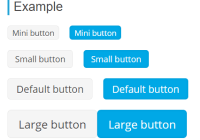
Fill
This placeholder will display a rectangle.
Props
width(String|Number) [Optional]: The width of rectangle.height(String|Number) [Optional]: The height of rectangle.align(String) [Optional]: If you set a width(such as300) lower than the real width of original component, the rectangle will not fill in the full area, but you can use this prop to set the alignment. Supportleft,rightandcenter. Defaultcenter.
Square
This placeholder will display a square.
Props
side(String|Number) [Optional]: the side length of square.align(String) [Optional]: Similar to the align prop ofFill.
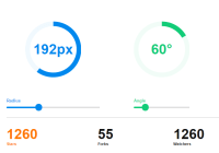
Circle
This placeholder will display a circle.
Props
diameter(String|Number) [Optional]: The diameter of circle.align(String) [Optional]: Similar to the align prop ofFill.
Text
This placeholder will display a piece of blank text.
Props
length(Number) [Optional]: The length of text. Default100.lineHeight(String|Number) [Optional]: the line height of text. Default2.3.fontSize(String|Number) [Optional]: the font size of text. Default'0.7em'.
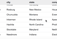
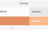
Table
This placeholder will display a table.
Props
width(Number) [Optional]: The width of table.height(Number) [Optional]: The height of table.cols(Number) [Optional]: The cols number of table. Default2.rows(Number) [Optional]: The rows number of table. Default2.gap(Number) [Optional]: The gap between cols and rows. Default2.align(String) [Optional]: Similar to the align prop ofFill.
Plugins
- react-hold-animation: A higher-order component be use for add animation to the placeholder.
More cool plugins is in the todo list.
License
MIT


