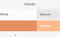
A beautiful site navigation bar to be proud of. Powered by styled components inspired by stripe.com
🎉
Check out the live preview here (powered by now).
Your search for the perfect site navigation bar ends here. Finally a world class navigation bar you can use straight out of the box. Why use this package?
- Beautiful animations
- Automatic viewport detection and correction so flyouts never get rendered off screen
- Completely customisable
- Powered by css grid, css animations and styled components
No more compromises. Welcome to react-site-nav.
Installation
yarn add react-site-nav
Quickstart
import React from 'react'; import {Switch, Link, Route} from 'react-router-dom'; import SiteNav, {ContentGroup} from 'react-site-nav'; // 1. Do this import Home from './home'; import MyStory from './myStory'; export default () => ( <div> {/* 2. Add SiteNav with ContentGroup as children */} <SiteNav> <ContentGroup title="About" height="200"> {/* 3. You can add anything in a ContentGroup */} <ul> {/* react router link! */} <li><Link to="/my-story">My Story</Link></li> <li>Another list item</li> </ul> </ContentGroup> <ContentGroup title="Contact" height="200"> Free text followed by some links.<br/> <a href="mailto:[email protected]">Email</a><br/> <a href="https://github.com/yusinto">Github</a> </ContentGroup> </SiteNav> <Switch> <Route exact path="/" component={Home}/> <Route path="/my-story" component={MyStory}/> </Switch> </div> ); Check the two examples for a fully working spa with react router, server side rendering and hot reload.
Api
SiteNav
The main react component that represents the site nav. The root container is a css grid so most of the props below maps directly to this grid and should be self-explanatory. Place ContentGroup components as children of SiteNav to render the "flyouts".
<SiteNav align="center" /* center, left, right. This directly maps to justify-content of the root grid. */ columnWidth="150" rowHeight="45" background="#323232" color="#fff" fontSize="18" fontFamily="Helvetica, sans-serif" contentBackground="#fff" /* Applies to all content groups */ contentColor="#323232" /* Applies to all content groups */ contentTop="0" /* Adjusts the distance between ContentGroups and root items */ breakpoint="768" /* Show site nav at this breakpoint */ debug={false} /* Keep ContentGroups open to make debugging easier */ > { /* These will render as flyouts */} <ContentGroup>...</ContentGroup> <ContentGroup>...</ContentGroup> </SiteNav>ContentGroup
Each SiteNav contains ContentGroup children components. Each ContentGroup will be rendered as a "flyout" on hover of the root items. It accepts the following props which are self-explanatory.
<ContentGroup title="Products" width="420" height="270" rootUrl="https://some/link" /* Optional. Render root item as a link */ background="white" /* Optional. Overrides SiteNav contentBackground property */ > { /* You can render anything here! */ } </ContentGroup>To render a root item as a link without a ContentGroup, you can do this:
<ContentGroup title="Open Source" rootUrl="https://github.com/yusinto" />By not specifying width and height, SiteNav assumes you just want to render the root item without a ContentGroup. Of course you can have a linked root item plus a ContentGroup. Just specify either a width or a height so SiteNav knows you want to render the group.
<ContentGroup title="Open Source" rootUrl="https://github.com/yusinto" height="200"> { /* You can render anything here! */ } </ContentGroup>Check the demo in my blog.


