react-text-selection-popover

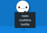
This module provides a way to render a popover/tooltip style component when text (inside a contenteditable element) is selected.

Disclaimer
- This only works inside an element with the
contenteditabletag - This doesn't give you the selected text, use the selection
Install
npm install --save react-text-selection-popoverUsage
The simplest way to use react-text-selection-popover is with 0 props just like this:
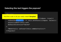
<Popover><MySweetComponent /></Popover>This will display the popover when any text on the page is selected.
Restricting selection to a component
By default, any text within document (or in other words - the entire page) will trigger the Popover. To restrict it you can define the selectionRef prop. Just pass a React ref to it:
constructor(props) { super(props) this.ref = React.createRef() } render() { return <div> <p ref={this.ref}>This text will trigger the popover</p> <Popover selectionRef={this.ref}>Hello there</Popover> </div> }Positioning the Popover
Since 1.0, positioning is completely configurable via the placementStrategy prop. By default, the popover gets centered above or below the text selection (useful for inline toolbars in text editors like Medium) but you're not tied in to this behaviour.
Alternative strategies are in the lib folder of the package.
Here's how you use a placement strategy from the lib folder:
import Popover from 'react-text-selection-popover'; import placeRightBelow from 'react-text-selection-popover/lib/placeRightBelow' <Popover placementStrategy={placeRightBelow} > <!-- my awesome popover content here --> </PopoverWriting your own placement strategy
You can also write your very own placement strategy. A placement strategy takes as an argument an object containg all the properties you need to compute the position of the popover and returns a style object as a result. See below for the exact shape of the Object
If you'd like to look at an example, just have a look at the default positioning strategy
Btw: If you have written a placement strategy that you want to share because you think it might be useful to others :), please open a pr and add it to the lib folder. I'd be more than happy to review it and help get it merged if there's a significant usecase.
Managing Popover display
By default, the popover automatically opens when text is selected and closes when text is unselected. However, on some occasions you might want to control this yourself.
To control whether the Popover is shown or not all you need to define is the isOpen prop. isOpen={true} will show the popover, isOpen={false} will hide it.
<Popover isOpen={this.state.isOpen}>Hey there</Popover>You might still want to use selection events to control whether the Popover is shown or hidden. To do so - use the onTextSelect and onTextUnSelect prop.
<Popover isOpen={this.state.isOpen} onTextSelect={() => this.setState({ isOpen: true })} onTextUnselect={() => this.setState({ isOpen: false })} >Hey there</Popover>Using Popover inside a scrollable element
Some applications have scrollable elements inside them other than <body>. By default Popover repositions itself when the viewport scrolls (window that is). If you're using the Popover inside a scrollable element you need to define the scrollRef prop like so:
class MyApp extends Component { constructor() { this.scrollRef = React.createRef() } render() { return <div> <main ref={this.scrollRef}> </main> <Popover scrollRef={this.scrollRef}>My popover</Popover> </div> } } For more info on how to use the Popover component, please see below :)
<Popover /> Props
| Property | Type | required? | Description |
|---|---|---|---|
containerNode | React.ref | optional | DOM element where popover will be mounted (defaults to document.body) |
selectionRef | React.ref | optional | Set this to constrain selection events to a dom element and its children. You need this especially if you use more than one Popover component (defaults to document) |
scrollRef | React.ref | optional | By default Popover repositions itself when there's a scroll event for document.body. Set this to reposition the Popover upon scrolling of a given element |
isOpen | Boolean | optional | Is the Popover visible or not (defaults to true) |
onTextSelect | Function | optional | Callback for when text is selected (typically used for setting state that opens the modal) |
onTextUnSelect | Function | optional | Callback for when selection collapses (typically used for setting state that closes the modal) |
className | String | optional | CSS class name for Popover container. |
gap | Number | optional | Pixel gap between text selection and popover - (defaults to 5) |
placementStrategy | ({ gap, windowWidth, windowHeight, topOffset, leftOffset, lineHeight, boxWidth, boxHeight }) => StyleObject | optional | A method that produces a style object to position the popover |
License
MIT © juliankrispel
Shoutouts
This was originally written during some freelance work for Spectrum. Shoutout to their awesomeness for letting me do all my work for them in the open!
Work with me?
I freelance for clients around the world, hit me up on my website to get in touch about a project.


