react-simple-maps
An svg map component built with and for React. It allows the creation of pure react svg maps.
Why
React-simple-maps aims to make working with svg maps in react easier. It handles tasks such as panning, zooming and simple rendering optimization, and takes advantage of parts of d3-geo and topojson-client instead of relying on the entire d3 library.
Since react-simple-maps leaves DOM work to react, it can also be easily used with other libraries, such as react-motion and redux-tooltip.
❗️ API changes from 0.9 to 0.10
In version 0.10 the method of passing geography data to react-simple-maps has changed. Where previously geographyUrl and geographyPaths were separate, they are now handled together through the geography prop. If you are upgrading from version 0.9, simply change geographyUrl or geographyPaths to geography and you should be good to go.
Installation
To install react-simple-maps
$ npm install react react-dom react-simple-maps --saveUsage
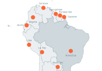
React-simple-maps exposes a set of components that can be combined to create svg maps with markers and annotations. In order to render a map you have to provide a reference to a valid topojson file. You can find example topojson files in the topojson-maps folder or on topojson world-atlas. To learn how to make your own topojson maps from shapefiles, please read "How to convert and prepare TopoJSON files for interactive mapping with d3" on medium.
import React, { Component } from "react" import ReactDOM from "react-dom" import { ComposableMap, ZoomableGroup, Geographies, Geography, } from "react-simple-maps" class App extends Component { render() { return( <div> <ComposableMap> <ZoomableGroup> <Geographies geography={ "/path/to/your/topojson-map-file.json or geography object" }> {(geographies, projection) => geographies.map(geography => ( <Geography key={ geography.id } geography={ geography } projection={ projection } /> ))} </Geographies> </ZoomableGroup> </ComposableMap> </div> ) } } document.addEventListener("DOMContentLoaded", () => { ReactDOM.render(<App />, document.getElementById("app")) })Here is the complete simplified component structure of any map created with react-simple-maps.
<ComposableMap> <ZoomableGroup> <Geographies geography={ "/path/to/your/topojson-map-file.json or geography object" }> {(geographies, projection) => geographies.map(geography => ( <Geography key={ geography.id } geography={ geography } projection={ projection } /> ))} </Geographies> <Markers> <Marker /> </Markers> <Lines> <Line /> </Lines> <Annotation /> </ZoomableGroup> </ComposableMap>The above results in the following svg structure rendered by react:
<svg class="rsm-svg"> <g class="rsm-zoomable-group"> <g class="rsm-geographies"> <path class="rsm-geography" /> <path class="rsm-geography" /> <path class="rsm-geography" /> ... </g> <g class="rsm-markers"> <g class="rsm-marker"></g> </g> <g class="rsm-lines"> <path class="rsm-line"></g> </g> <g class="rsm-annotation"></g> </g> </svg>Components
React-simple-maps is a set of components that simplify the process of making interactive svg maps with react. The components included are:
<ComposableMap /><ZoomableGroup /><ZoomableGlobe /><Geographies /><Geography /><Markers /><Marker /><Annotations /><Annotation /><Graticule /><Lines /><Line />
<ComposableMap />
<ComposableMap /> forms the wrapper around your map. It defines the dimensions of the map and sets the projection used by Geographies, Markers, and Annotations, to position elements. By default the maps use the "times" projection, but react-simple-maps also supports robinson, eckert4, winkel3, mercator, and miller projections out of the box. Additionally you can plug in a custom projection of your choice. All projections from d3-geo-projections are supported.
Props
| Property | Type | Default |
|---|---|---|
| width | Number | 800 |
| height | Number | 450 |
| projection | String/Function | "times" |
| projectionConfig | Object | *see examples below |
| defs | SVG Def Element | *see defs spec |
Configuring projections
The following custom configuration would prevent a visual split of Russia.
... <ComposableMap projectionConfig={{ scale: 200, rotation: [-10,0,0], }} > ... </ComposableMap> ...The default configuration of the projection:
{ scale: 160, xOffset: 0, yOffset: 0, rotation: [0,0,0], precision: 0.1, } <ZoomableGroup />
<ZoomableGroup /> is a component that allows you to zoom and pan. Check out the zoom example to find out how to work with zoom in react-simple-maps.
Props
| Property | Type | Default |
|---|---|---|
| zoom | Number | 1 |
| center | Array | [0,0] |
| disablePanning | Boolean | false |
| style | Object | {} |
| onMoveStart | Function | |
| onMoveEnd | Function |
Zooming
The ZoomableGroup component exposes a zoom property, which can be updated from a wrapper component via setState.
import React, { Component } from "react" import ReactDOM from "react-dom" import { ComposableMap, ZoomableGroup, Geographies, Geography, } from "react-simple-maps" class App extends Component { constructor() { super() this.state = { zoom: 1, } this.handleZoomIn = this.handleZoomIn.bind(this) this.handleZoomOut = this.handleZoomOut.bind(this) } handleZoomIn() { this.setState({ zoom: this.state.zoom * 2, }) } handleZoomOut() { this.setState({ zoom: this.state.zoom / 2, }) } render() { return( <div> <button onClick={ this.handleZoomIn }>{ "Zoom in" }</button> <button onClick={ this.handleZoomOut }>{ "Zoom out" }</button> <hr /> <ComposableMap> <ZoomableGroup zoom={ this.state.zoom }> <Geographies geography={ "/path/to/your/topojson-map-file.json or geography object" }> {(geographies, projection) => geographies.map(geography => ( <Geography key={ geography.id } geography={ geography } projection={ projection } /> ))} </Geographies> </ZoomableGroup> </ComposableMap> </div> ) } } document.addEventListener("DOMContentLoaded", () => { ReactDOM.render(<App />, document.getElementById("app")) })Move events
The ZoomableGroup component allows you to hook into the onMoveStart and onMoveEnd event, and exposes the new center of the map in the callback.
handleMoveStart(currentCenter) { console.log("New center: ", currentCenter) } handleMoveEnd(newCenter) { console.log("New center: ", newCenter) } ... <ZoomableGroup onMoveStart={this.handleMoveStart} onMoveEnd={this.handleMoveEnd} > <Geographies> ... </Geographies> </ZoomableGroup> ... <ZoomableGlobe />
<ZoomableGlobe /> is a component used as a replacement for <ZoomableGroup /> when making SVG globes. While <ZoomableGroup /> is used for zooming and panning, <ZoomableGlobe /> is used for zooming and rotation.
Props
| Property | Type | Default |
|---|---|---|
| zoom | Number | 1 |
| center | Array | [0,0] |
| style | Object | {} |
| onMoveStart | Function | |
| onMoveEnd | Function |
Note that if you are using the <ZoomableGlobe /> component together with the graticule, you will have to specify <Graticule globe={true} /> for the graticule. See the globe example for more information on how to use the <ZoomableGlobe /> component.
<Geographies />
<Geographies /> is a group wrapper around the geographies paths. It returns a function that contains the geographies extracted from the data passed ot the geography prop.
React-simple-maps offers a couple of ways to optimise the performance of the map:
-
By default the
<Geographies />component usesshouldComponentUpdateto prevent the paths from being rerendered. This optimisation can be bypassed using thedisableOptimizationprop. This is useful when making choropleth maps that are updated on user interaction. -
A second way in which react-simple-maps can optimise maps is by setting a
cacheIdon the individual geographies. See the<Geography />component for more info. The unique cacheIds help to cache the paths and significantly accelerate rerenders. This second method is the recommended way of optimising maps with react-simple-maps.
If you do not want react-simple-maps to load your topojson and pass it down automatically, you can also pass your topojson converted features directly into the Geographies component, or an object containing the topojson data.
Props
| Property | Type | Default |
|---|---|---|
| disableOptimization | Boolean | false |
| geography | String or Object, or Array | "" |
Choropleth map
The below example uses the world-50m.json TopoJSON file.
import React, { Component } from "react" import { scaleLinear } from "d3-scale" // If you want to use an object instead of requesting a file: import geographyObject from "/path/to/world-50m.json" const colorScale = scaleLinear() .domain([0, 100000000, 1338612970]) // Max is based on China .range(["#FFF176", "#FFC107", "#E65100"]) class ChoroplethMap extends Component { render() { return ( <div> <ComposableMap style={{ width: "100%" }}> <ZoomableGroup> <Geographies geography={ "/path/to/world-50m.json or geography object" } disableOptimization> // if you are using the object, then geography={geographyObject} {(geographies, projection) => geographies.map((geography, i) => ( <Geography key={ `geography-${i}` } cacheId={ `geography-${i}` } geography={ geography } projection={ projection } style={{ default: { fill: colorScale(geography.properties.pop_est), stroke: "#FFF", strokeWidth: 0.5, outline: "none", }, }} /> ))} </Geographies> </ZoomableGroup> </ComposableMap> </div> ) } } export default ChoroplethMapCustom TopoJSON via geography
If you want to transform your own TopoJSON maps with topojson-client, you can use geography prop to inject your own array of paths into react-simple-maps.
import React, { Component } from "react" import { get } from "axios" import { feature } from "topojson-client" class CustomMap extends Component { contructor() { super() this.state = { geographyPaths: [], } this.loadPaths = this.loadPaths.bind(this) } componentDidMount() { this.loadPaths() } loadPaths() { get("/path/to/world-topojson.json") .then(res => { if (res.status !== 200) return const world = res.data const geographyPaths = feature( world, world.objects[Object.keys(world.objects)[0]] ).features this.setState({ geographyPaths }) }) } render() { return ( ... <Geographies geography={this.state.geographyPaths} disableOptimization> ... </Geographies> ... ) }Check out the custom-json-geographyPaths example to see how to do this.
<Geography />
The <Geography /> component represents each shape converted with topojson. The component can be used to assign events to individual shapes on the map, and to specify their hover, focus and click behavior.
Props
| Property | Type | Default |
|---|---|---|
| cacheId | Number/String | null |
| precision | Number | 0.1 |
| round | Boolean | false |
| geography | Object | *see examples below |
| tabable | Boolean | true |
| style | Object | *see examples below |
Styling
There are no default styles assigned to the <Geography /> component. Since the geography paths have to be optimized in order to allow for decent performance, the styles have to be handled by the <Geography /> component internally. The style prop is an object that defines three states for each path.
... <Geography style={{ default: { fill: "#666" }, hover: { fill: "#999" }, pressed: { fill: "#000" }, }}/> ...Geography events and accessing geography data in events
... handleClick(geography, evt) { console.log("Geography data: ", geography) } ... <Geographies geography={ "/path/to/your/topojson-map-file.json" }> {(geographies, projection) => geographies.map((geography, i) => ( <Geography key={ i } geography={ geography } projection={ projection } onClick={this.handleClick} /> ))} </Geographies> ...Currently supported events are onMouseEnter, onMouseLeave, onMouseDown, onMouseUp, onClick, onMouseMove, onFocus, onBlur.
<Markers />
<Markers /> is a simple wrapper component for the individual markers.
<Marker />
The <Marker /> component represents each marker and uses coordinates to position the marker on the map. It does not make any assumptions about what your marker looks like, so you have to specify yourself what shape it should have. See the example below for how to make the recommended circular marker. The component can be used to assign events to individual markers on the map, and to specify the hover, focus and click behavior. You can also choose to preserve the markers aspect/size when in a <ZoomableGroup /> via the preserveMarkerAspect prop.
Props
| Property | Type | Default |
|---|---|---|
| marker | Object | *see below examples |
| tabable | Boolean | true |
| style | Object | *see below examples |
| preserveMarkerAspect | Boolean | true |
Marker location
Marker data is added to the marker prop and should contain the coordinates of the marker.
<Markers> <Marker marker={{ coordinates: [ 8.5, 47.3 ] }}> <circle cx={ 0 } cy={ 0 } r={ 10 } /> </Marker> </Markers>Styling and shape
There are no styles assigned to the style prop, and the marker does not have a shape by default.
... <Marker marker={{ coordinates: [ 8.5, 47.3 ] }} style={{ default: { fill: "#666" }, hover: { fill: "#999" }, pressed: { fill: "#000" }, } }> <circle cx={ 0 } cy={ 0 } r={ 10 } /> </Marker> ...Marker events and passing marker data to marker events
In order to allow easy access to marker data when handling events, pass the marker data to the marker prop. Below is an example of how to iterate through markers.
... handleClick(marker, evt) { console.log("Marker data: ", marker) } ... <Markers> { markers.map((marker, i) => ( <Marker key={ i } marker={ marker } onClick={ this.handleClick } /> ))} </Markers> ...Currently supported events are onMouseEnter, onMouseLeave, onMouseDown, onMouseUp, onClick, onMouseMove, onFocus, onBlur.
<Annotations />
<Annotations /> is a simple wrapper component for the individual annotations.
<Annotation />
<Annotation /> components can be used to add textual annotations. To position an annotation you have to specify the coordinates of the subject of the annotation, and then pass in numbers for dx and dy to specify the offset of the annotation itself.
Props
| Property | Type | Default |
|---|---|---|
| subject | Array | [0,0] |
| dx | Number | 30 |
| dy | Number | 30 |
| zoom | Number | 1 |
| stroke | String | "#000000" |
| strokeWidth | Number | 1 |
| style | Object | {} |
| markerEnd | String | "none" |
| curve | Number | 0 |
Example annotation
The following example shows how to add a sample annotation for the city of Zurich on a world map.
... <Annotation dx={ -30 } dy={ 30 } subject={ [ 8.5, 47.3 ] } strokeWidth={ 1 }> <text> { "Zurich" } </text> </Annotation> ...You can also use the <Annotations /> component to iterate over annotations.
... <Annotations> { annotations.map((annotation, i) => ( <Annotation key={i} dx={ -30 } dy={ 30 } subject={ annotation.coordinates } strokeWidth={ 1 } > <text> { annotation.label } </text> </Annotation> )) } </Annotations> ...Annotations with a curved connector
The following example shows how to add an annotation with a curved connector for the city of Zurich on a world map. The curve prop can take either a positive number (e.g. 0.5), or a negative number (e.g. -0.5) to create connectors with varying curve intensity. The default value of 0 will connect the annotation through a straight line with no curve.
... <Annotation dx={ -30 } dy={ 30 } subject={ [ 8.5, 47.3 ] } strokeWidth={ 1 } curve={0.5} > <text> { "Zurich" } </text> </Annotation> ...Annotations with an arrow connector
To make the connector an arrow, you can pass a custom SVG marker id to the markerEnd prop of the <Annotation /> component.
... <Annotation dx={ -30 } dy={ 30 } subject={ [ 8.5, 47.3 ] } stroke="#000" strokeWidth={ 1 } curve={0.5} markerEnd="url(#custom-arrow)" > <defs> <marker id="custom-arrow" markerWidth={10} markerHeight={10} refX={7} refY={5} orient="auto" markerUnits="userSpaceOnUse" > <path d="M1,1 L7,5 L1,9" fill="none" stroke="#000" strokeWidth={1} /> </marker> </defs> <text> { "Zurich" } </text> </Annotation> ... <Graticule />
The <Graticule /> component can be used to add a graticule to the map. Note that you can place the graticule before (behind) or after (on top of) the other elements.
Props
| Property | Type | Default |
|---|---|---|
| step | Array | [10,10] |
| round | Boolean | true |
| precision | Nmber | 0.1 |
| outline | Boolean | true |
| stroke | String | "#DDDDDD" |
| fill | String | "transparent" |
| style | Object | { pointerEvents: "none" } |
| disableOptimization | Boolean | true |
| Globe | Boolean | false |
<Lines />
In general <Lines /> and <Line /> components work the same way as <Markers /> and <Marker /> components, with a slight change in it's API.
<Lines /> is a simple wrapper component for the individual line.
<Line />
The <Line /> component represents each line and uses two coordinates (start and end) to position the line on the map. By default a straight line is rendered, so you have to specify yourself what shape it should have. See the example below for how to make the recommended curved line. The component can be used to assign events to individual lines on the map, and to specify the hover, focus and click behavior. You can also choose to preserve the lines aspect/size when in a <ZoomableGroup /> via the preserveMarkerAspect prop.
Props
| Property | Type | Default |
|---|---|---|
| line | Object | *see below examples |
| tabable | Boolean | true |
| style | Object | *see below examples |
| preserveMarkerAspect | Boolean | true |
| buildPath | Function | *see below examples |
Line location
Line data is added to the line prop and should contain the coordinates of the line.
<Lines> <Line line={{ coordinates: { start: [0, 0], end: [-99.1, 19.4] } }} /> </Lines>Styling and shape
There are no styles assigned to the style prop.
... <Line line={{ coordinates: { start: [0, 0], end: [-99.1, 19.4] } }} style={{ default: { stroke: "#666" }, hover: { stroke: "#999" }, pressed: { stroke: "#000" }, }} /> ...Shaping the line
By default the line will be drawn as a straight <path />, if you wish to curve the line in a custom way you need to define a build function. This build function receives the start and end coordinates with the map projection already applied. The third argument corresponds to the line prop provided to the <Line /> component. The returned value will be applied to the resulting <path /> as the d property.
If you wish to know more about what you can achieve with the buildPath prop, checkout MDN's Path documentation.
... // This funtion returns a curve command that builds a quadratic curve. // And depending on the line's curveStyle property it curves in one direction or the other. buildCurves(start, end, line) { const x0 = start[0]; const x1 = end[0]; const y0 = start[1]; const y1 = end[1]; const curve = { forceUp: `${x1} ${y0}`, forceDown: `${x0} ${y1}` }[line.curveStyle]; return `M ${start.join(' ')} Q ${curve} ${end.join(' ')}`; } ... <Line line={{ coordinates: { start: [0, 0], end: [-99.1, 19.4] } }} buildPath={this.buildCurves} />Line events and passing line data to line events
In order to allow easy access to line data when handling events, pass the line data to the line prop. Below is an example of how to iterate through lines.
... handleClick(line, evt) { console.log("Line data: ", line) } ... <Lines> { lines.map((line, i) => ( <Line key={ i } line={ line } onClick={ this.handleClick } /> ))} </Lines> ...Currently supported events are onMouseEnter, onMouseLeave, onMouseDown, onMouseUp, onClick, onMouseMove, onFocus, onBlur.
If you wish to see a real code example check it out here. Otherwise go check it out live at trase.earth.
License
MIT licensed. Copyright (c) Richard Zimerman 2017. See LICENSE.md for more details.
