Pigeon Maps - ReactJS maps without external dependencies


Demo: https://pigeon-maps.js.org/ (using maps from Mapbox, Wikimedia, Stamen and OSM)
What is it?

Are you tired of waiting 3 seconds to parse 200kb of Google Maps JavaScript just to display a few tiles and a marker? 140kb of minified Leaflet too much?
Welcome to the club!
This project aims to provide a performance-first React-centric extendable map engine.
It was originally created to reduce page load speed for the search results on Apprentus, a marketplace for private lessons.
We're currently at:
Implemented:
- Show tiles
- Arbitrary overlays (markers, etc)
- Move the map by dragging
- Move the map by touch on mobile
- Zooming with the scroll wheel
- Zooming by touch
- Fractional zooming (e.g. to level 12.2)
- Zoom without flickering (keep old tiles until new ones load)
- Smooth animated zooming
- Slide when dragging and letting go
- Event handling (clicks, etc)
- Double click and double tap zooming
- Option to block dragging with one finger and mouse wheel scrolling without holding meta key
- Enable/disable touch and mouse events as needed - you could make a 100% static server rendered react map
- Support for 100% width/height containers
Missing:
- Double tap and then swipe touch zooming
Install
One of:
# with yarn yarn add pigeon-maps # still on npm npm install --save pigeon-maps Code
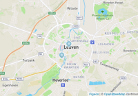
import Map from 'pigeon-maps' import Marker from 'pigeon-marker' import Overlay from 'pigeon-overlay' const map = ( <Map center={[50.879, 4.6997]} zoom={12} width={600} height={400}> <Marker anchor={[50.874, 4.6947]} payload={1} onClick={({ event, anchor, payload }) => {}} /> <Overlay anchor={[50.879, 4.6997]} offset={[120, 79]}> <img src='pigeon.jpg' width={240} height={158} alt='' /> </Overlay> </Map> )Plugins
pigeon-overlay (demo) - an anchored overlay
pigeon-marker (demo) - a simple marker component
pigeon-draggable (demo) - a draggable overlay
If you're interested in making a new plugin, check out the code of pigeon-marker as a starting point. Feel free to clone the repo and rename every mention of pigeon-marker to pigeon-myplugin. You'll get a demo and linking system out of the box. More documentation about this coming soon. Contributions welcome.
API
Map
center - Coordinates of the map center in the format [lat, lng]. Use if the component is controlled, e.g. you'll be listening to onBoundsChanged and passing a new center when the bounds change.
defaultCenter - Initial coordinates of the map center in the format [lat, lng]. Use if the component is uncontrolled.
zoom - Current zoom level, e.g. 12, use for controlled components and update when onBoundsChanged give you a new value.
defaultZoom - The initial zoom for uncontrolled components.
width - Width of the component in pixels. Defaults to 100% of the parent div if not set.
height - Height of the component in pixels. Defaults to 100% of the parent div if not set.
defaultWidth - If you don't specify a width, we wait until the component is mounted and measure the container before rendering tiles, markers and other objects. Setting defaultWidth assumes a width and renders everything before mounting. If the actual width of the component differs, it will just be re-rendered. Use this for example to render tiles on server rendering, when width is not set.
defaultHeight - Similar as defaultWidth, but for the height.
provider - Function that returns a TMS URL: (x, y, z, dpr) => url. The argument dpr will be a value from the dprs array (see below) or undefined when requesting the default tile.
dprs - An array of devicePixelRatios that your tile provider supports. Defaults to []. Pass an array like [1, 2] and the numbers here will be sent to provider as the 4th argument. The responses will be combined into an <img srcset> attribute, which modern browsers use to select tiles with the right resolution.
animate - Animations enabled, true.
animateMaxScreens - If an updated center prop is more than animateMaxScreens screens away, we will directly switch to it, otherwise smoothly animate to it. Defaults to 5
zoomSnap - Snap to discrete zoom increments (14, 15, 16, etc) when scrolling with the mouse or pinching with touch events, Defaults to true.
minZoom - The lowest zoom level possible. Defaults to 1
maxZoom - The highest zoom level possible. Defaults to 18
attribution - What to show as an attribution. React node or false to hide.
attributionPrefix - Prefix before attribution. React node or false to hide.
onClick - When map is clicked `function ({ event, latLng, pixel })``
onBoundsChanged - When the bounds change, function ({ center, zoom, bounds, initial }). Use this for a controlled component, then set center and zoom when it's called. This callback also gets called on the initial mount (when the first bounds become known). In this case the prop initial will be set to true. It will be false on all subsequent calls.
onAnimationStart - Called when the map starts moving
onAnimationStop - Called when the map stops moving
mouseEvents - Can the user interact with the map with the mouse? Defaults to true.
touchEvents - Can the user interact with the map by touching it? Defaults to true.
metaWheelZoom - Zooming with the mouse wheel only works when you hold down the meta (cmd/win) key. Defaults to false.
metaWheelZoomWarning - Warning text to show if scrolling on a map with metaWheelZoom enabled, but without the meta key. Defaults to Use META+wheel to zoom!, where META is automatically replaced with either "⌘" or "⊞", depending on Mac vs non-Mac. Set to null to disable.
twoFingerDrag - Moving the map requires touching with two fingers. Defaults to false.
twoFingerDragWarning - Warning to show when twoFingerDrag and you try to move the map with one finger. Defaults to Use two fingers to move the map. Set to null to disable.
warningZIndex - The z-index value for the meta warning. Defaults to 100
boxClassname - The classname for the tiles div, allowing you to style it with a filter css property without impacting the overlays.
Overlays
<Map /> takes random React components as its children. The children may have these special props:
anchor - At which coordinates [lat, lng] to anchor the overlay with the map.
offset - Offset in pixels relative to the anchor.
The children get passed these special props:
left - Pixels from the left of the map, calculated from anchor and offset
top - Pixels from the top of the map, calculated from anchor and offset
mapState - An object { center, zoom, bounds, width, height } that gets updated at every animation frame.
latLngToPixel - A helper function (latLng, center, zoom) that returns the position in pixels [x, y] for any [lat, lng]. The last 2 arguments are optional.
pixelToLatLng - A helper function (pixel, center, zoom) that converts any pixel coordinates [x, y] to [lat, lng]. The last 2 arguments are optional.
Use these two functions to create beautiful widgets. See a sample overlay.
Add the class pigeon-drag-block to disable dragging on the overlay. Add the class pigeon-click-block to disable map background clicks on the element.
Alternatively use the <Overlay /> component. It accepts anchor, offset and classNames as its props and positions itself accordingly.
Yeah, but why pigeon??
Pigeons are experts in magnetoreception. Good pigeons can find their way home from anywhere.
Magnets were essential in making the first maps. With a good map you can find your way home from anywhere.
Thus, pigeon.
Source: https://en.wikipedia.org/wiki/Homing_pigeon
Pigeon image by Robert Claypool


