The missing React Native UI Kit for iOS.


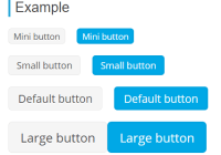
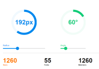
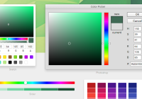
Features
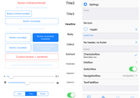
You can find documentation with all list of features and components here
Try it out
cd example && npm run iosor run the example app with Expo to see it in action.
Getting Started
Installation
Open a Terminal in your project's folder and run
yarn add react-native-ios-kit react-native-vector-iconsAfter installation, you'll need to link react-native-vector-icons.
Usage
Wrap your root component in ThemeProvider from react-native-ios-kit.
It's a good idea to wrap the component which is passed to AppRegistry.registerComponent.
Example:
import * as React from 'react'; import { AppRegistry } from 'react-native'; import { ThemeProvider } from 'react-native-ios-kit'; import App from './src/App'; function Main() { return ( <ThemeProvider> <App /> </ThemeProvider> ); } AppRegistry.registerComponent('main', () => Main);The ThemeProvider component provides the theme to all the components in the framework. It also acts as a portal to components which need to be rendered at the top level.
Customization
Main theme for application
You can provide a custom theme to customize the colors, fonts etc. with the ThemeProvider component. Check the Theme Type to see what customization options are supported.
Example:
import * as React from 'react'; import { AppRegistry } from 'react-native'; import { DefaultTheme, ThemeProvider } from 'react-native-ios-kit'; import color from 'color'; import App from './src/App'; const theme = { ...DefaultTheme, primaryColor: 'tomato', primaryLightColor: color('tomato') .lighten(0.2) .rgb() .string(), disabledColor: 'yellow', }; function Main() { return ( <ThemeProvider theme={theme}> <App /> </ThemeProvider> ); }Customization per component
You can also customize theme per one component by using theme prop.
Example:
<Icon name="ios-people" theme={{ primaryColor: 'green' }} >This code will change icon color to green
Documentation
Check the components and their usage in our documentation.
Contributing
Read the contribution guidelines before contributing.
Made with ❤️ at Callstack
react-native-ios-kit is an open source project and will always remain free to use. If you think it's cool, please star it


