react-native-spinner-button 
This is a pure javascript and react-native Button component with a Spinner embeded in it. In many of the react-native projects we have worked on required the button to be disabled when app is processing something on tap of that button, and a loading indicator on it or beside it, so the user can be made aware of app doing some processing.
From a developer perspective, it is very painful to manage two different components: a button and a spinner for lots of buttons! So when we came accross this beautiful component SSspinnerButton, we decided to do something like that in react-native.
By default it will render a Button and you have to pass a boolean isLoading prop to it. When the isLoading will be true, it will render a Spinner in place of the Button and once its false, the Button will be rendered back again.

Features
- Drop in replacement for a button and indicator combo
- Very easy to use
- Pure javscript component
- Consistent look and feel on both iOS and Android
- Any spinner from react-native-indicators can be used with most of its properties
- The animations fadeIn, flipInX and flipInY can be used from react-native-animatable
- Give any style to your button
Getting Started
npm i react-native-spinner-button --saveUsage
import SpinnerButton from 'react-native-spinner-button'; ... // Your button component <SpinnerButton buttonStyle={styles.buttonStyle} isLoading={this.state.defaultLoading} onPress={() => { this.setState({ defaultLoading: true }); }} indicatorCount={10} > <Text style={styles.buttonText}>Default Or Ball SpinnerButton</Text> </SpinnerButton>Don't forget to set the state variable you have given to isLoading prop false when processing is done for the button tap.
Common properties
- animationType
- Type of animation for the button and spinner.
- Default type: string
- Default value: fadeIn
- buttonStyle
- Its a stylesheet object.
- Default button style
defaultButtonStyle: { justifyContent: 'center', alignItems: 'center', height: 50, backgroundColor: '#25CAC6', }
- indicatorCount
- The count property of react-native-indicators.
- Default type: number
- Default value: fadeIn
- isLoading
- The flag to render a Button or a Spinner. false will render button and true will render button.
- Default type: boolean
- Default value: false
- onPress
- The function to execute on tap of the button.
- Default type: functin.
- Default value: nothing is executed
- size
- The size of the Spinner.
- Default type: number
- Its default value veries according to the spinnerType.
- spinnerColor
- The color of the Spinner.
- Default type: string
- Its default value is white. You can give spinnerColor in all react-native acceptable formats of color.
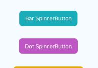
- spinnerType
- Type of the spinner.
- Default type: string
- Its default value is BallIndicator.
- These are all spinner types:
- BallIndicator
- BarIndicator
- DotIndicator
- MaterialIndicator
- PacmanIndicator
- PulseIndicator
- SkypeIndicator
- UIActivityIndicator
- WaveIndicator
- spinnerOptions
- An object of waveMode for WaveIndicator for WaveIndicator.
- Default type: Object
- For more details about these properties, refer react-native-indicators
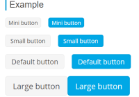
Example
A full working example project is here Example
Acknowledgments and Big Thanks to
License
This project is licensed under the MIT License - see the LICENSE file for details


