A set of tiny, composable React components
for handling state with render props.
Why? · Principles · Examples · Documentation · Contributing!
react-values gives you a set of simple, composable helpers that let you build more complex, stateful UI components like toggles, dropdowns, lists, checkbox groups, popovers, tooltips, you name it!
It does this using a small render-prop-based API that exposes helpful transforms like toggle, increment, filter, etc. depending on the type of value, all based on JavaScripts native value types...
Anyvalues provide simple transforms likesetandclear.Arrayvalues provide native methods likepush,pop,filter, etc.Booleanvalues providetoggle, which we've all re-implemented 100 times.Datevalues provide really helpful transforms likesetHoursandincrementMonth.Mapvalues provide native methods likeset,deleteandclear.Numbervalues provideincrementanddecrement, which have also been re-written in every codebase ever.Objectvalues provide helpful transforms likeset,unsetandassign.Setvalues provide native methods likeadd,deleteandclear.Stringvalues provide native methods likeconcat,repeat,trim, etc.
This saves you from constantly re-writing the same state management logic, so you can keep your components focused on behavior and presentation.
For example, here's the classic state management "counter" example:
import { NumberValue } from 'react-values' const Counter = () => ( <NumberValue defaultValue={0}> {({ value, increment, decrement }) => ( <button onClick={() => increment()}>+1</button> <span>{value}</span> <button onClick={() => decrement()}>-1</button> )} </NumberValue> )Of going further, here's a full fledged <Toggle> (respecting value/defaultValue and providing onChange) implemented in just a few lines of code using a <BooleanValue>:
import { BooleanValue } from 'react-values' const Toggle = ({ value, defaultValue, onChange }) => ( <BooleanValue value={value} defaultValue={defaultValue} onChange={onChange}> {({ value: on, toggle }) => ( <Track on={on} onClick={toggle}> <Thumb on={on} /> </Track> )} </BooleanValue> ) const Track = styled.div` position: relative; height: 25px; width: 50px; background-color: ${props => (props.on ? 'lightgreen' : 'lightgray')}; border-radius: 50px; ` const Thumb = styled.div` position: absolute; left: ${props => (props.on ? '25px' : '0')}; height: 25px; width: 25px; background-color: white; border-radius: 50px; `But you can go further, because react-values can "connect" a single value across multiple components. This is helpful any time you need a "global" piece of state in your app, without wanting to add tons of complexity.
For example, using the <Toggle> from above, here's a modal you can open and close from anywhere in your app:
import { createBooleanValue } from 'react-values' import { Modal, Toggle } from './ui' const ModalValue = createBooleanValue(false) const App = () => ( <div class="app"> <div class="sidebar"> <ModalValue> {({ value, set }) => ( <Toggle value={value} onChange={set} /> )} </ModalValue> </div> <div class="content"> <ModalValue> {({ value: opened }) => ( opened && <Modal /> )} </ModalValue> </div> <div> )The primitives react-values gives you seem simple at first, but they can be composed together to create complex behaviors that are still easy to reason about, in just a few lines of code.
Why?
While building an app with React, you end up building a lot of stateful components in the process. Whether at the UI kit level for things like toggles, tooltips, checkbox groups, dropdown, etc. Or at the app level for modals, popovers, sorting, filtering, etc.
In the process, you end up re-implementing run of the mill state handling logic all over the place—whether with this.setState or by adopting some "state management framework" and writing the same boilerplate over and over again. And for your components to be nicely reusable across your application you augment them to handle both "controlled" and "uncontrolled" use cases using value or defaultValue. And to make things a bit more manageable, you re-invent common transforms like open, close, toggle, increment, decrement, etc. in lots of different components. And if you're working with a team, you end up doing all of this in slightly different ways throughout your codebase.
In the end, you're now maintaing a lot more logic than necessary, duplicated in many different places in slightly different ways. It gets harder and harder to understand your app's data flow. All while your app's bundle size grows.
react-values solves all of that with a few principles...
Principles
-
Leverage render props. It uses a render-prop-based API, exposing its state and a handful of convenient transform functions to you with the flexible function-as-children pattern.
-
Follow React's conventions. Its components follow React's own naming conventions, using familiar concepts like
value/defaultValue. This makes it extremely easy to slot into existing codebases or frameworks. -
Follow JavaScript's conventions. It exposes JavaScript's familiar, built-in methods like
setDate/setHours,push/pop,filter,concat, etc. to avoid reinventing the wheel and forcing you to constantly read documentation. -
Be extremely lightweight. It's extremely lightweight (and tree-shakeable), with most components weighing just a few hundred bytes, so you can even import it from public-facing component libraries.
-
Prioritize convenience. It's designed to provide convenient functions like
increment,toggle, and smarter ones likeincrementDate,decrementMonth, so you can build complex interactions in just a few lines of code.
Examples
To get a sense for how you might use react-values, check out a few of the examples:
- Basic Toggle — using a
Booleanto create a simple toggle component. - Reusable Toggle — showing how you might turn that toggle into a controlled component in your own UI kit.
- Counter — a simple counter using a
Numberand its convenience transforms. - Connected Counters — two counters that are connected together, sharing a single value.
- Time Picker — a more complex time picker component, using
Dateand its convenience transforms. - Filtering — a basic
Stringvalue used for filtering a list. - Checkbox Set — using a
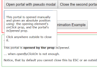
Setto keep track of a checkbox group. - Simple Tooltip — a simplistic tooltip implemented as a
Boolean. - Simple Modal — a simplistic modal implemented as a
Boolean. - Connected Modal — a modal whose opened/closed state is controllable from other components.
If you have an idea for an example that shows a common use case, pull request it!
Documentation
If you're using react-values for the first time, check out the Getting Started guide to familiarize yourself with how it works. Once you've done that, you'll probably want to check out the full API Reference.
If even that's not enough, you can always read the source itself.
There are also translations of the documentation into other languages:
If you're maintaining a translation, feel free to pull request it here!
Contributing!
All contributions are super welcome! Check out the Contributing instructions for more info!
react-values is MIT-licensed.
