


react-notifications-component
Highly configurable and easy to use React component to notify your users!
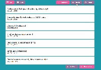
Demo
https://teodosii.github.io/react-notifications-component/

Features
| Touch support | |
| Responsive notifications | |
| Standard notification types ( default, success, info, danger, warning) | |
| Custom notification types | |
| Custom notification content ( images, icons etc) | |
| Dismiss after timeout | |
| Dismissable by swiping | |
| Dismissable by clicking | |
| Dismissable by custom × icon | |
| Custom animations on show | |
| Custom animations on exit | |
| Custom transitions on sliding | |
| Custom transitions on swiping | |
| Notification insertion at both ends of container |
Install
npm install react-notifications-component Usage
You must place ReactNotificationsComponent component at the root level of the application in order to work properly, otherwise it might conflict with other DOM elements due to the positioning.
Use ref syntax when declaring ReactNotificationsComponent in order to have access to internal method addNotification. All API methods provided must be called like this.
For further information on supported options, check documentation.
import React from "react"; import ReactNotification from "react-notifications-component"; import "react-notifications-component/dist/theme.css"; class App extends React.Component { constructor(props) { super(props); this.addNotification = this.addNotification.bind(this); this.notificationDOMRef = React.createRef(); } addNotification() { this.notificationDOMRef.current.addNotification({ title: "Awesomeness", message: "Awesome Notifications!", type: "success", insert: "top", container: "top-right", animationIn: ["animated", "fadeIn"], animationOut: ["animated", "fadeOut"], dismiss: { duration: 2000 }, dismissable: { click: true } }); } render() { return ( <div className="app-content"> <ReactNotification ref={this.notificationDOMRef} /> <button onClick={this.addNotification} className="btn btn-primary"> Add Awesome Notification </button> </div> ); } }Note: It is important to import react-notifications-component CSS theme, which is located in dist/theme.css
Development
First build the library
npm run build:library:dev then run the webpack server to see the app running
npm run start Test
npm run test API
addNotification(options)
Render a new notification. Method returns a unique ID representing the rendered notification. Supplied options are internally validated and an exception will be thrown if validation fails.
removeNotification(id)
Manually remove a notification by ID. Nothing will happen if notification does not exist.
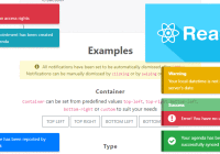
Examples
Options
There are 2 types of options. In order to configure the root component - <ReactNotificationComponent /> - you need to set props to be used as options
| Name | Type | Description |
|---|---|---|
| isMobile | Boolean | Set whether you want component to be responsive or not |
| breakpoint | Number | Breakpoint for showing mobile notifications, it defaults to 768 (px). If window width is smaller than set number, then the responsive containers will be shown - top and bottom |
| types | Object | User defined types - see examples on GitHub pages |
| onNotificationRemoval | Function | Callback function to be called when notification has been removed. Function is called with id and removedBy as parameters. removedBy parameter takes one of the following values
|
In order to configure the notification itself you need to use the following properties when calling addNotification
| Name | Type | Description |
|---|---|---|
| id | String | Id of the notification. Option is not required and should be used only if you want to have custom id over random id that is generated internally |
| title | String | Title of the notification. Option is ignored if content is set |
| message | String | Message of the notification. Option is ignored if content is set, otherwise it is required |
| content | React.Component | Custom notification content, must be a valid React component |
| type | String | Type of the notification (success, danger, default, info, warning or custom). Option is ignored if content is set, otherwise it is required |
| container | String | Container in which the notification will be displayed (top-left, top-right, bottom-left, bottom-right). Option is required |
| insert | String | Insert notification at the top or at the bottom of the container. Option defaults to top |
| userDefinedTypes | Array | Define allowed types when rendering custom types
|
| dismissable | Object | Specify how a notification should be manually dismissed
|
| dismissIcon | Object | Custom X icon
|
| animationIn | Array | CSS classes used to animate notification on show |
| animationOut | Array | CSS classes used to animate notification on removal |
| slidingEnter | Object | Transition to be used when sliding to show a notification
|
| slidingExit | Object | Transition to be used when sliding to hide a notification
|
| touchSlidingBack | Object | Transition to be used when sliding back after an incomplete swipe
|
| touchSlidingExit | Object | Transition to be used when sliding on swipe
|
| dismiss | Object | Automatically dismiss a notification after specified timeout
|
| width | Number | Overwrite notification's width defined by stylesheets |


