📅 recal 📅


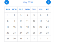
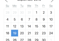
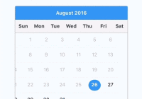
A minimal, accessible React/Preact calendar component using modern CSS, for modern browsers. Now with a 100 Lighthouse Accessibility Audit score. It works with native Javascript dates, so there's no need to import any heavy dependencies like
moment. For a set of functions for working with Javascript Dates, we recommenddate-fns. For a more flexible, fully-featured set of calendar components, seereact-dates.

Installation
Using recal is simple. Just install the npm package:
npm i -S recalOr, import recal and its stylesheet via CDN:
<link rel="stylesheet" type="text/css" href="https://unpkg.com/recal/lib/index.css" /> <script src="https://unpkg.com/recal"></script>Usage
If you're using recal from npm, be sure to import the necessary modules into the file you wish to use it in.
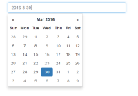
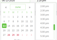
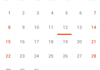
// You can use React or Preact here—just make sure you have the proper aliasing. import React from 'react'; // Calendar components. import { DatePicker, DateRangePicker } from 'recal'; // Stylesheet for calendar. import 'recal/lib/index.css';Date Picker
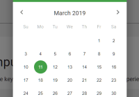
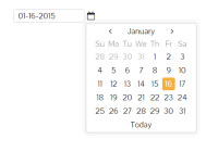
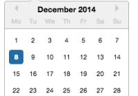
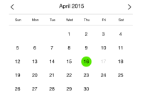
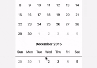
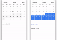
To create a single date picker, use the DatePicker component as follows:
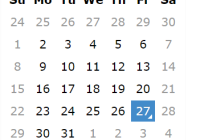
class MyDatePicker extends React.Component { state = {}; onDateSelected = (selectedDate) => { this.setState({ selectedDate }); } render() { return ( <DatePicker date={ this.state.selectedDate } onDateSelected={ this.onDateSelected } /> ); } }Date Range Picker
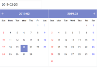
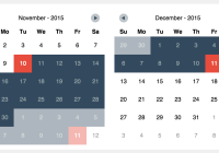
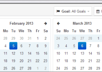
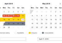
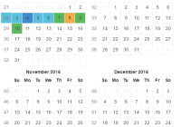
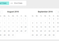
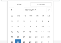
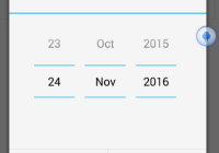
To create a date range picker, use the DateRangePicker component as follows:
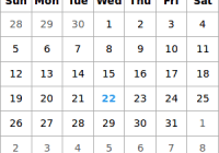
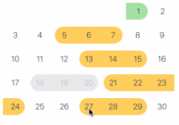
class MyDateRangePicker extends React.Component { state = {}; onStartDateSelected = (startDate) => { this.setState({ startDate }); } onEndDateSelected = (endDate) => { this.setState({ endDate }); } render() { return ( <DateRangePicker startDate={ this.state.startDate } endDate={ this.state.endDate } onStartDateSelected={ this.onStartDateSelected } onEndDateSelected={ this.onEndDateSelected } /> ); } }Options
Both calendars have some required and some optional props.
// Used by DatePicker selectedDate: PropTypes.instanceOf(Date), onDateSelected: PropTypes.func, // Used by DateRangePicker startDate: PropTypes.instanceOf(Date), endDate: PropTypes.instanceOf(Date), onStartDateSelected: PropTypes.func, onEndDateSelected: PropTypes.func, // Used by either (optional) onDateHovered: PropTypes.func, onDateFocused: PropTypes.func, isDateHighlighted: PropTypes.func, isDateEnabled: PropTypes.func, locale: PropTypes.string, disabled: PropTypes.boolLocalization
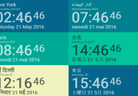
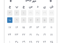
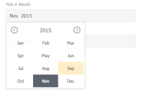
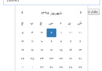
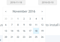
Use the locale string prop on the calendar components to localize the month and days of the week into other languages (e.g. "en-US", "es-MX", etc.).
Accessibility
This set of calendars are optimized for screen readers as well as for keyboard-based navigation. The following shortcuts are available when the calendar is focused:
| Key | Direction | Time |
|---|---|---|
| Left Arrow | Back | 1 day |
| Right Arrow | Forward | 1 day |
| Up Arrow | Back | 1 week |
| Down Arrow | Forward | 1 week |
| Page Up | Back | 1 month |
| Page Down | Forward | 1 month |
| Shift + Page Up | Back | 1 year |
| Shift + Page Down | Forward | 1 year |